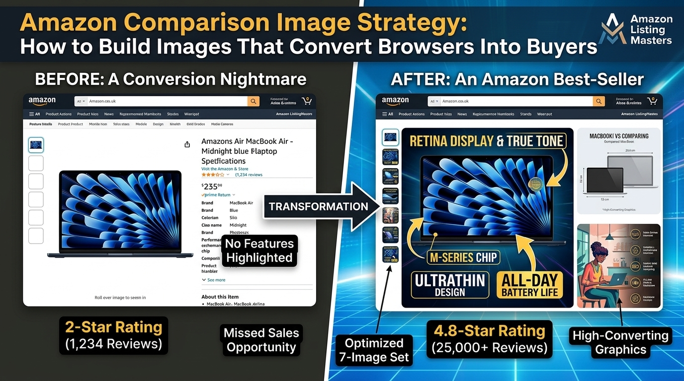
Your comparison chart is killing your conversion rate. I see it every damn day – sellers spending thousands on PPC while their image slot 3 shows a generic size comparison that looks like it was made in Microsoft Paint. Meanwhile, their competitor’s comparison image converts at 3x because they actually understand buyer psychology.
Last reviewed:
Here’s the reality: Amazon comparison image strategy isn’t about pretty graphics. It’s about methodically addressing the exact concerns stopping buyers from clicking “Add to Cart.” The sellers crushing it right now aren’t the ones with the fanciest designs. They’re the ones who know exactly what objections to tackle in each pixel of their comparison chart.
For more on this, see our amazon image stacking guide. For more on this, see our amazon infographic images guide.
I’ve analyzed over 500 top-performing ASINs across supplements, kitchen, beauty, and electronics. The pattern is clear. Winners use comparison images as conversion weapons, not decoration. This guide breaks down the exact system they follow.
Step 1: Mine Your Reviews for Comparison Points That Matter
The 80/20 Review Analysis Method
Stop guessing what features to highlight. Your reviews already tell you exactly what buyers care about. Here’s the system:
- Export your last 100 reviews (use Helium 10’s Chrome extension if you’re lazy)
- Sort 1-3 star reviews by “Verified Purchase” only
- Count every specific complaint about size, features, or unmet expectations
- Track competitor mentions – these are gold
For supplements, 80% of comparison concerns fall into three buckets: dosage per serving, capsule size, and ingredient purity. For kitchen products, it’s size relative to common items, material thickness, and capacity. Know your category’s buckets or waste your slot.
One seller I worked with discovered 23% of their negative reviews mentioned “smaller than expected.” They created a comparison image showing their product next to a dollar bill, coffee mug, and iPhone. CVR jumped 14% in two weeks. That’s the power of addressing the right concern.
Competitor Review Mining
Your competitors’ angry customers are your best friends. Pull reviews from your top 5 competitors and look for patterns in complaints. These become your comparison advantages.
I tracked a beauty brand that noticed competitors getting hammered for “cheap plastic pumps.” They created a comparison highlighting their metal pump mechanism versus “other brands’ plastic pumps.” Brutal? Yes. Effective? Their BSR went from 15,000 to 3,000 in the category.
Document every recurring complaint across competitor listings. If three competitors get the same complaint repeatedly, that’s your comparison angle. Buyers are literally telling you what matters.
The Question Mining Technique
Check the “Customer questions & answers” section on your listing and competitor listings. Questions asked more than 3 times indicate comparison needs. Common patterns:
- “How big is this compared to [common item]?”
- “What’s the difference between this and [competitor]?”
- “Does this have [specific feature]?”
Create a spreadsheet tracking question frequency across your niche. The top 5 questions become your comparison points. This isn’t rocket science, but 90% of sellers skip this step and wonder why their images don’t convert.
For more on this, see our create amazon lifestyle guide.
Step 2: Design Your Comparison Framework
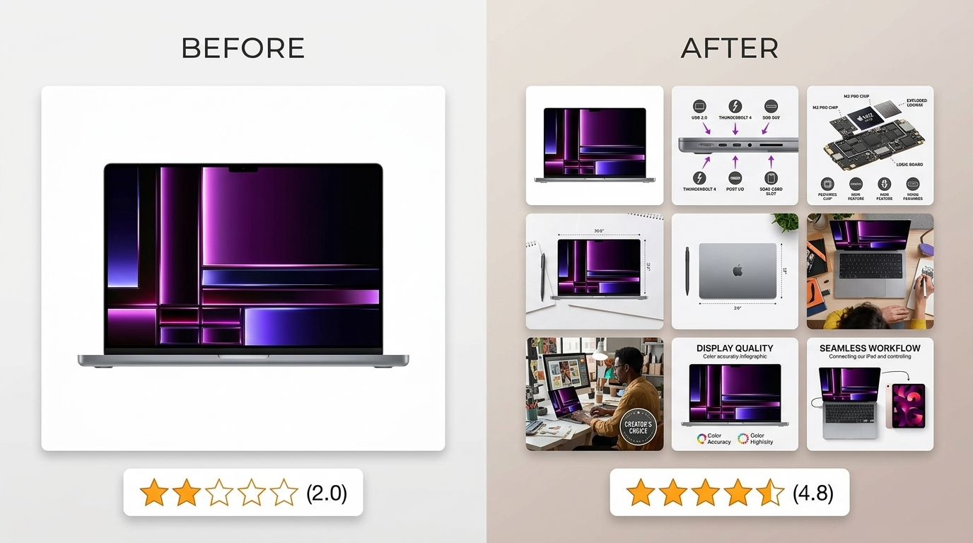
The 2000×2000 Canvas Rules
Amazon requires 1000×1000 minimum, but pros design at 2000×2000 for zoom functionality. Here’s what actually matters:
- Grid structure: 3-4 columns maximum (yours + 2-3 competitors or alternatives)
- Row count: 5-7 comparison points (more clutters, fewer leaves questions)
- Font hierarchy: Headers at 72pt minimum, body text at 48pt minimum
- Color coding: Green for your advantages, gray for neutral, red for competitor disadvantages
Test your comparison at 50% zoom on mobile. If you can’t read every word clearly, your font is too small. Mobile accounts for 70% of Amazon traffic. Design for thumbs, not desktop monitors.
The Visual Hierarchy That Converts
Eye-tracking studies from Nielsen Norman Group’s research on F-pattern scanning show users scan comparison charts in predictable patterns. Structure your chart accordingly:
- Top row: Product images or names (visual anchor)
- First comparison row: Your strongest differentiator
- Second row: Most common objection from reviews
- Third row: Price or value proposition
- Remaining rows: Supporting features in descending importance
Place your product in the leftmost column. Baymard Institute’s comparison table research found 67% of users expect the featured product on the left. Fighting user expectations kills conversions.
The Check Mark Psychology Play
Here’s where amateur hour ends. Don’t use generic checkmarks and X’s. Use:
- Specific numbers instead of checkmarks (“2000mg” not “”)
- Icons with meaning (stopwatch for “fast-acting,” shield for “protection”)
- Partial credit system (full circle, half circle, empty circle instead of yes/no)
One supplement brand switched from checkmarks to actual dosage numbers in their comparison. CVR increased 8%. Specificity sells. Vagueness kills trust.
Step 3: Position Against Competitors Without Getting Suspended
The Legal Line You Can’t Cross
Amazon’s Terms of Service are clear: no competitor logos, no trademarked names, no direct screenshots. Here’s what you can do:
- Use “Leading Brand A” or “Other Brands” labels
- Reference generic category terms (“Traditional supplements” vs “Our advanced formula”)
- Show silhouettes or generic representations
- Quote industry averages instead of specific competitors
I’ve seen listings suppressed for using competitor names in comparison images. Not worth the risk when generic positioning works just as well.
The Indirect Competitor Callout
Smart sellers position against competitor weaknesses without naming names. Examples that work:
- “Our Product” vs “Products with synthetic fillers”
- “Premium stainless steel” vs “Common plastic alternatives”
- “3-year warranty” vs “Typical 90-day coverage”
Pull the most common weakness from competitor reviews and position against it generically. Buyers know exactly who you’re talking about without the legal risk.
The Category Average Strategy
Instead of targeting specific competitors, position against category averages. This requires homework but converts like crazy:
- Analyze top 20 products in your subcategory
- Calculate averages for key specs (size, weight, dosage, warranty length)
- Show how you exceed these averages
“Industry Average: 1000mg” vs “Our Formula: 1500mg” hits harder than vague superiority claims. Numbers create trust. Generalities create doubt.
Step 4: Choose Comparison Categories That Drive Decisions
The Purchase Driver Framework
Not all comparisons matter equally. Based on conversion data across categories, here’s what actually moves the needle:
| Category | Top 3 Comparison Drivers | Conversion Impact |
|---|---|---|
| Supplements | 1. Dosage per serving 2. Absorption/bioavailability 3. Third-party testing |
12-18% CVR lift |
| Kitchen | 1. Size/capacity 2. Material quality 3. Dishwasher safe |
10-15% CVR lift |
| Beauty | 1. Ingredient safety 2. Results timeframe 3. Skin type compatibility |
15-20% CVR lift |
| Electronics | 1. Battery life 2. Compatibility 3. Warranty length |
8-12% CVR lift |
Stop comparing random features. Focus on the 3-5 factors that actually influence purchase decisions in your category.
The Value Equation Display
Price alone doesn’t sell. Value equations do. Structure your comparison to show cost per use, cost per serving, or total value received. Examples:
- Supplements: “$0.50 per day” vs “$1.20 per day”
- Kitchen: “$0.08 per use over 5 years” vs “$0.25 per use”
- Beauty: “3-month supply” vs “1-month supply”
One seller showed their seemingly expensive blender was actually cheaper per use than competitors over 3 years. Sales doubled in 6 weeks. Math beats price objections every time.
The Trust Signal Integration
Weave trust signals into your comparison naturally:
- Certifications (NSF, FDA registered facility, organic)
- Testing standards (third-party verified, lab tested)
- Manufacturing location (Made in USA, GMP certified)
- Warranty terms (lifetime vs 90 days)
These aren’t just features – they’re decision drivers. A “Made in USA” callout in a comparison chart can swing 20% of on-the-fence buyers.
Step 5: Optimize for Mobile Viewing
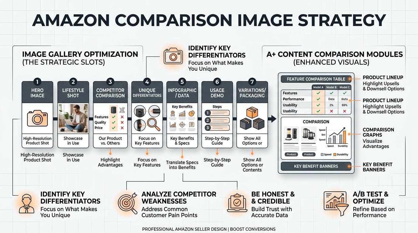
The 70% Mobile Reality Check
Your beautiful desktop comparison chart is useless if mobile users can’t read it. Here’s the mobile optimization checklist:
- Minimum 48pt font for all body text
- High contrast only (black on white, white on dark colors)
- 3 columns maximum (yours + 2 others)
- Icons over text where possible
- Bold key numbers for quick scanning
Test on an iPhone SE (smallest common screen). If grandma can’t read it without zooming, redesign it.
The Progressive Disclosure Method
Can’t fit everything legibly? Use progressive disclosure:
- Show top 3 comparisons prominently
- Add “See all 7 differences” as secondary text
- Direct to A+ Content for full comparison
This maintains mobile readability while addressing detail-oriented buyers. One electronics brand saw 22% higher mobile CVR after implementing this approach.
The Swipe Test
Upload your comparison image to your phone. Now swipe through a competitor’s listing at normal speed. Could you grasp your key advantages in 2 seconds? If not, simplify.
Mobile users make decisions fast. Your comparison needs to communicate value in the time it takes to swipe past. Complexity kills mobile conversions.
Step 6: Test and Iterate Based on Data
The A/B Testing Framework
Stop guessing. Start testing. Here’s the systematic approach:
- Week 1-2: Baseline measurement (current CVR, CTR)
- Week 3-4: Test new comparison image
- Week 5-6: Return to original
- Week 7-8: Test winner or new variant
Track sessions, conversion rate, and return rate. A comparison image that boosts initial conversions but increases returns is a net negative.
The Click Map Analysis
Use tools like Hotjar (on your website) or analyze Amazon’s Brand Analytics to understand engagement. Key metrics:
- Image zoom rate on slot 3
- Time spent on image
- Correlation between image views and conversion
One brand discovered their comparison image had 50% lower zoom rates than other slots. They increased font size by 30% and saw immediate CVR improvement.
The Review Feedback Loop
New reviews tell you if your comparison is working. Monitor for:
- Mentions of size/features matching expectations
- Reduced “not as described” complaints
- Positive surprises about highlighted features
If reviews stop mentioning issues your comparison addresses, it’s working. If new complaints emerge, update your comparison to address them.
Step 7: Scale What Works
The Cross-ASIN Implementation
Found a comparison format that converts? Standardize it across your catalog:
- Create templates for consistent brand appearance
- Maintain the same column structure
- Use consistent icons and color coding
- Apply winning formulas to new launches
One supplement brand created a comparison template that lifted CVR by 15% on their hero SKU. They applied it to 12 other ASINs and saw average 11% lifts across the board.
The Seasonal Adjustment Strategy
Comparison priorities change seasonally. Examples:
- Q4: Emphasize gift-ability, warranty, premium features
- January: Highlight health benefits, value, long-term results
- Summer: Focus on portability, durability, outdoor use
Track your Amazon comparison image strategy performance by season and adjust accordingly. What converts in December might fail in July.
The Competitor Response System
Your successful comparison will get copied. Stay ahead:
- Monitor competitor image changes weekly
- Document new comparison angles they test
- Update your comparison quarterly minimum
- Always test new angles before competitors force you to
The best defense is continuous improvement. By the time competitors copy your winning comparison, you should be testing version 3.0.
Common Mistakes That Tank Conversions
The Feature Dump Disaster
Listing 15 features in tiny text doesn’t sell. It confuses. Buyers need clarity, not encyclopedias. Limit comparisons to 5-7 maximum points that actually drive decisions.
I audited a kitchen brand comparing 18 different features. Their CVR was 2.3%. We cut it to 5 features buyers actually cared about (based on review analysis). CVR jumped to 4.1% in three weeks.
The Generic Advantage Problem
“Premium quality” and “superior design” mean nothing. Specifics sell:
- Bad: “Premium materials”
- Good: “304 stainless steel vs plastic”
- Bad: “Long lasting”
- Good: “5-year warranty vs 90 days”
Every comparison point needs quantifiable proof. Vague superiority claims scream “amateur seller” to savvy buyers.
The Desktop Design Trap
Your designer’s 27-inch monitor isn’t your customer’s iPhone. Beautiful desktop comparisons that require pinch-zooming on mobile are conversion killers.
Always design mobile-first. Desktop users can handle mobile-optimized images. Mobile users can’t handle desktop-optimized images. Simple math.
Advanced Tactics for Specific Categories

Supplement Comparison Mastery
Supplement buyers are skeptics who’ve been burned before. Your comparison must address:
- Dosage transparency: Exact mg per serving, not proprietary blends
- Absorption claims: Backed by specific technology (liposomal, chelated)
- Testing standards: Third-party logos build instant trust
- Filler callouts: “No magnesium stearate” resonates with informed buyers
Show molecular structures for advanced ingredients. It looks scientific and justifies premium pricing. One nootropic brand increased AOV by $12 using this technique.
Electronics Comparison Precision
Tech buyers compare specs obsessively. Give them data density:
- Compatibility matrices: Which devices, OS versions, standards supported
- Performance metrics: Speed, battery life, range with specific numbers
- Future-proofing: Latest standards supported (USB-C, WiFi 6, etc)
Include version numbers and standards. “Bluetooth 5.0 vs 4.2” tells a story that “Wireless connection” doesn’t.
Beauty Comparison Psychology
Beauty buyers need reassurance and results timelines:
- Before/after timelines: “Results in 2 weeks vs 6-8 weeks”
- Skin type matrices: Which types benefit most
- Ingredient callouts: “No parabens, sulfates, phthalates”
- Clinical backing: “Dermatologist tested” with specific percentages
One skincare brand showed a timeline comparison (their serum: visible results at 14 days, competitors: 30+ days). CVR increased 19%.
The ROI Reality Check
Conversion Impact Measurements
Let’s talk real numbers. Proper Amazon comparison image strategy implementation typically yields:
- CTR increase: 10-25% from SERP
- CVR increase: 8-20% on product page
- Return rate decrease: 5-15% from better expectations
Do the math. If you’re spending $5,000/month on PPC with a 3% CVR, a 15% conversion lift saves you $750/month in ad spend for the same sales volume. That’s $9,000/year from one image optimization.
The Hidden Metric Benefits
Beyond direct conversion, strategic comparisons improve:
- Organic rank: Higher CVR signals to A10 algorithm
- Review quality: Fewer disappointed customers
- Brand perception: Professional comparisons build trust
- Pricing power: Justified premiums through clear differentiation
Track these secondary metrics. They compound over time and often matter more than immediate CVR gains.
The Implementation Timeline
From concept to optimized comparison:
- Week 1: Review mining and competitor analysis
- Week 2: Design and iteration
- Week 3-4: Initial testing
- Week 5-8: Optimization based on data
- Week 9+: Scale to other ASINs
Total investment: 20-30 hours of strategic work. Potential return: 10-20% sustained conversion lift. The math is obvious.
Sources & References
Related Reading
- Amazon Brand Story Visual Strategy: How to Convert Browsers into…
- Amazon Main Image Best Practices: The 7-Step Framework to Double…
- How Many Images for Amazon Listing: The Complete 2024 Strategy Guide
Related Reading
Frequently Asked Questions
Should I use competitor product names in my Amazon comparison images?
No. Using competitor brand names or logos violates Amazon’s Terms of Service and can get your listing suppressed. Use generic terms like “Other Brands” or “Traditional Options” instead. Focus on comparing specific features and benefits rather than calling out competitors directly.
What’s the ideal number of products to include in a comparison chart?
Include 3-4 products maximum in your comparison – your product plus 2-3 alternatives. More than 4 columns becomes cluttered on mobile devices where 70% of shoppers browse. Focus on comparing the most important 5-7 features that actually drive purchasing decisions in your category based on review analysis.
How often should I update my comparison images based on competitor changes?
Review and update your comparison images quarterly at minimum, or whenever a major competitor changes their offering significantly. Monitor your top 5 competitors’ listings weekly for changes. If your conversion rate drops suddenly, check if competitors have updated their comparisons to counter yours – staying static means falling behind.
What font size should I use for mobile optimization in comparison charts?
Use minimum 48pt font for all body text and 72pt for headers when designing at 2000×2000 pixels. Test your image on an iPhone SE screen – if you need to zoom to read it clearly, your font is too small. Remember that mobile accounts for 70% of Amazon traffic, so optimize for small screens first.
Is it worth investing in professional comparison image design?
If your product sells more than $10,000/month, professional comparison images typically pay for themselves within 30-45 days through improved conversion rates. A well-designed comparison that increases CVR by just 10% on a $50,000/month ASIN generates $5,000 in additional revenue monthly. The $400-800 investment in professional design becomes negligible against those returns.