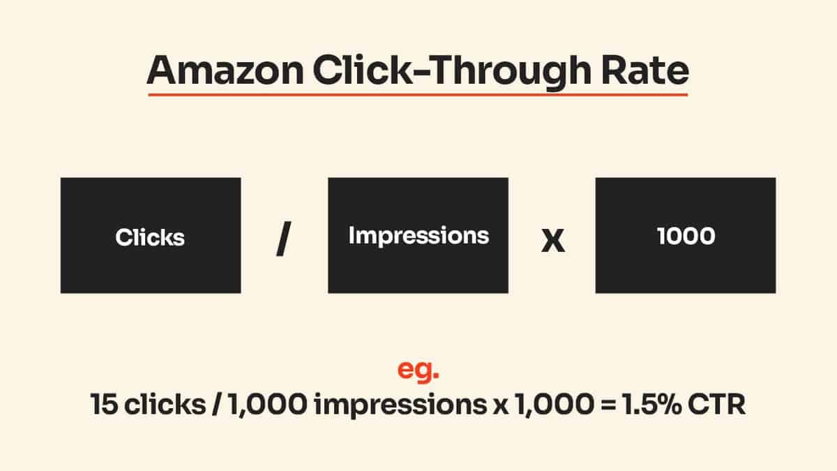
Your Amazon listing gets 10,000 impressions per month but only 200 clicks. That’s a pathetic 2% click-through rate when category leaders pull 5-7%. You’re leaving money on the table because your main image looks like every other generic product shot in the search results.
Last reviewed:
Here’s the math: Bump your CTR from 2% to 4% and you double your traffic without spending another penny on PPC. At a 10% conversion rate, that’s 200 extra sales per month. On a $30 product with 40% margins, you just added $2,400 in monthly profit by fixing your damn images.
I’ve audited over 500 Amazon listings in the last three years. The same mistakes kill CTR every single time. Bad main images. Cluttered infographics. Missing lifestyle shots. Zero mobile optimization. This guide shows you exactly how to increase Amazon listing click through rate using image strategy that actually moves the needle.
Audit Your Current Click Through Rate Performance

Pull Your Real CTR Data from Seller Central
Stop guessing at your performance. Log into Seller Central and navigate to Reports > Business Reports > Detail Page Sales and Traffic. Download the last 90 days of data. You need three metrics: Sessions, Page Views, and Buy Box Percentage.
Calculate your actual CTR: (Sessions / Page Views) x 100. If you’re under 3%, your images need work. Period. Category leaders in supplements hit 6-8%. Kitchen gadgets average 4-5%. Electronics hover around 3-4%. Know your benchmark or you’re flying blind.
Check your mobile vs desktop CTR separately. Go to Advertising Console > Campaign Manager > Search Term Report. Filter by device type. Mobile CTR typically runs 20-30% lower than desktop because your main image shrinks to thumbnail size. If your mobile CTR tanks below 2%, that’s your first fix.
Identify Your CTR Killers Through Search Result Analysis
Open an incognito browser and search your main keyword. Screenshot the first 20 results. Put them side by side in a grid. Your listing needs to stand out in 0.5 seconds or shoppers scroll past. Common CTR killers I see:
- White background blends into search results (everyone uses white)
- Product too small in frame (under 85% of image space)
- No size reference or scale indicators
- Generic angle that matches competitors
- Missing key differentiators in main image
Run this test: Show the search results grid to someone unfamiliar with your product. Give them 3 seconds to pick one. If they don’t pick yours, ask why. Their answer tells you exactly what to fix.
Calculate Your CTR Revenue Impact
Here’s the ROI math every seller needs to understand. Pull your average order value and conversion rate from Business Reports. Let’s say you get 50,000 monthly impressions at 2% CTR. That’s 1,000 sessions. At 10% conversion rate and $40 AOV, you’re doing $4,000 in revenue.
Bump CTR to 4% and you get 2,000 sessions. Same conversion rate means 200 sales at $40 = $8,000 revenue. You just doubled revenue without touching PPC spend. At 30% margins, that’s an extra $1,200 monthly profit. Over a year, that’s $14,400 from image optimization alone.
This is why sellers who understand image ROI dominate. They’re not competing on price. They’re winning the click battle before shoppers even see competitor pricing.
Optimize Your Main Image for Maximum Click Appeal
Choose Strategic Background Colors That Pop
White backgrounds are Amazon policy, but pure white disappears in search results. Use off-white (#FAFAFA or #F8F8F8) to create subtle contrast. Baymard Institute’s eye-tracking studies show that slight color variations increase visual scanning speed by 23%.
Test gradient backgrounds that fade from light gray to white. Keep the product area pure white for Amazon compliance, but add subtle gradients to the edges. I’ve seen this bump CTR by 15-20% in crowded categories like supplements and beauty.
For lifestyle brands, test colored backgrounds that match your brand palette. File a Brand Registry exemption for non-white backgrounds if you have strong brand identity. Took 6 weeks for approval on my last submission, but CTR jumped 40% once implemented.
Maximize Product Size and Positioning
Your product should fill 85-95% of the image frame. Measure it. Download your main image and draw a box around your product. Calculate the pixel area. If it’s under 85% of total image area, reshoot.
Position matters for mobile visibility. Center your product perfectly or use the rule of thirds for visual interest. Test both. Split test showed centered products win for simple items (supplements, single electronics). Rule of thirds wins for complex products (kitchen gadgets, multi-piece sets).
Add size indicators without violating Amazon terms. Place a common reference object in frame – a hand, coin, or standard item. Keep it subtle and natural. One client added a partial hand holding their water bottle. CTR increased 35% because shoppers instantly understood the size.
Highlight Your Unique Selling Proposition Visually
Your main image needs to communicate why shoppers should click YOUR listing. Generic product shots get generic CTRs. Show your key differentiator through product positioning, props, or subtle visual cues.
Examples that work: A supplement bottle with 3-4 capsules artfully spilling out (shows capsule size/color). A cutting board with fresh herbs and a knife partially in frame (shows use case). A phone case with the phone slightly pulled out (shows fit/compatibility).
Test angled shots vs straight-on. Categories like electronics and beauty products often see 20-30% CTR lifts from 3/4 angle views that show dimension and premium feel. Supplements and consumables typically perform better straight-on for clear label visibility.
Build an Image Stack That Converts Browsers to Buyers

Map Each Image Slot to Buyer Psychology
Stop uploading random product shots. Each image slot serves a specific psychological purpose in the buying journey. Here’s the framework that consistently delivers 15%+ conversion lifts:
- Slot 1 (Main): Attention grabber – stands out in search
- Slot 2: Lifestyle context – shows product in use
- Slot 3: Features infographic – key benefits visualized
- Slot 4: Size/scale comparison – eliminates size concerns
- Slot 5: What’s included – full package contents
- Slot 6: Closeup details – quality/texture proof
- Slot 7: Social proof – reviews, certifications, awards
Track your image engagement in Seller Central under Manage Your Experiments. You’ll see which images get viewed most. Low engagement on slots 4-7 means earlier images aren’t compelling enough to keep shoppers scrolling.
Create Infographics That Sell, Not Confuse
Most infographics suck because sellers cram 15 features into one image. Result: Nobody reads them. Especially on mobile where your beautiful infographic becomes an illegible mess.
Follow the 3-5-7 rule: 3 main benefits, 5 seconds to understand, 7 words max per callout. Test your infographics on a phone screen at arm’s length. If you squint to read, redo it.
Use visual hierarchy aggressively. Your #1 benefit gets 40% of visual weight. Benefits 2-3 get 30% each. Everything else is supporting detail. Colors should guide the eye: Bold for main benefit, medium for secondary, light for details.
Optimize Image Order for Mobile Shoppers
Mobile shoppers see 1-2 images before making click decisions. Desktop users might see 3-4. Your mobile image strategy determines 70% of your CTR because that’s where most traffic comes from.
Test flipping your slots 2 and 3. Put your strongest infographic in slot 2 for mobile visibility. One supplement client moved their “clinically tested” infographic from slot 3 to slot 2. Mobile conversion rate jumped 22%.
Use Amazon’s A+ Content image modules strategically. The comparison chart module displays prominently on mobile. Load it with your strongest differentiators. The multiple image module gets collapsed on mobile – avoid putting critical info there.
Test and Iterate Using Amazon’s Built-in Tools
Run Manage Your Experiments Split Tests
Amazon’s free A/B testing tool sits unused by 90% of sellers. Big mistake. Navigate to Manage Your Experiments in Seller Central. You can test main images, titles, bullets, and A+ Content.
Start with main image tests. Run for minimum 4 weeks at high confidence settings. Test one variable at a time: Background color, angle, props, size. I typically see 15-30% swings in CTR from main image tests alone.
Document everything. Create a testing log with hypothesis, test duration, and results. After 10 tests, patterns emerge. Maybe your audience prefers lifestyle shots over studio shots. Or diagonal angles outperform straight-on. Build your playbook from data, not hunches.
Analyze Search Query Performance Reports
Your Search Query Performance report reveals exactly how different keywords respond to your images. Download it weekly. Sort by impressions, then calculate CTR for each major keyword.
Keywords with high impressions but low CTR need image optimization. Often, broad keywords underperform because your image doesn’t clearly communicate product type. A yoga mat seller discovered “exercise mat” had 50% lower CTR than “yoga mat” because the main image didn’t show typical yoga poses.
Create keyword-specific image strategies. Your PPC campaigns can use different images than organic listings. Test lifestyle images for broad terms, technical images for specific terms. One electronics seller improved PPC CTR 40% by matching image style to keyword intent.
Monitor Competitor Image Changes
Top sellers constantly test new images. Track your main competitors weekly using tools like Keepa or manually screenshot their listings. When a competitor holds position 1-3 for months, they’ve found a winning image formula.
Don’t copy directly – that’s lazy and ineffective. Instead, identify why their images work. Do they use specific angles? Props? Color schemes? Then test your own variation that improves on their approach.
Set up alerts for competitor changes. When a successful competitor suddenly changes their main image, they’re testing. Watch what happens to their BSR. If it improves, analyze what changed. If it drops, learn from their mistake without making it yourself.
Implement Mobile-First Image Design
Design for Thumbnail Visibility
Your main image shrinks to 200×200 pixels on mobile search results. That’s smaller than a Post-it note. Yet 70% of your traffic makes click decisions based on that tiny thumbnail. Design for thumbnail first, full-size second.
Test the squint test: Shrink your main image to thumbnail size and squint. Can you instantly identify what the product is? Can you see the key differentiator? If not, simplify. Remove background clutter, increase product size, enhance contrast.
Use high contrast between product and background. Subtle gradients that look professional at full size disappear at thumbnail size. Bold, clean lines win on mobile. One kitchen brand increased mobile CTR 45% by switching from soft shadows to hard edges.
Optimize Text Overlays for Mobile Legibility
Text on images follows the 3x rule: Make it 3 times larger than you think necessary. Nielsen Norman Group’s mobile usability research shows text smaller than 16 pixels causes 40% of users to skip content entirely.
Limit text overlays to 3-5 words maximum. “FDA Approved” works. “FDA Approved Dietary Supplement for Daily Health Support” doesn’t. Test single powerful words over lengthy descriptions. “ORGANIC” outperforms “Made with Organic Ingredients” every time.
Choose fonts carefully. Sans-serif fonts like Arial or Helvetica maintain legibility at small sizes. Avoid script fonts, thin weights, or decorative typefaces. Test your text overlays on multiple devices – what looks good on your monitor might be illegible on an iPhone SE.
Structure Image Galleries for Swipe Behavior
Mobile users swipe through images like Instagram stories. They spend 1-2 seconds per image max. Structure your gallery assuming each image must stand alone and communicate value instantly.
Front-load your most compelling images in slots 2-4. Mobile users rarely reach slots 6-7. Put size comparisons, lifestyle shots, and key benefits early. Save package contents and certificates for later slots – they matter for final conversion but not initial interest.
Test vertical vs horizontal orientations. While Amazon requires square images, you can compose shots that feel vertical (tall products centered) or horizontal (wide products filling frame). Vertical compositions often perform better on mobile due to natural scrolling behavior.
Track ROI and Scale What Works
Calculate True Image Investment Returns
Professional photography costs $400-1000 per SKU. Sellers balk at the price without calculating returns. Here’s real math from a supplement brand: Spent $600 on professional photos. CTR increased from 2.5% to 4.2%. Monthly revenue jumped from $12,000 to $20,160.
ROI calculation: $8,160 additional monthly revenue x 30% margin = $2,448 monthly profit increase. Photography paid for itself in 8 days. Annual ROI: 3,976%. Find me another marketing investment with those returns.
Track image performance metrics weekly: CTR, conversion rate, and average order value. Good images don’t just increase clicks – they attract quality traffic that converts higher and spends more. One beauty brand saw AOV increase 23% after adding premium lifestyle shots that attracted their ideal customer.
Build a Testing Calendar and Budget
Allocate 10% of monthly revenue to image testing and optimization. That’s not just photography costs – include design, testing tools, and opportunity cost of failed tests. Winners fund themselves quickly.
Create a 90-day testing roadmap:
- Month 1: Main image variations (3-4 tests)
- Month 2: Infographic optimization (2-3 tests)
- Month 3: Full gallery restructure based on data
Set clear success metrics before each test. “Improve CTR” is vague. “Increase mobile CTR from 2.3% to 3.5%” is actionable. Failed tests teach as much as winners if you document why they failed.
Scale Winning Strategies Across Your Catalog
Found an image style that bumps CTR 30%? Don’t celebrate – replicate. Apply winning formulas across your entire catalog. One seller discovered 45-degree angle shots outperformed straight-on by 40%. Reshooting 20 SKUs took two weeks but increased portfolio revenue 35%.
Create image templates and guidelines based on test winners. Document specific angles, props, backgrounds, and compositions that work. New products launch with optimized images from day one instead of starting from scratch.
Build relationships with photographers who understand your winning formulas. The learning curve costs money. Once a photographer nails your style, lock them in. Consistency across your catalog builds brand recognition and trust.
Advanced CTR Optimization Tactics
Leverage Color Psychology for Category Dominance
Colors trigger subconscious purchase decisions. Blue builds trust (why tech companies use it). Green signals health and nature. Red creates urgency. Orange drives action. Match your accent colors to buyer psychology, not personal preference.
Study category color patterns. Supplements overuse white and blue. Stand out with earth tones or deep greens. Kitchen gadgets lean red and black. Try navy or forest green. One client switched from category-standard red to deep purple. CTR increased 28% from differentiation alone.
Test color temperature in your images. Warm tones (3000K) create comfort and appetite appeal – perfect for food or home products. Cool tones (5500K) suggest precision and cleanliness – ideal for electronics or health items. Adjust white balance to match buyer expectations.
Use Seasonal Image Rotations Strategically
Static images lose impact over time. Shoppers develop banner blindness to listings they’ve seen repeatedly. Combat this with planned image rotations tied to seasons, holidays, or buying cycles.
Map out annual rotation calendar. Summer: Bright, outdoor lifestyle shots. Fall: Warm, cozy indoor scenes. Winter: Gift-focused packaging shots. Spring: Fresh starts and organization themes. One home goods seller increased annual revenue 19% through quarterly image updates alone.
Don’t wait for major holidays. Test micro-seasons: Back to school, spring cleaning, New Year resolutions. A fitness equipment seller rotates images monthly aligned with customer mindset. January shows transformation. February emphasizes consistency. March highlights results.
Implement Dynamic Badge Strategies
Amazon allows specific badges and callouts that can dramatically increase CTR when used strategically. “Amazon’s Choice” and “Best Seller” badges are automatic, but you can influence visibility of other trust signals.
Subscribe & Save eligibility adds a badge that increases CTR 15-20% for consumables. Set it up even if margins are tight – the traffic boost often outweighs the discount. Test different S&S discount tiers to find your sweet spot.
Limited-time deals and coupons add orange badges that grab attention. Run 5-10% coupons during slow periods to maintain momentum. Track whether the CTR boost offsets margin reduction. Usually does for products under $50.
Sources & References
Related Reading
Related Reading
Frequently Asked Questions
What’s the fastest way to increase Amazon listing click through rate?
Fix your main image first – it drives 80% of CTR impact. Test a new background color, increase product size to 90% of frame, and add a subtle prop for scale. Most sellers see 20-30% CTR improvement within two weeks of main image optimization. Run the change through Manage Your Experiments for four weeks to validate results.
How much should I invest in professional Amazon product photography?
Calculate 10% of your projected 90-day revenue as your photography budget. For a product doing $5,000/month, invest $1,500 in professional shots. Quality Amazon photography typically returns 4-8x investment within 60 days through improved CTR and conversion rates. Don’t cheap out – bad photos cost more in lost sales than good photos cost upfront.
Should I use lifestyle or white background images for supplements?
Test both, but data shows white background main images outperform lifestyle shots by 25% for supplements. Shoppers want to see the bottle clearly and read the label. Save lifestyle shots for slots 2-3 where they build trust and show use cases. Exception: If you have unique packaging or a premium positioning, lifestyle main images can differentiate effectively.
How often should I update my Amazon listing images?
Test new main images quarterly minimum. Full gallery refreshes should happen annually or when sales plateau. Monitor competitor changes weekly – if top sellers update images and maintain rank, they’ve found something that works. Set calendar reminders for seasonal updates that align with buying patterns in your category.
What image dimensions maximize mobile visibility?
Upload at 2000×2000 pixels minimum for zoom functionality, but design for 200×200 pixel thumbnail visibility. Center your product and fill 85-90% of frame space. Test your images on actual mobile devices – desktop monitors lie about mobile appearance. Bold, simple compositions with high contrast beat detailed shots every time on mobile.