
Your mobile conversion rate is 35% lower than desktop. That’s not a typo. While you’re obsessing over keywords and PPC bids, 70% of your potential customers are bouncing because your images look like garbage on a 6-inch screen. Amazon image optimization for mobile isn’t optional anymore. It’s the difference between a 15% conversion rate and wondering why your ACoS keeps climbing.
For more on this, see our amazon comparison image guide.
Last reviewed:
Here’s what most sellers don’t understand: Amazon’s mobile app displays images differently than desktop. Different aspect ratios. Different zoom behaviors. Different swipe patterns. Your perfectly crafted 2000×2000 lifestyle shot that looks significant on a monitor? It’s an unreadable mess on iPhone.
I’ve audited over 500 Amazon listings in the past year. The pattern is consistent. Sellers who optimize specifically for mobile see CTR improvements between 25-40% within 30 days. Those who don’t stay stuck in price wars, burning through PPC budgets trying to compensate for poor organic performance.
Step 1: Audit Your Current Mobile Performance Like You Actually Give a Damn
Before you touch a single image, you need baseline data. Most sellers skip this step because they’re lazy. Don’t be most sellers.
Pull Your Mobile-Specific Metrics
Log into Seller Central. Navigate to Business Reports > Detail Page Sales and Traffic. Filter by ASIN and set your date range to the last 30 days. Now here’s the part everyone misses: download the report and segment by traffic source.
Look for these specific columns:
- Mobile App Sessions – This tells you raw traffic volume from mobile
- Mobile App Page Views – Divided by sessions gives you pages per session
- Mobile App Units Ordered – Your actual mobile conversions
- Mobile Browser Sessions – Different behavior than app users
Calculate your mobile conversion rate: (Mobile Units Ordered / Mobile Sessions) x 100. If it’s below 8%, your images are the problem. Period. Desktop converts at 12-15% on average. Mobile should be 8-12% minimum.
Test Your Images on Actual Devices
Stop looking at your listing on your computer. Pull out your phone right now. Open the Amazon app. Search for your product using your main keyword. Found it? Good.
Now answer these questions:
- Can you read your product title overlay text from the search results?
- Does your main image fill at least 85% of the frame?
- When you tap into the listing, can you identify key features without zooming?
- Do your lifestyle images show product scale clearly?
If you answered no to any of these, you’re hemorrhaging conversions. Mobile users make purchase decisions in 8-12 seconds. They won’t zoom. They won’t squint. They’ll click your competitor’s listing instead.
Document Your Stack Order Problems
Here’s where it gets interesting. Amazon’s mobile app displays images in a horizontal carousel. Desktop shows a vertical stack. This means your carefully planned image sequence might be completely wrong for mobile users.
Screenshot your current image order on both desktop and mobile. Pay attention to:
- Which images appear “above the fold” without swiping
- How many swipes it takes to reach your comparison chart
- Whether your lifestyle shots appear before or after features
Mobile users typically view 3-4 images max. Desktop users view 5-7. If your money shot is in position 6, mobile users never see it. That’s conversion rate suicide.
Step 2: Redesign Your Main Image for 375-Pixel Wide Screens
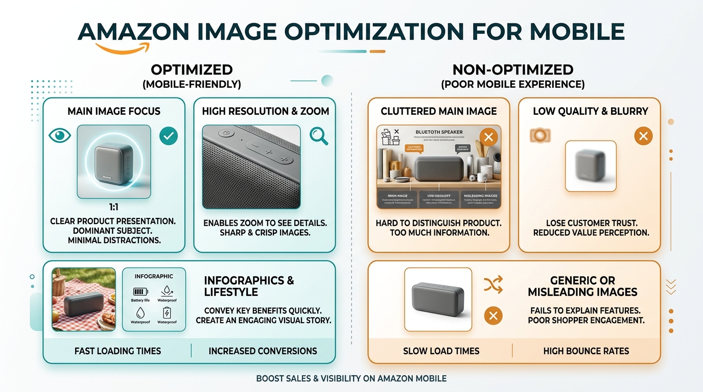
Your main image carries 80% of the weight for mobile CTR. Most sellers upload a 2000×2000 image and call it done. That’s like wearing a tuxedo to the gym. Technically dressed, functionally useless.
Optimize for Search Results Thumbnail
Amazon displays search results at approximately 150×150 pixels on mobile devices. Your gorgeous product shot becomes a postage stamp. Here’s how to make it count:
Fill the frame completely. Aim for 90-95% frame coverage. White space is wasted space on mobile. Baymard Institute’s mobile commerce research shows that products filling 85%+ of the frame see 23% higher click rates.
Simplify your angles. Straight-on or 3/4 view only. Complex angles that look dynamic on desktop become confusing blobs on mobile. Kitchen gadgets should show the business end clearly. Supplements need labels readable at thumbnail size.
Remove all text overlays from main images. Amazon technically prohibits them anyway, but I still see sellers trying. That “Best Seller” badge you snuck on? Invisible on mobile. Worse, it clutters your product and reduces clarity.
Test Contrast and Color Pop
Mobile screens vary wildly in quality. Your image needs to perform on everything from a budget Android to the latest iPhone. High contrast is non-negotiable.
Use these specific adjustments:
- Increase contrast by 15-20% over desktop versions
- Boost saturation by 10% for color products
- Add subtle vignetting to separate product from background
- Ensure shadows are dark enough to show depth without going black
Test your images on multiple devices. Borrow phones from friends if needed. What looks perfect on your iPhone 14 might be muddy garbage on a Samsung A-series.
Master the Zoom Factor
Here’s the technical stuff that matters. Amazon allows zoom up to 1600 pixels on mobile. But the zoom behavior differs from desktop. Mobile users pinch-zoom intuitively. Desktop users hover.
Structure your main image with zoom in mind:
- Place critical details (logos, textures, quality indicators) in the center 60%
- Ensure text remains sharp at 1600px viewing
- Keep file sizes under 10MB for fast loading on cellular
- Save at quality level 10-11 in Photoshop (92-95% in other software)
Mobile users on slow connections abandon listings that take over 3 seconds to load. Every megabyte counts.
Step 3: Stack Your Images Based on Mobile Behavior Data
Mobile users swipe horizontally through images. They’re trained by Instagram and dating apps. Swipe fast, decide faster. Your image sequence needs to match this behavior or you’re dead in the water.
Follow the 1-2-3 Hook Formula
Your first three images make or break the sale on mobile. Here’s the exact sequence that works:
Position 1: Main product image (already covered above)
Position 2: Lifestyle or scale shot. Show the product in use or next to common objects for size reference. Mobile users can’t judge scale from isolated product shots. That portable blender better be shown next to a water bottle. That yoga mat needs a person on it.
Position 3: Close-up detail or primary benefit. This is your hook shot. Show the ONE thing that differentiates your product. Premium stitching on a bag. The non-slip base on a kitchen appliance. The capsule quality on a supplement. Make it impossible to miss.
Positions 4-7 can include comparison charts, ingredient lists, or additional lifestyle shots. But assume most mobile users never see them. Nielsen Norman Group’s eye-tracking studies confirm that carousel engagement drops 50% after the third item.
Reorder Based on Category Norms
Different categories have different mobile shopping patterns. Here’s what actually works:
Beauty/Personal Care:
- Position 2: Before/after or texture shot
- Position 3: Ingredient callouts or certifications
- Position 4: Size/quantity comparison
Home/Kitchen:
- Position 2: Product in kitchen setting
- Position 3: Key feature close-up (blade, handle, mechanism)
- Position 4: What’s included/size options
Electronics:
- Position 2: Ports/connections visible
- Position 3: Size comparison with common devices
- Position 4: What’s in the box
Create Mobile-Specific Comparison Charts
Your beautiful 4-column comparison chart is worthless on mobile. Text becomes microscopic. Columns stack weird. Mobile users won’t zoom to read it.
Redesign comparisons for mobile:
- Maximum 2 columns (yours vs. generic competitor)
- Limit to 5 comparison points
- Use icons instead of text where possible
- Minimum 16pt font (tests at 8pt on device)
- High contrast colors only (no pastels)
Place this in position 4 or 5, not position 7. Mobile users who swipe this far are comparison shopping. Give them what they need.
Step 4: Design Text Overlays That Don’t Suck on Small Screens
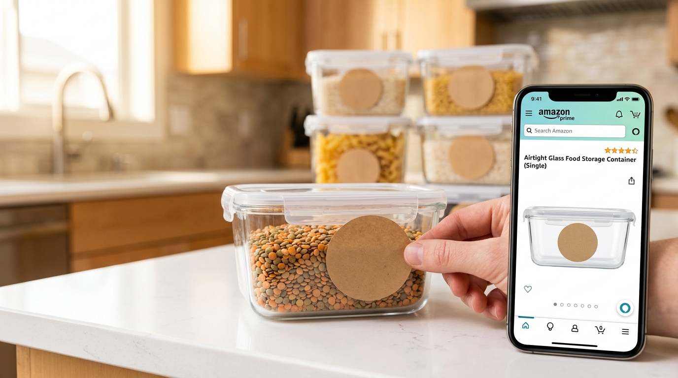
Text on images is where most sellers completely fail mobile optimization. Your elegant 14pt font becomes unreadable nonsense on a phone screen. Fix it or watch your conversion rate tank.
Apply the 3-Second Rule
Mobile users give each image 3 seconds max. Your text needs to communicate instantly. Here’s the framework:
- One key message per image. Not three benefits. Not a paragraph. One thing.
- Maximum 5 words for headlines. “Dishwasher Safe” beats “This Product Can Be Safely Washed in Your Dishwasher”
- Sans-serif fonts only. Helvetica, Arial, or similar. Serif fonts blur on small screens.
- Minimum 24pt at upload size. This renders at approximately 12pt on device.
Test readability by viewing your image at 375 pixels wide (iPhone standard). If you have to lean in, the font’s too small.
Position Text for Thumb Scrolling
Mobile users hold phones with one hand and scroll with their thumb. This creates dead zones where text gets ignored or covered.
Safe zones for text placement:
- Top 30% of image (always visible)
- Center 40% (primary focus area)
- Avoid bottom 20% (thumb coverage zone)
- Keep 10% margins on all sides
Right-handed users (90% of population) naturally cover the bottom-right corner while scrolling. Never put critical information there.
Use Visual Hierarchy That Works
Desktop users scan. Mobile users glance. Your visual hierarchy needs to guide the eye instantly.
Effective mobile hierarchy:
- Contrast ratios of 7:1 minimum. Black on white. White on dark blue. Yellow on black. No gray on beige nonsense.
- Bold weight for headlines. Regular weight gets lost on mobile screens.
- Icons before text. A checkmark communicates “included” faster than words.
- Color coding for categories. Green for benefits. Red for problems solved. Blue for features.
Skip the fancy effects. No gradients on text. No drop shadows. No outlines. Clean, high-contrast text only.
Step 5: Optimize File Sizes Without Destroying Quality
Page load speed directly impacts conversion rate. Statista’s mobile commerce data shows a 32% abandonment rate when load time exceeds 3 seconds. Your images are probably the culprit.
Hit the Sweet Spot Compression
Amazon allows up to 10MB per image. That doesn’t mean you should use it. Here’s what actually works:
Target file sizes by image type:
- Main image: 500KB – 1MB (needs zoom quality)
- Lifestyle shots: 300KB – 700KB (less detail needed)
- Text overlays: 200KB – 500KB (compress harder)
- Comparison charts: 400KB – 800KB (text must stay sharp)
Use progressive JPEG encoding. Mobile browsers render these faster, showing a low-quality version immediately while loading details. Better than staring at a blank space.
Choose the Right Dimensions
Bigger isn’t always better for mobile. Amazon recommends 2000×2000 minimum, but that’s for zoom functionality. Your actual displayed size is much smaller.
Optimal dimensions by image type:
- Square products: 2000×2000 (maximum zoom potential)
- Tall products: 1600×2000 (vertical emphasis)
- Wide products: 2000×1600 (horizontal emphasis)
- Lifestyle shots: 2000×1500 (cinematic feel without excess pixels)
Never upload at 3000×3000 or higher. The quality gain is invisible on mobile, but the load time penalty is real.
Test Load Times Like Your Business Depends on It
Because it does. Use Chrome DevTools to simulate mobile connections. Here’s how:
- Open your listing in Chrome
- Press F12 for DevTools
- Click the Network tab
- Change “No throttling” to “Slow 3G”
- Refresh the page
Watch the waterfall. If your images take over 2 seconds each on slow 3G, you’re losing rural and commuting customers. That’s 20-30% of mobile traffic.
Step 6: A/B Test Your Mobile Images Like a Data-Driven Seller
Stop guessing what works. Test it. Mobile behavior differs from desktop, and your assumptions are probably wrong.
Set Up Proper Split Tests
Amazon doesn’t offer native A/B testing for images. Work around it with time-based testing. Here’s the protocol:
Week 1-2: Current images (baseline)
Week 3-4: New mobile-optimized images
Week 5-6: Return to original (validate results)
Week 7-8: Best performer permanent
Track these metrics specifically:
- Mobile sessions to listing
- Mobile conversion rate
- Mobile units per session
- Mobile CTR from search results
Ignore desktop metrics during this test. You’re optimizing for mobile. Desktop performance is a separate problem.
Test One Variable at a Time
Sellers try to change everything at once. That’s how you get meaningless data. Test systematically:
Main image tests:
- Angle (straight vs. 3/4 view)
- Background (pure white vs. subtle gradient)
- Product fill (85% vs. 95% frame coverage)
- Props (with vs. without size reference)
Image stack tests:
- Lifestyle position (slot 2 vs. slot 3)
- Number of images (5 vs. 7)
- Text overlay presence (with vs. without)
- Comparison chart position (slot 4 vs. slot 6)
Each test needs 500+ mobile sessions for statistical significance. Less than that and you’re reading tea leaves.
Document Everything for Future Listings
Build your own playbook. What works for one ASIN often works for similar products. Track:
- Which angles convert best by category
- Optimal text sizes that test well
- Color schemes that pop on mobile
- Stack orders that maximize swipe-through
Create templates based on winners. Your next listing launches with proven mobile optimization, not guesswork.
Step 7: Monitor and Iterate Based on Real Mobile Performance
Amazon image optimization for mobile isn’t a one-time task. Mobile devices evolve. Shopping behaviors shift. Your competition adapts. Stay ahead or fall behind.
Set Up Mobile-Specific Dashboards
Stop looking at blended metrics. Build dashboards that track mobile performance separately:
Weekly mobile metrics to track:
- Mobile conversion rate by ASIN
- Mobile session percentage (should be 65-75%)
- Mobile average order value
- Mobile return rate (often higher than desktop)
Use Seller Central’s Business Reports API to automate this. Pull data weekly, not daily. Daily noise obscures real trends.
React to Algorithm Changes Fast
Amazon tweaks image display constantly. When search results layout changes, CTR patterns shift immediately. Stay alert for:
- Thumbnail size adjustments in search
- Badge placement changes
- Mobile app UI updates
- New image slot features
Join seller forums and Facebook groups. When multiple sellers report CTR drops, investigate immediately. The A10 algorithm weights image engagement heavily. Don’t get caught flat-footed.
Refresh Images Every Quarter Minimum
Fresh images signal active listings to Amazon. Plus, seasonal updates keep you relevant. Quarterly refresh schedule:
For more on this, see our images amazon listing guide.
Q1: Post-holiday cleanup, New Year angles
Q2: Spring/outdoor themes where relevant
Q3: Back-to-school/fall prep positioning
Q4: Holiday gifting angles and bundles
Even changing image order can boost performance. The algorithm notices engagement pattern changes. Give it something to notice.
| Image Type | Desktop Priority | Mobile Priority | Key Difference |
|---|---|---|---|
| Main Product | Detail clarity | Frame fill % | Mobile needs 95% fill |
| Lifestyle | Scene complexity OK | Simple/clear only | Mobile users won’t study scenes |
| Features | Multiple callouts | One feature max | Mobile = 3 second viewing |
| Comparison | 4-6 columns fine | 2 columns max | Mobile screens can’t fit more |
| Text Size | 14pt minimum | 24pt minimum | Mobile = 50% size reduction |
The Bottom Line on Mobile Image Optimization
Your mobile conversion rate should be within 20% of desktop. If it’s not, your images are costing you thousands in lost sales. Every month you delay optimization is money burned.
The sellers crushing it on Amazon understand this: Amazon image optimization for mobile is the highest ROI activity you can do today. Higher than PPC optimization. Higher than keyword research. Higher than review management.
Why? Because 70% of your traffic is mobile. A 20% conversion improvement on mobile beats a 50% improvement on desktop. It’s basic math that most sellers ignore.
Start with your main image. Test one change at a time. Measure everything. What works for your competitor might tank your conversions. Build your own data-driven playbook.
Remember: Mobile shoppers are impatient, distracted, and quick to bounce. Your images have seconds to convert them. Make those seconds count or watch them buy from sellers who do.
Sources & References
Related Reading
- Amazon Main Image Best Practices: The 8-Step Framework That…
- Amazon Listing Image Requirements 2026: A Complete Compliance…
- How to Audit Amazon Listing Images: The 15-Minute Method That…
Related Reading
Related Reading
Frequently Asked Questions
What’s the ideal image dimension for mobile optimization on Amazon?
Use 2000×2000 pixels for square products to maximize zoom capability, but ensure your main subject fills 90-95% of the frame. For rectangular products, 1600×2000 (vertical) or 2000×1600 (horizontal) works better. Keep all files under 1MB for faster mobile loading while maintaining zoom quality.
How many images should I use for mobile-optimized listings?
Use exactly 7 images, but optimize your first 3 for maximum impact since mobile users rarely swipe beyond that. Position your lifestyle shot second and your key differentiator third. Mobile users view 3-4 images average, while desktop users view 5-7.
Should I create separate images for mobile and desktop users?
No, Amazon doesn’t support device-specific images. Instead, optimize all images to work on mobile first, then verify they still look good on desktop. If an image works great on mobile, it typically works fine on desktop, but the reverse isn’t true.
How can I test my Amazon images on different mobile devices?
Use Chrome DevTools to simulate different devices and connection speeds. Press F12, select device emulation, and test at slow 3G speeds. Also physically test on real devices – borrow different phones from friends to see how images display on various screen sizes and qualities.
What’s the most common mobile image mistake that kills conversions?
Text that’s too small to read without zooming. Your elegant 14pt font becomes illegible on mobile. Use minimum 24pt font at upload size, stick to sans-serif fonts, and limit text to 5 words max per callout. If you have to squint at 375px width, customers won’t bother.