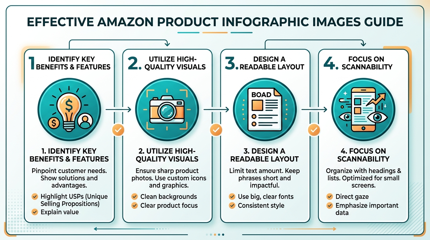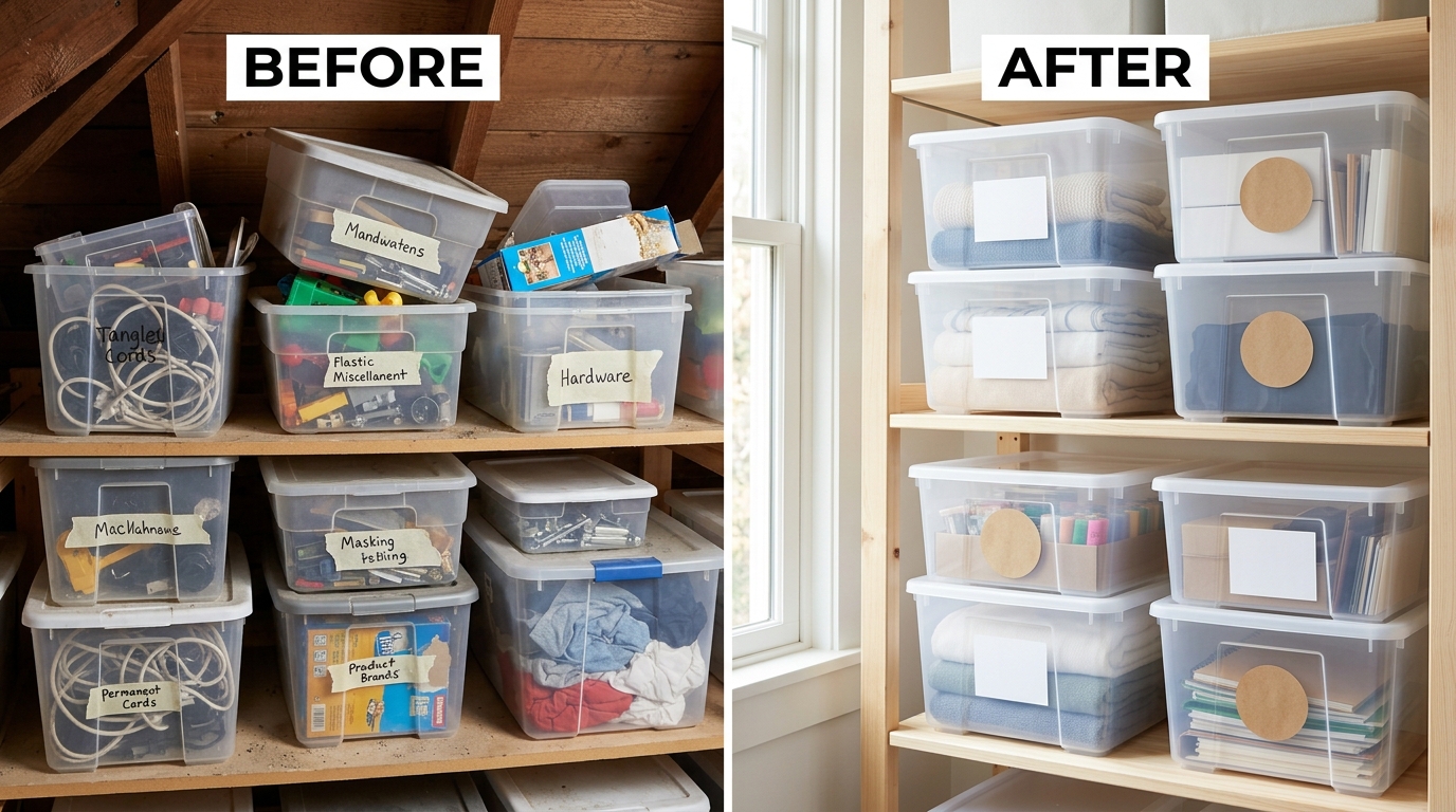
What “Infographic Images” Actually Mean on Amazon (And Why Slot Position Matters)
Ask ten sellers what an infographic image is and you’ll get ten different answers. Most of them are wrong. An infographic image isn’t a picture with some text slapped on top in a design app. It’s a single visual argument, backed by one number or one benefit, placed in a specific slot to do a specific job. Get that definition wrong and you’ll keep bleeding money on a gallery that looks busy but converts like garbage.
Last reviewed:
Best practices for Amazon infographic images start with understanding what job each slot does. The Main Image sells the click. Slots 2 through 7 sell the purchase. Confuse those two jobs and your CTR looks fine while your CVR tanks. That’s the exact pattern we’ve seen across hundreds of listing audits: sellers obsess over the Main Image, then throw whatever’s left into the gallery without a plan.
The A10 Algorithm Doesn’t Read Your Infographic. Shoppers Do.
Here’s a misconception that costs sellers real PPC budget: they think Amazon’s A10 algorithm is scanning their infographics for keyword relevance. Wrong. A10 reads your title, bullets, backend search terms, and behavioral signals like CTR, CVR, and sales velocity. It does not read the text on your images. Amazon’s own image guidance confirms text overlays and graphics are a shopper communication tool, not a ranking input, per Amazon Seller Central’s image requirements documentation.
Amazon Comparison Image Strategy covers this in more detail.
So why do infographics matter at all? Because they move the behavioral signals A10 actually cares about. A shopper who understands your product in three seconds converts. A shopper who has to guess dimensions, compatibility, or use case bounces back to the SERP, and that bounce tells Amazon your listing is a bad match for the query. Do that enough times and your organic rank drops. Infographics are a conversion lever that indirectly becomes a ranking lever. Treat them like decoration and you’re leaving both on the table.
How Many Images For Amazon Listing covers this in more detail.
Amazon’s Actual Image Requirements: Pixel Specs, File Types, Naming
Before you design a single infographic, lock in the technical specs. Get these wrong and Amazon either rejects the upload or degrades the image quality on zoom, which kills the exact clarity you’re trying to create.
- Minimum dimensions: 1000 x 1000 pixels on the longest side to enable zoom functionality. Anything smaller and mobile shoppers can’t zoom in on your infographic text.
- Recommended resolution: 2000 x 2000 pixels or larger for crisp zoom on high-density mobile screens.
- File format: JPEG for photography-based infographics, PNG only if you need transparency for A+ Content modules (not the main gallery, which requires solid backgrounds outside the Main Image).
- File size: Keep under 10MB to avoid upload timeouts on bulk uploads through Seller Central or flat file.
- File naming: Use your SKU or ASIN plus a descriptive suffix, like B08XYZ123-infographic-dimensions.jpg. This isn’t cosmetic. Clean naming prevents version control disasters when you’re managing 40+ SKUs and iterating on creative monthly.
- Color mode: RGB, not CMYK. CMYK files uploaded to Seller Central render with shifted, muddy colors. We’ve seen this kill an otherwise solid infographic because the designer exported print-ready files by habit.
If you’re still unsure how many image slots you should even be filling before you start worrying about infographic content, that’s a separate strategic question worth solving first. It changes how much infographic real estate you actually have to work with.
Where Infographics Belong in Your Seven-Image Lineup
You get seven image slots (plus a video slot on most listings). The Main Image is off-limits for infographic treatment. Amazon’s policy requires a pure product shot on white background for the Main Image, no text, no graphics, no lifestyle staging. Every infographic decision happens in slots 2 through 7.
The standard allocation that performs across supplement, kitchen, beauty, and electronics categories we’ve shot for: one lifestyle/in-use image, two to three benefit infographics, one dimension or size infographic, one comparison chart against generic alternatives, and one trust/credential infographic if you have certifications worth flagging (USDA organic, FDA registered facility, patent pending, etc). That’s not a rigid formula. It’s a starting allocation you test and adjust based on your category’s actual purchase objections.
The Anatomy of an Infographic That Converts

Most infographics fail before a shopper even reads the copy. They fail on information density. A shopper spends an average of a few seconds per image while scrolling a gallery on mobile. If your infographic requires ten seconds of reading to understand, you’ve already lost the sale to the next listing down.
One Claim Per Image, Not Five
This is the single biggest mistake we see in supplement and beauty listings specifically: sellers try to cram every selling point onto one image because they’re afraid of “wasting” a slot. Third-party servings, no fillers, third-party tested, vegan, non-GMO, made in USA, all stacked on one 1000×1000 canvas in 8-point font. Nobody reads that. It reads as noise, and noise on mobile at thumbnail size is functionally invisible.
One claim, one image. “60 Servings Per Bottle. $0.42 Per Serving.” That’s an infographic. It’s a single fact, rendered large, with a supporting visual (a bottle next to a stack of coins, or a 30-day calendar grid). Shoppers process single claims in under two seconds because there’s no decision tree involved in reading it. Nielsen Norman Group’s research on how users actually read web content confirms that users scan in F-shaped and fragmented patterns and skip dense text blocks entirely, which is exactly what happens to a five-claim infographic crammed into one slot, per NN/g’s eye-tracking research on reading behavior.
Text-to-Image Ratio and the Mobile Reality
Over 70% of Amazon traffic happens on mobile, and mobile thumbnails in the search grid render at roughly 300×300 pixels or smaller before a shopper even taps into the listing. Your gorgeous, detailed infographic with six data points and a paragraph of explanatory text is unreadable at that size. It’s not almost unreadable. It’s completely illegible.
The fix is a hard ratio rule: text should occupy no more than 30% of the visual space, and the largest text element (your headline claim) should be readable at thumbnail size, meaning a font that would look absurdly oversized on a desktop monitor. Test this yourself. Shrink your infographic draft down to 300 pixels wide on your phone and see if you can read the main claim without zooming. If you can’t, your font is too small and your infographic is dead on arrival for the mobile shopper who never even gets to the full-size gallery view.
Color Psychology and Brand Consistency Across Slots
Color isn’t decoration, it’s a conversion signal. Research on color’s role in consumer judgment shows shoppers form category and quality impressions from color within the first moments of exposure, well before they process any text, as documented in peer-reviewed work on visual perception and consumer response published through the Baymard Institute’s ecommerce UX research library. A supplement brand using clinical blues and whites signals trust and science. A kitchen brand using warm oranges and wood tones signals home and craft. Mixing palettes across your seven slots signals something worse: inconsistency, which reads subconsciously as low production value.
Lock a two or three color palette before you design a single infographic, tied to your brand’s actual packaging colors, and apply it across every slot. This also matters for Brand Story and A+ Content modules further down the listing. A shopper who sees five different color schemes across your gallery and A+ Content assumes they’re looking at a reseller or a dropshipper, not an established brand, and that assumption tanks trust-dependent categories like supplements and beauty especially hard.
Step-by-Step: Building Your Infographic Image Set
Enough theory. Here’s the actual process, the one we run for every client before a single infographic gets designed. Skip steps here and you end up with pretty images that don’t move the numbers that matter: CTR, CVR, and ACoS.
Step 1 and 2: Audit Your Listing and the Competitor SERP
Step one: pull your current CVR from Brand Analytics or your Business Reports. If it’s below 10% for supplements, below 12% for kitchen, or below 8% for electronics, your images are a suspect, not your price. Step two: search your primary keyword and screenshot the top 10 organic results. Look specifically at what claims their infographics make in slots 2 through 7. You’re not copying them. You’re identifying which objections are already being answered by the market so you know which ones you need to answer better, and which gaps nobody’s covering that you can own.
Step 3 and 4: Map Claims to Slots
Step three: list every purchase objection a shopper has for your specific product. For a protein powder: does it mix without clumping, does it taste chalky, how many servings, is it third-party tested, does it cause bloating. For a kitchen gadget: is it dishwasher safe, does it fit standard drawers, what’s the warranty, does it scratch nonstick coatings. Step four: rank those objections by how often they show up in your negative reviews and PPC search term reports. The objections costing you the most conversions and the highest ACoS on wasted clicks get infographic slots first. This is the difference between a strategic gallery and a “look how many features we have” gallery.
Step 5 and 6: Brief Your Designer and Test Before Launch
Step five: write a one-line brief per infographic before any design work starts. Not “make it look nice,” but “communicate that this container holds 30 days of servings, using a calendar or countdown visual, headline under 8 words.” Vague briefs produce vague infographics. Step six: before you push live, run every infographic through the shrink-to-thumbnail test described earlier, and get five people outside your company to look at each image for three seconds and tell you the one claim they took away. If they can’t repeat your intended claim, the infographic failed, no matter how good it looks at full size on a designer’s monitor.
If your product has close substitutes competing on the same search term, a dedicated comparison layout inside this sequence deserves its own deep treatment, which is exactly what an Amazon comparison image strategy covers in more detail than we can fit into one section here.
Data and Placement: Where Infographics Drive CTR vs CVR

Not every slot does the same job, and treating them identically is why sellers can’t explain why their “great” gallery still isn’t converting. Some slots influence the click decision on the SERP thumbnail carousel. Others only get seen after the shopper has already clicked through, meaning they influence CVR exclusively, never CTR.
Main Image vs Supporting Images: Different Jobs, Different Rules
The Main Image has zero infographic content by policy and by best practice. Its only job is to win the click against nine other thumbnails on a crowded SERP, using product clarity, framing, and enough visual distinction to stop the scroll. Supporting images, slots 2 through 7, never influence CTR from the search grid because Amazon typically only surfaces the Main Image (and sometimes a hover-preview second image) in search results. Their entire job is CVR, once the shopper is already on your listing page deciding whether to buy.
| Slot | Primary Job | Infographic Content Allowed | Metric Impacted |
|---|---|---|---|
| Main Image | Win the click | None (pure product, white background) | CTR |
| Slot 2 | First impression after click | Lifestyle or hero benefit claim | CVR |
| Slots 3-4 | Answer top objections | Benefit and spec infographics | CVR |
| Slot 5 | Differentiate from competitors | Comparison chart | CVR |
| Slot 6 | Build trust | Certifications, guarantees, made-in claims | CVR |
| Slot 7 | Close remaining objections | Size/dimension or usage infographic | CVR |
The Comparison Chart Slot: Your Most Underused Real Estate
Roughly 60% of the audits we’ve run show sellers skipping the comparison chart entirely, treating it as optional. It isn’t. A shopper comparing your $34.99 listing against a $19.99 generic alternative in another tab needs a reason to justify the price gap, and a well-built comparison infographic gives them that reason without them having to open the competitor’s listing and do the work themselves. Every extra click a shopper makes outside your listing is a chance they don’t come back. A comparison chart keeps that decision inside your product page where you control the framing.
A+ Content Infographics vs Gallery Infographics: Not the Same Job
A+ Content sits below the fold, after price and buy box, meaning only shoppers already leaning toward purchase scroll that far. That changes what belongs there. Gallery infographics need to answer objections fast because attention is scarce and the shopper hasn’t committed yet. A+ Content infographics can go deeper: brand story modules, ingredient sourcing breakdowns, multi-step usage instructions. Sellers who copy-paste the same shallow infographics from their gallery into A+ Content are wasting a section built for a warmer, more patient audience. If you’re still deciding how many total image assets you need across gallery and A+ Content to cover this properly, that allocation question is worth resolving with a dedicated look at how many images an Amazon listing actually needs before you start production.
Common Infographic Mistakes That Tank Conversion
We’ve audited over 500 listings across supplements, kitchen, beauty, and electronics. The same five mistakes show up on a majority of underperforming listings. If you recognize your own gallery in this list, that’s your CVR problem, not your price, not your reviews.
The Wall-of-Text Infographic
Covered above, but it deserves repeating because it’s the most common failure by far: cramming every feature into one dense graphic. If your infographic has more than 15 words of body copy plus a headline, you’ve built a wall, not an infographic. Cut it in half. Then cut it in half again. What survives that process is probably close to what should have been there from the start.
Ignoring Mobile Crop and Thumbnail Legibility
Designers working on a 27-inch monitor build infographics that look sharp at full resolution and forget the shopper is viewing it on a 6-inch phone screen inside a gallery thumbnail that’s smaller than a postage stamp until tapped. Text sized at 24pt on a design canvas can become genuinely unreadable once compressed to mobile gallery dimensions. Always export a test file, load it on an actual phone, and view it exactly the way a shopper would before approving final assets. Skipping this step is how sellers end up with infographics nobody can actually read.
Copying Competitor Infographics Verbatim
We see this constantly: a seller finds a competitor’s infographic layout, likes it, and has their designer replicate the same layout with their own product swapped in. This does two things, both bad. First, if the competitor is testing and iterating faster than you, you’re always one cycle behind, copying yesterday’s winner instead of building your own edge. Second, and worse, if you’re in a saturated category, a nearly identical infographic style across five competing listings does nothing to differentiate your product in a shopper’s mind during a side-by-side mental comparison. Study competitor infographics for objection patterns, never for direct layout replication. For a deeper breakdown of infographic structure and layout principles that actually hold up across categories, an Amazon infographic images guide is worth reviewing before your next creative refresh.
Testing, Iterating, and Measuring Infographic Performance
Here’s what separates sellers who are crushing it from sellers who are stuck: the winners treat their image gallery as a living asset that gets tested and refreshed on a schedule. The losers design once, upload, and never touch it again until a competitor’s listing embarrasses theirs in a side-by-side comparison.
Split Testing With Manage Your Experiments
If you have brand registry, Amazon’s Manage Your Experiments tool lets you A/B test image variants against your live traffic, splitting a percentage of visitors between version A and version B over a set test window, typically a minimum of a few weeks to reach statistical confidence depending on your traffic volume. This is not optional if you’re spending real PPC budget. Running ads at a 35% ACoS into an untested gallery is lighting money on fire. A single infographic swap in slot 2 or 3 has moved CVR by 2 to 4 percentage points in tests we’ve run, and at any meaningful ad spend, that difference pays for a full professional image set in the first month alone.
Reading CTR, CVR, and BSR Signals After Launch
After any gallery change, watch three numbers for at least 14 days before drawing conclusions: CTR from Brand Analytics search query performance, CVR from your Business Reports unit session percentage, and BSR trend within your subcategory. If CTR holds steady but CVR climbs, your infographic changes worked, since supporting images shouldn’t move CTR anyway. If CVR climbs and BSR follows within a week or two, that’s the flywheel: better conversion drives more sales velocity, which drives organic rank, which drives more free clicks, which lowers your blended ACoS across the account. That compounding effect is the entire financial case for taking infographic strategy seriously instead of treating it as an afterthought behind the Main Image.
Refresh Cadence and Review Velocity Considerations
Set a quarterly review cadence for your infographic gallery, minimum. Categories with fast review velocity and frequent new entrants, think phone accessories or kitchen gadgets, need tighter cycles, sometimes monthly, because the competitive SERP shifts fast enough that a comparison chart built two quarters ago may be citing a competitor price or feature set that’s no longer accurate. Stale comparison infographics are worse than none at all, since an outdated claim a shopper can disprove in the review section destroys trust instantly. If your current Main Image hasn’t been revisited in over a year, that’s also worth auditing alongside your infographics, and a review of current Amazon Main Image best practices is a reasonable place to start that broader audit, alongside a second pass through additional Amazon Main Image best practices covering thumbnail-specific testing tactics.
None of this requires guesswork if you’re working from clean source photography to begin with. A properly shot, well-lit product set gives your design team clean layers to build infographics around instead of fighting bad lighting or awkward angles in every revision, which is the difference between a fast quarterly refresh and a full reshoot every time you want to test a new claim. Studios like AZ Product Shots exist specifically to solve that upstream production bottleneck so your creative team can iterate on messaging instead of fighting the raw assets.
Related Articles
- Amazon Listing Image Requirements 2026: The Complete Technical Guide
Sources & References
Amazon Listing Images That Actually Convert
Stop losing sales to competitors with better images. We research your niche, find the 6 buying objections in your category, and ship 7 strategic listing images that address each one.
Frequently Asked Questions
How many infographic images should an Amazon listing have?
Most listings perform best with 3 to 4 dedicated infographic slots out of the 6 non-Main-Image positions, leaving room for at least one lifestyle image and one comparison chart. Supplements and beauty tend to need more objection-handling infographics than simple kitchen tools, since trust claims carry more weight in ingestible and topical categories.
Do Amazon infographic images affect search ranking directly?
No. A10 ranks listings on text relevance and behavioral signals like CTR, CVR, and sales velocity, not on image text content. Infographics affect ranking indirectly by improving CVR and reducing bounce-back-to-SERP behavior, which then feeds the sales velocity and conversion signals A10 actually measures.
What’s the ideal text amount for an Amazon infographic?
Keep body copy under 15 words per image, with one dominant headline claim under 8 words that remains readable at a 300-pixel mobile thumbnail size. If you need more than that to make your point, split it across two separate infographic slots instead of cramming it into one.
Can I use the same infographic template across multiple SKUs?
Yes, and you should, for brand consistency and to speed up creative production across a catalog. Just make sure the underlying claim and data point on each template is accurate per SKU. A template built for a 60-serving bottle showing “$0.42 per serving” copied onto a 30-serving variant without updating the math is a factual error that destroys trust in your reviews section fast.
How often should I update my Amazon infographic gallery?
Audit quarterly at minimum, monthly in fast-moving categories with frequent new competitor entrants. Any time a comparison infographic cites a competitor price, feature, or review count, treat that claim as having an expiration date and verify it every time you touch the listing, not just on your fixed review schedule.