Tag: photography fundamentals

  • How to White Balance Product Photos Correctly in 7 Steps

    How to White Balance Product Photos Correctly in 7 Steps

    Step 1: Gather the Right Equipment for Accurate Color

    Data visualization for this article

    You cannot white balance product photos correctly with a phone propped against a stack of books and Auto White Balance doing the guessing. Auto WB looks at a scene, makes an assumption about what “neutral” should look like, and gets it wrong constantly under mixed studio light. Before a single frame gets shot, three pieces of equipment need to be in place: a gray reference, controlled lighting, and a camera that lets a human override the guesswork.

    Last reviewed:

    The gray card or color checker you actually need

    A basic 18% gray card runs $10-20 and does one job well: it gives your camera and your editing software a true neutral reference point under your actual lighting setup. Step up to an X-Rite ColorChecker Passport ($100-130) and you get 24 color patches instead of one, which lets software correct for color casts across the whole spectrum, not just gray. For a seller running repeat shoots every time a new SKU launches, the ColorChecker pays for itself inside two or three sessions. It replaces “does this look right” with a number.

    Lighting that holds a consistent color temperature

    Buy strobes or LED panels rated between 5000K and 6500K, the daylight-balanced range that matches how a Main Image is expected to look: bright, neutral, true to life. Cheap continuous lighting kits drift in color temperature as bulbs heat up, which means your first frame and your fiftieth frame stop matching each other. Spend the extra $150-300 on daylight-balanced strobes with a fixed, published color temperature rating and that drift problem disappears.

    Camera settings that support manual white balance

    Shoot in Manual exposure mode and RAW file format. Full stop. Turn off Auto White Balance in the camera menu before you touch the shutter. Every DSLR and mirrorless camera above entry level has a Custom White Balance function and a manual Kelvin dial, usually buried two menus deep. Find it now, not mid-shoot when the light is already set and the clock is running.

    Watch out: phone cameras and point-and-shoots that lock Auto White Balance with no manual override cannot do this job correctly. If your only camera is a phone, get a different camera before you get a gray card.

    Step 2: Standardize Your Lighting Environment First

    Most sellers skip this step and pay for it in every photo they shoot afterward. White balance correction only works if the light hitting the product stays the same color from the first frame to the last. Mixed light sources are the single biggest reason a seller can own a $130 color checker and still fail to white balance product photos correctly.

    Match your key and fill lights to the same Kelvin rating

    If your key light is a 5500K strobe and your fill is a 3200K desk lamp bounced off a card, you have two color temperatures fighting inside one frame. The product shows a warm cast on one side and a neutral or cool cast on the other. Match every light in the setup to the same Kelvin rating before you shoot the reference frame, not after.

    Kill every stray light source in the room

    Window light shifts color temperature by the hour, from a warm 3000K at sunrise to 6500K-plus under midday overcast. Overhead fluorescent office lighting runs anywhere from 3500K to 5000K depending on the bulb, and it bleeds onto reflective products like supplement bottles, beauty compacts, and stainless steel kitchenware. Shut the blinds, kill the overheads, shoot under your controlled strobes only.

    Watch your product’s own color cast

    Bright packaging, especially the reds and yellows common in supplement and beauty brands, bounces its own color back onto nearby surfaces and even onto the product itself in reflective areas. White balance settings do not fix this. It is a lighting angle and distance problem, and it is worth knowing the difference before you blame your camera for something your packaging caused.

    Watch out: a lightbox with mismatched bulbs is worse than no lightbox at all. It creates a gradient color shift across a single product that no amount of post-processing corrects cleanly.

    Step 3: Shoot a Gray Card Reference Frame
    Step 3: Shoot a Gray Card Reference Frame

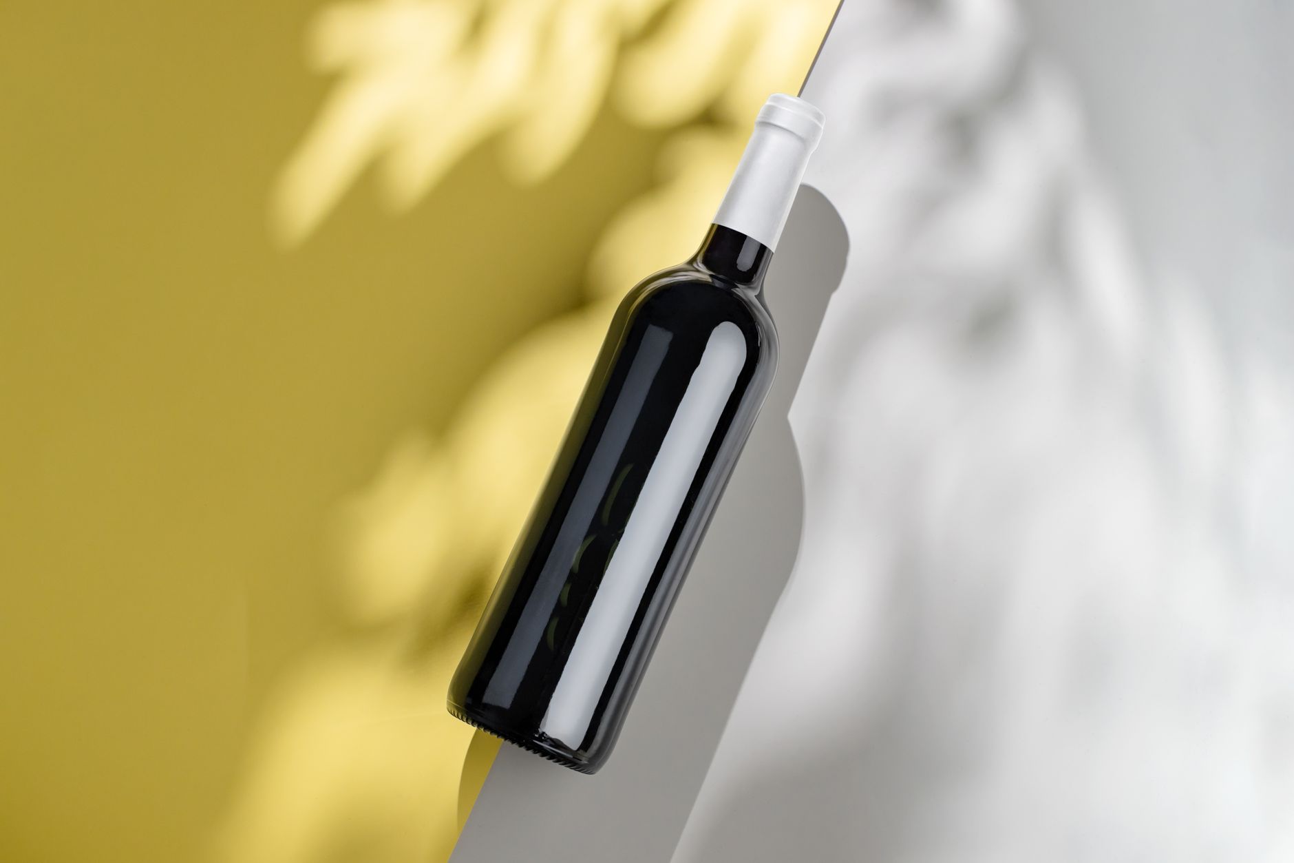
    Once lighting is locked, shoot a reference frame before the product ever enters the set. This single frame is what every white balance correction downstream depends on, whether you’re setting a custom white balance in-camera or fixing color in post later.

    Fill the frame correctly

    Hold the gray card or color checker in the product’s future position, under the exact same light the product will sit in. Fill 60-80% of the frame with the card itself, not the surrounding set. A reference shot that includes too much background lets ambient light contaminate the reading.

    Lock exposure before you shoot the reference

    Set exposure manually (aperture, shutter, ISO) and lock it before the reference frame. A gray card that’s blown out or underexposed gives a bad white balance reading even if the color temperature itself is close. Aim for the card’s histogram to sit mid-range, not clipped on either end.

    Reshoot the reference every time light changes

    Move a light, swap a modifier, add a reflector, or reposition the camera, and the reference frame is dead. Reshoot it. This feels excessive on a fast-moving shoot with 40 SKUs to knock out, but it’s the difference between a listing that photographs true to color and one that gets a return with “colors don’t match” typed into the review.

    Step 4: Set a Custom White Balance In-Camera

    With the reference frame captured, tell the camera what neutral actually looks like under this specific light. This is the step most sellers skip entirely, defaulting to Auto White Balance and hoping for the best. Hope is not a color management strategy.

    Using your camera’s Custom WB function

    Navigate to the Custom or Preset White Balance setting in the camera menu, select the gray card reference frame you just captured, and let the camera calculate the color temperature and tint correction from that frame. Every major camera brand supports this, though the menu path differs. Canon calls it Custom White Balance, Nikon calls it Preset Manual, Sony calls it Custom 1/2/3. Five minutes with the manual solves this permanently.

    Dialing in Kelvin manually as a backup method

    If the custom WB workflow isn’t available, switch to manual Kelvin input instead. Daylight-balanced strobes in the 5000-6500K range typically need a camera Kelvin setting matched within 100-200K of the bulb’s rating, fine-tuned using the reference frame as a visual check. It’s a rougher method than Custom WB, but it still lands miles ahead of Auto White Balance guessing scene by scene.

    Light Source Approximate Color Temperature Typical Color Cast if Uncorrected
    Tungsten / incandescent bulb 2700K-3200K Strong orange/yellow cast
    Household LED (warm white) 2700K-3000K Yellow cast
    Office fluorescent 3500K-5000K Green or yellow-green cast
    Daylight-balanced strobe/LED 5000K-5600K Neutral, matches expected Main Image look
    Overcast daylight 6500K-7500K Blue cast
    Open shade 7000K-8000K Strong blue cast

    Step 5: Shoot in RAW, Not JPEG

    RAW files store the actual sensor data before the camera applies any color processing. JPEG files bake white balance, contrast, and color decisions into the pixels permanently at the moment of capture. Shoot JPEG and get the white balance wrong, and there is no clean fix waiting for you in post.

    Why JPEG bakes in bad color permanently

    A JPEG file has already thrown away roughly 90% of the color data your sensor captured, compressed into an 8-bit file optimized for size, not editing latitude. Try to shift white balance more than a small amount on a JPEG and banding, posterization, and visible color shifts show up fast, especially in gradients like the curve of a stainless steel product.

    File size and storage tradeoffs, worth it

    RAW files run 25-45MB compared to 3-8MB for a JPEG from the same camera. A single shoot covering 40 SKUs at 7 images each generates roughly 280 files, which at RAW size is 7-12GB. Storage costs less than a dollar per shoot on a modern hard drive. Weigh that against the cost of a suppressed listing or a spike in returns from color mismatch, and RAW is not a close call.

    Step 6: Correct White Balance in Post-Production
    Step 6: Correct White Balance in Post-Production

    Even a well-executed in-camera custom white balance benefits from a final check in post. This is also where a seller who shot RAW without setting custom WB in-camera fixes everything retroactively, frame by frame or in batch.

    Using the eyedropper tool on your gray reference

    In Lightroom, Capture One, or Photoshop Camera Raw, select the White Balance eyedropper tool and click directly on the gray card in the reference frame. The software reads that pixel, calculates the shift needed to make it neutral, and applies the correction. This is the single most reliable method to white balance product photos correctly in post, more accurate than eyeballing temperature and tint sliders.

    Calibrating your monitor before you trust your eyes

    None of this matters if the monitor making the color decisions is itself inaccurate. A hardware calibrator like a Datacolor SpyderX or X-Rite i1Display ($150-200) corrects your monitor’s color output against a known standard. Editing on an uncalibrated monitor means every white balance decision is being made against a reference that’s already lying to you.

    Batch syncing white balance across your full shot list

    Once the correction is dialed in on the reference frame, sync that setting across every other frame shot under the same light. Lightroom’s Sync Settings and Capture One’s Copy/Apply Adjustments both do this in seconds across a folder of hundreds of images, which is the only realistic way to process a 280-image shoot without losing a full day to manual correction.

    Step 7: Verify Color Accuracy Before You Upload

    The last step gets skipped constantly, and it’s the one that actually catches mistakes before they cost money. Verify color. Don’t assume it. Get this step right and everything upstream you did to white balance product photos correctly finally pays off in the actual listing.

    Side-by-side comparison against the physical product

    Put the physical product next to the calibrated monitor, in neutral room lighting, and compare directly. Colors should match within a shade a reasonable customer would never flag. This five-minute check catches mismatches a screen full of thumbnails hides.

    Checking consistency across all 7 image slots

    Amazon gives every listing seven image slots, and shoppers scroll through all of them before converting on high-consideration categories like electronics and beauty. If the Main Image reads true white and Image 4 has a warm cast because it was shot on a different day under different light, that inconsistency reads as unprofessional. It erodes trust and drags down CVR even when each image individually looks fine on its own. Amazon’s own product image requirements specify a pure white RGB 255,255,255 background for the Main Image, and a shifted white balance is the fastest way to miss that target without noticing.

    When to send it out instead

    Build all of this in-house, or hand it to a photography operation that already owns the calibrated gear and runs the workflow daily, like a professional Amazon product photography studio. Either path works. What doesn’t work is skipping the process and hoping Auto White Balance gets lucky across 280 frames.

    Common Mistakes to Avoid

    Common Mistakes to Avoid
    • Leaving Auto White Balance on for the entire shoot. It recalculates per frame, which means your 40th product photo can have a different color cast than your first, even under identical light.
    • Mixing light sources without matching Kelvin ratings. One 3200K desk lamp in a 5500K strobe setup ruins the whole batch, and it’s the most common cause of split color casts on a single product.
    • Shooting JPEG to save memory card space. A $10 SD card upgrade is cheaper than reshooting a listing because the color can’t be corrected after the fact.
    • Skipping the reference reshoot after moving a light. Any change to the lighting setup invalidates the last gray card frame, full stop.
    • Trusting an uncalibrated monitor to judge color. Shoppers see your listing on their own uncalibrated phone screens, but you still need a neutral starting point to correct from, and an uncalibrated editing monitor doesn’t give you one.
    • Uploading without a side-by-side check against the physical product. This is the five-minute step that catches color mismatch before a customer does, in a review.

    What’s Next

    Now that you know how to white balance product photos correctly, the next weak point to audit is lighting angle and shadow control on your Main Image, since color accuracy and lighting quality solve two different problems that both show up as the same symptom: a listing that underperforms on CTR despite decent PPC placement. Products with inaccurate color also see a measurable bump in returns, and research on ecommerce product presentation from the Baymard Institute has repeatedly flagged “product looked different than pictured” as a top-cited reason shoppers cite for sending items back. Fixing white balance is cheap. Eating a return at $4-8 in reverse logistics fees per unit is not. For more on the fundamentals covered here, browse the rest of the AZ Product Shots blog.

    Related Articles

    • DIY Amazon Product Photography Setup: A Complete Build Guide Under $500
    • Product Photography Lighting for Amazon: The Setup That Actually Converts
    • Amazon Product Photography Pricing Breakdown: The Real Math Behind Your Image Investment

    Sources & References

    1. product image requirements specify a pure white RGB 255,255,255 background for the Main Image
    2. professional Amazon product photography studio
    3. Baymard Institute
    4. Nielsen Norman Group

    Amazon Listing Images That Actually Convert

    Stop losing sales to competitors with better images. We research your niche, find the 6 buying objections in your category, and ship 7 strategic listing images that address each one.

    Get Your Images

    Frequently Asked Questions

    What’s the best Kelvin setting for Amazon product photography?

    Aim for 5000K-5600K on your lights and match your camera’s custom white balance to that same range using a gray card reference. This range reads as neutral daylight, which is the look Amazon’s Main Image guidelines expect and what shoppers are used to seeing on the SERP.

    Can I fix white balance in Photoshop if I shot JPEG?

    You can nudge it, but not correctly. JPEG discards most of the color data at capture, so any significant white balance shift introduces banding and posterization, especially on gradients and reflective surfaces. Shoot RAW and this stops being a problem entirely.

    Do I need a gray card if my studio light never changes?

    Yes, because “never changes” is rarely true once you factor in bulb aging, modifier swaps, and stray window light. A gray card reference takes 10 seconds per setup and removes the guesswork, which is cheap insurance against a full reshoot.

    How does bad white balance actually affect my return rate?

    A product that photographs cooler or warmer than its true color sets a false expectation, and shoppers return items that don’t match what they saw on the listing. Research from the Nielsen Norman Group on ecommerce trust signals consistently shows visual accuracy drives purchase confidence, and confidence gaps show up later as refunds.

    Should I ever use Auto White Balance for product shots?

    No. Auto White Balance recalculates per frame based on scene content, which means identical lighting can still produce inconsistent color across a shot list. Manual custom white balance with a gray card reference is the only method that holds steady across an entire session.

  • Flat Lay Product Photography for Ecommerce: A Complete Setup Guide for Amazon Sellers

    Flat Lay Product Photography for Ecommerce: A Complete Setup Guide for Amazon Sellers

    Your flat lay photography is costing you sales. I see it every day — sellers dropping $3,000 on inventory, then shooting their products on a wrinkled bedsheet with their iPhone 6. Your competitors are eating your lunch because their flat lay product photography for ecommerce actually shows buyers what they’re getting.

    For more on this, see our product photography budget guide. For more on this, see our diy amazon product guide. For more on this, see our shoot cosmetics product guide. For more on this, see our product photography lighting guide.

    Last reviewed:

    Here’s the math: A proper flat lay setup runs you $200-500. That same investment increases your conversion rate from 8% to 12%. On 1,000 sessions per month at a $30 AOV, that’s an extra $1,200 in revenue. Every. Single. Month.

    I’ve shot over 10,000 flat lays for Amazon sellers. From supplements arranged on marble to tech accessories on concrete — the principles stay the same. This guide breaks down exactly how to shoot flat lays that make buyers click “Add to Cart” instead of scrolling to your competition.

    Essential Equipment for Professional Flat Lay Photography

    Camera and Lens Requirements

    Stop asking if your phone camera is “good enough.” It’s not. Not for serious ecommerce. You need a real camera with manual controls. Period.

    Minimum specs that actually matter:

    • 24+ megapixels — Amazon’s zoom feature exposes every flaw in low-res images
    • Full manual mode — Auto settings give you inconsistent results across your catalog
    • RAW file capability — JPEGs throw away data you need for color correction
    • Tethering support — See your shots on a big screen while shooting

    Best entry-level options: Canon EOS Rebel T7i ($700), Nikon D5600 ($600), Sony a6100 ($750). Any of these blow away the newest iPhone for product work.

    For lenses, you want a 50mm or 85mm prime. Why? Zero distortion. Your products look exactly like they do in real life. Wide-angle lenses make products look warped. Telephoto lenses compress depth weirdly. A used 50mm f/1.8 runs $125 and outperforms any zoom lens under $1,000 for flat lays.

    Lighting Setup That Actually Works

    Natural light is free. It’s also unpredictable garbage for consistent product shots. One cloud rolls by and your white balance shifts 500K. Your editing time triples trying to match images shot at different times.

    Here’s what works:

    • Two softbox lights minimum — 24″ x 24″ boxes with 5500K daylight bulbs
    • C-stands or light stands — Weighted bases that won’t tip when you bump them
    • White foam boards — 30″ x 40″ boards for fill light (cheaper than a third softbox)
    • Light meter or grey card — Consistent exposure across every shot

    Budget setup that delivers: Neewer 700W softbox kit ($150) plus two foam boards from Office Depot ($20). Position lights at 45-degree angles to your flat lay surface, 3 feet away. Boom — shadowless, even lighting that makes products pop.

    Skip the ring lights. They’re for beauty vloggers, not product photography. The circular catchlights look amateur on flat surfaces.

    Backgrounds and Surfaces

    Your background sells the lifestyle. Kitchen gadgets on barn wood say “farmhouse chic.” Supplements on white marble scream “premium wellness.” Tech on matte black signals “professional grade.”

    Surfaces that convert:

    • White seamless paper — $30 for a 53″ roll, works for everything
    • Replica surfaces from Replica Surfaces — $40-80 each, look like real marble/wood/concrete
    • Actual materials from Home Depot — Marble tiles ($5-15), wood planks ($20-40)
    • Colored card stock — $2-5 per sheet for bright lifestyle shots

    Pro tip: Buy 3-5 surfaces and rotate them. Shooting 20 SKUs on the same white background looks lazy. Varying surfaces keeps shoppers engaged as they scroll your catalog.

    Composition Techniques for Converting Browsers to Buyers

    Visual guide to flat lay product photography for ecommerce

    The Rule of Odds and Visual Hierarchy

    Human brains process odd numbers faster than even numbers. Three products. Five accessories. Seven color swatches. Never two or four — it creates visual tension that makes viewers uncomfortable.

    Nielsen Norman Group’s eye-tracking research shows users scan images in an F-pattern. Place your hero product in the upper left. Supporting items flow right and down. Most important features stay in that golden F-zone.

    Size creates hierarchy. Your main product takes up 40-50% of frame. Secondary items get 20-30%. Props and lifestyle elements fill the remaining space. Break this rule and buyers get confused about what you’re actually selling.

    Real example: Supplement bottle flat lay. Bottle in upper left at 45% of frame. Three capsules scattered center-right. Fresh ingredients (lemon, ginger, turmeric) in bottom third. Eye flows naturally from product to benefits to ingredients.

    Props That Sell vs Props That Distract

    Good props reinforce your product’s use case. Bad props confuse buyers and tank conversion rates.

    Props that work:

    • Ingredients for consumables — Show what’s inside supplements, teas, protein powders
    • Complementary products — Phone case with earbuds, cutting board with knife
    • Texture elements — Fabric swatches for fashion, leaves for natural products
    • Size references — Coins, hands, common objects for scale

    Props that kill sales:

    • Random flowers — Unless you’re selling flowers
    • Coffee cups in every shot — Lazy lifestyle signaling
    • Competing brands — Why advertise for others?
    • Seasonal items — Christmas props in July listings look stupid

    Test your props: Show the image to someone for 3 seconds. Ask what they remember. If they mention the props before your product, reshoot.

    Negative Space and Breathing Room

    Cramming every inch with products and props screams “amateur.” Professional flat lay product photography for ecommerce uses negative space strategically.

    The 60/40 rule: 60% of your frame shows products and props. 40% stays empty. This breathing room makes products feel premium, not cluttered.

    Where to place negative space:

    • Around hero product — 2-3 inches minimum clearance
    • Between product groups — Clear separation prevents visual merging
    • Frame edges — Never crop tight to product edges

    Exception: Bundle shots. When showing everything included, you can push to 70/30. But maintain clear groupings with micro-spaces between items.

    Step-by-Step Flat Lay Photography Process

    Pre-Shoot Preparation

    Half your flat lay success happens before you touch the camera. Rushed prep work shows in the final images.

    24 hours before:

    • Clean every product with microfiber cloth and rubbing alcohol
    • Remove all stickers, tags, protective films
    • Check for damage — scratches, dents, loose threads
    • Gather and clean all props

    Morning of shoot:

    • Charge all camera batteries (keep 3 minimum)
    • Format memory cards (32GB minimum per 100 products)
    • Clean camera sensor with rocket blower
    • Set up and test tethering to laptop

    1 hour before:

    • Turn on all lights, let bulbs warm up for consistent color
    • Sweep/vacuum shooting area (dust shows at high resolution)
    • Layout backgrounds in shooting order
    • Pre-arrange products by category

    This prep routine saves 3-4 hours of shooting time per 50 products. Do it right or do it twice.

    Camera Settings and Technical Setup

    Forget auto mode exists. These manual settings deliver consistent results across hundreds of shots:

    Base settings for flat lays:

    • Aperture: f/8 to f/11 (sharpest range for most lenses)
    • ISO: 100-200 (minimum noise, maximum quality)
    • Shutter speed: 1/125 or faster (prevents camera shake)
    • White balance: 5500K or custom grey card reading
    • File format: RAW + JPEG (RAW for editing, JPEG for quick review)

    Camera position matters. Mount your camera directly above the flat lay surface. No angle. No tilt. Perfect 90-degree down angle. Use a horizontal tripod arm or C-stand with boom arm. Manfrotto 131D ($200) or Impact Grip Arm Kit ($150) both work.

    Minimum shooting height: 3 feet above products. This prevents wide-angle distortion even with a 50mm lens. Mark your tripod legs with tape once you find the sweet spot.

    Focus technique: Single-point autofocus on the hero product. For groups, focus 1/3 into the scene depth. Everything stays sharp at f/8 or smaller.

    Shooting Workflow and Consistency

    Consistency across your catalog trumps individual “artistic” shots. Build a repeatable workflow:

    Per product workflow (5-7 minutes):

    1. Place hero product according to your composition plan
    2. Add secondary items and props
    3. Check spacing with live view zoom
    4. Shoot test frame, check histogram for blown highlights
    5. Adjust product angles for best logo/label visibility
    6. Shoot 3-5 frames with micro adjustments
    7. Remove products, reset for next shot

    Batch similar products together. All supplements, then all accessories, then all textiles. Your brain stays in the same creative mode. Switching categories constantly slows you down 40%.

    Name files while shooting: SKU_FlatLay_01, SKU_FlatLay_02. Don’t rely on camera numbering. You’ll waste hours matching images to products later.

    Quality control during shoot: Review every 10th image at 100% zoom. Check sharpness, dust, alignment. Catching problems early beats discovering them in post.

    Post-Processing for Maximum Impact

    Amazon listing image design examples

    Color Correction and White Balance

    Raw files look flat. That’s the point. You’ve captured maximum data to sculpt in post. Here’s the processing order that works:

    Step 1: Global corrections (2 minutes per image)

    • White balance: Match to grey card shot or adjust until whites are pure white
    • Exposure: +0.3 to +0.7 stops typically (flat lays tend to underexpose)
    • Highlights: -50 to -100 to recover product detail
    • Shadows: +20 to +40 to open up dark areas
    • Whites/Blacks: Adjust until histogram touches both edges without clipping

    Step 2: Color grading (1 minute per image)

    • Vibrance: +15 to +25 (more natural than saturation)
    • Saturation: +5 to +10 maximum
    • HSL adjustments: Target specific colors (make reds pop, neutralize unwanted casts)

    Create presets for each product category. Supplements get warmer tones (+100K). Electronics stay neutral. Fashion can push cooler (-100K). Apply preset, then fine-tune.

    Reality check: Baymard Institute’s study on product returns found 22% of returns happen because product color didn’t match images. Accurate color beats artistic color every time.

    Background Cleanup and Refinement

    Even “perfect” white backgrounds aren’t perfect. Every flat lay needs cleanup:

    Essential cleanup tasks:

    • Dust spot removal (healing brush for every speck)
    • Background whitening (push to 255,255,255 for true white)
    • Edge cleanup (remove shadows at product borders)
    • Prop alignment (straighten anything that shifted during shoot)

    Photoshop actions speed this up. Record your cleanup process once, apply to hundreds of images. 30 seconds per image vs 5 minutes manual.

    Background replacement technique for non-white backgrounds: Pen tool around all products, save selection, drop in new background. Keeps natural shadows while changing surface. Works great for A/B testing different lifestyle contexts.

    Image Optimization for Ecommerce Platforms

    Pretty images that load slowly kill conversion rates. Google’s research shows 53% of users abandon sites that take over 3 seconds to load. Your images need to look great AND load fast.

    Amazon optimization specs:

    • Minimum: 1000 x 1000 pixels (enables zoom)
    • Optimal: 2000 x 2000 pixels (sharp on all devices)
    • Format: JPEG at 85% quality (best size/quality ratio)
    • File size: Under 1MB per image (faster loading)
    • Color profile: sRGB (anything else displays wrong)

    Batch processing workflow: Export from RAW processor at 2500px, then use Photoshop’s “Save for Web” at 85% quality. This two-step process maintains quality while minimizing file size.

    File naming for SEO: product-name-flat-lay-angle.jpg. Not IMG_1234.jpg. Search engines and customers both appreciate descriptive names.

    Common Flat Lay Mistakes and Fixes

    Lighting Errors That Kill Sales

    Bad lighting ruins more flat lays than any other factor. Here are the mistakes I see daily:

    Mistake 1: Mixed color temperatures
    Your softbox pumps out 5500K daylight. The overhead fluorescent adds 4000K warm white. Result? Products look yellow on one side, blue on the other.

    Fix: Turn off all room lights. Use only your photography lights. Period.

    Mistake 2: Harsh shadows
    One light source = harsh shadows. Shadows hide product details and look unprofessional.

    Fix: Two lights minimum, plus white foam boards for fill. Shadows should be soft suggestions, not black holes.

    Mistake 3: Uneven exposure
    Center of frame bright, edges dark. Makes products look like they’re in a spotlight.

    Fix: Pull lights back to 4-5 feet. Use larger softboxes (36″ instead of 24″). Add a third light aimed at background.

    Composition Problems

    Even great products look terrible with poor composition:

    Problem: Everything centered
    Dead-center composition looks static and boring. Zero visual energy.

    Solution: Rule of thirds. Place hero product on intersection points. Create diagonal lines with supporting elements.

    Problem: Scale confusion
    No size reference = customers can’t judge actual product dimensions.

    Solution: Include a common object for scale. Coins for small items. Hands for medium products. Standard props buyers recognize.

    Problem: Competing focal points
    Too many products at equal visual weight. Buyer’s eye bounces around without landing.

    Solution: Clear hierarchy. Hero product 2x larger than secondary items. Use depth (overlap) to show importance.

    Post-Processing Disasters

    Overediting screams “amateur” louder than bad lighting:

    Sin 1: Nuclear white backgrounds
    Blowing out the background until products float in void. Loses all sense of surface and depth.

    Fix: Keep backgrounds at 245-250 RGB. Pure white for Amazon, but maintain subtle shadows for depth.

    Sin 2: Instagram filters on product photos
    VSCO might work for your food blog. It’s death for ecommerce. Filters shift colors unpredictably.

    Fix: Manual color grading only. Control every adjustment. Save presets for consistency.

    Sin 3: Over-sharpening
    Cranking sharpness until products glow with halos. Looks radioactive, not professional.

    Fix: Sharpen at 100% zoom. Amount: 80-120, Radius: 0.8-1.2, Threshold: 0-2. Subtle enhancement, not assault.

    Advanced Techniques for Stand-Out Listings

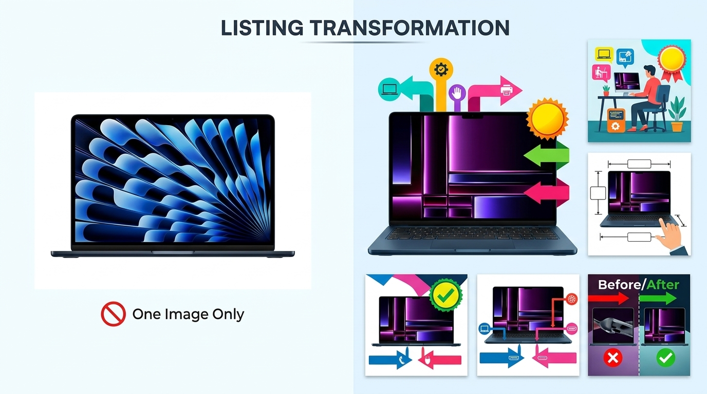
    Before and after listing image comparison

    Lifestyle Integration Without Losing Focus

    Pure white backgrounds convert. But lifestyle flat lays build brand. Here’s how to balance both:

    The 80/20 rule for flat lay product photography for ecommerce: 80% of frame stays clean and product-focused. 20% adds lifestyle context. This ratio maintains clarity while building aspiration.

    Lifestyle elements that enhance (not distract):

    • Morning routine setup for supplements (coffee mug, journal, not full breakfast spread)
    • Workspace corner for tech accessories (keyboard edge, not entire desk)
    • Fabric swatches for fashion items (texture reference, not full outfit)
    • Ingredient highlights for beauty/food (one sprig of lavender, not a garden)

    Test your lifestyle integration: Remove all lifestyle elements in Photoshop. If the image still clearly communicates product benefits, your lifestyle elements pass. If it looks empty or confusing, you relied too heavily on props.

    Pro technique: Shoot two versions. Clean product-only for main image. Lifestyle-rich for A+ Content and social media. Same lighting, same angle, different prop density.

    Multi-Product and Bundle Compositions

    Bundles should increase AOV. Bad bundle photography decreases conversion. The difference? Visual hierarchy and logical grouping.

    Bundle composition rules:

    • Primary product takes 40% of frame — Usually the highest-value item
    • Group by category — All bottles together, all accessories together
    • Consistent angles — All labels facing same direction
    • Clear separation — 1-2 inches between items minimum
    • Size progression — Large to small, left to right (matches reading pattern)

    Overlap technique for large bundles: Front items at 100% visibility. Back items show 70-80%. Creates depth without hiding products. Stack vertically before overlapping horizontally.

    Bundle naming visible in image: “INCLUDES:” text overlay listing everything. Buyers shouldn’t guess what’s included. Spell it out.

    Seasonal and Trend-Aware Styling

    Static flat lays all year = stale brand. But reshooting every season wastes money. Smart approach: Modular compositions.

    Base + Seasonal layer system:

    1. Shoot hero product on neutral background
    2. Save layered PSD with product masked
    3. Swap backgrounds and props seasonally
    4. 5 minutes per update vs 30 minutes full reshoot

    Seasonal elements that convert:

    • Spring: Fresh flowers, pastel props, bright surfaces
    • Summer: Tropical leaves, sandy textures, bold colors
    • Fall: Warm woods, autumn leaves, cozy textiles
    • Winter: Evergreen sprigs, metallic accents, rich textures
    • Holidays: Subtle themed props (pine cone, not full Christmas tree)

    Track performance by season. Some products convert better with seasonal styling. Others perform best with evergreen imagery. Let data guide your seasonal strategy.

    Measuring Success and Optimization

    Key Metrics for Flat Lay Performance

    Pretty pictures mean nothing if they don’t move product. Track these metrics religiously:

    Click-through rate (CTR) from search:
    Flat lay main images should hit 3-5% CTR minimum. Under 2%? Your images blend into the crowd. Test more aggressive compositions.

    Conversion rate by image type:
    A/B test flat lays against straight product shots. Most lifestyle categories see 15-30% conversion lift with flat lays. Technical products might perform better with isolated shots.

    Time on page:
    Good flat lays increase time on page 20-40%. Buyers study the details. Bad flat lays cause immediate bounces.

    Image interaction rate:
    Track how many visitors use Amazon’s zoom feature. Under 20%? Your flat lays lack interesting details. Over 50%? You’re nailing it.

    Pull these metrics weekly. One month of data tells you nothing. Three months shows trends. Six months guides strategy.

    A/B Testing Strategies

    Stop guessing what works. Test everything:

    Elements to test in flat lay product photography for ecommerce:

    • Background color/texture — White vs marble vs wood
    • Prop density — Minimal vs lifestyle-rich
    • Product angles — Straight-on vs 15-degree rotation
    • Number of items — Single hero vs multiple variants
    • Human elements — Hands/models vs product only

    Testing protocol: Run each test for minimum 1,000 impressions or 14 days. Statistical significance matters. Early results lie.

    Use Amazon’s Manage Your Experiments for main images. For gallery images, rotate weekly and track in Seller Central analytics. Document everything in a spreadsheet.

    Winner implementation: Don’t just update the tested listing. Roll out winning elements across your entire catalog. One good test can lift portfolio-wide conversion 10-20%.

    Continuous Improvement Process

    Your competitors aren’t standing still. Neither should your imagery:

    Monthly improvement cycle:

    1. Audit worst performers — Bottom 20% by conversion rate
    2. Identify common problems — Usually lighting or composition
    3. Reshoot with fixes — Test improvements immediately
    4. Document what worked — Build your playbook
    5. Apply to new products — Start strong instead of fixing later

    Competitive analysis quarterly: Screenshot top 10 competitors’ hero images. What are they doing that you’re not? Don’t copy — improve on their approach.

    Customer feedback goldmine: Read your reviews and questions. “Couldn’t see the texture” = add detail shots. “Smaller than expected” = better scale references. Let buyers tell you what’s missing.

    Investment tracking: Calculate photography ROI quarterly. (Additional revenue from improved conversion) / (Photography costs) = ROI multiple. Aim for 10x minimum. 20-30x is achievable with optimized flat lays.

    Sources & References

    1. Nielsen Norman Group’s eye-tracking research
    2. Baymard Institute’s study on product returns
    3. Google’s research shows 53% of users abandon sites

    Related Reading

    Frequently Asked Questions

    What’s the best camera height for flat lay product photography?

    Mount your camera 3-4 feet above your products for distortion-free flat lays. This height works perfectly with a 50mm lens to capture products without edge warping. Mark your tripod position with tape once you find the sweet spot — consistency across shots matters more than perfect height.

    How many products should I include in a single flat lay composition?

    Use odd numbers for visual appeal — typically 3, 5, or 7 items total. Your hero product should occupy 40-50% of the frame, with supporting items progressively smaller. For bundles, you can push to 9-11 items, but maintain clear visual hierarchy so buyers immediately understand what’s most important.

    Should I use natural light or artificial lighting for ecommerce flat lays?

    Artificial lighting wins every time for consistent ecommerce results. Natural light changes constantly — a passing cloud shifts your color temperature 500K and ruins batch consistency. Two 5500K softboxes give you identical lighting whether you’re shooting at 6 AM or midnight, processing 10 products or 100.

    What file size and dimensions work best for Amazon flat lay images?

    Export at 2000 x 2000 pixels minimum, JPEG format at 85% quality, keeping files under 1MB. This sweet spot enables Amazon’s zoom feature while loading fast on mobile. Always use sRGB color profile — other profiles display incorrectly and make products look off-color.

    How much should I invest in props for flat lay photography?

    Budget $200-300 for a versatile prop collection that covers multiple product categories. Buy 3-5 backdrop surfaces ($150), basic lifestyle props like fabric swatches and greenery ($50), and size reference items ($20). Quality props pay for themselves in reduced reshoot time — one wrinkled fabric can ruin 50 product shots.