Why Most Amazon Sellers Skip Image Audits (And Pay For It)
Your images are bleeding conversions, and you don’t even know it.
Most sellers upload their seven images, optimize their title and bullets, then wonder why their CVR sits at 8% while competitors hit 15%. They blame price. They blame reviews. They blame the A10 algorithm.
The real problem? Their images suck, and they’ve never done a proper audit to figure out why.
A proper image audit takes 15 minutes and can reveal conversion killers that cost you thousands in lost sales. I’m talking about main images that don’t pop on mobile SERPs. Lifestyle shots that confuse instead of convert. Feature callouts that highlight the wrong benefits.
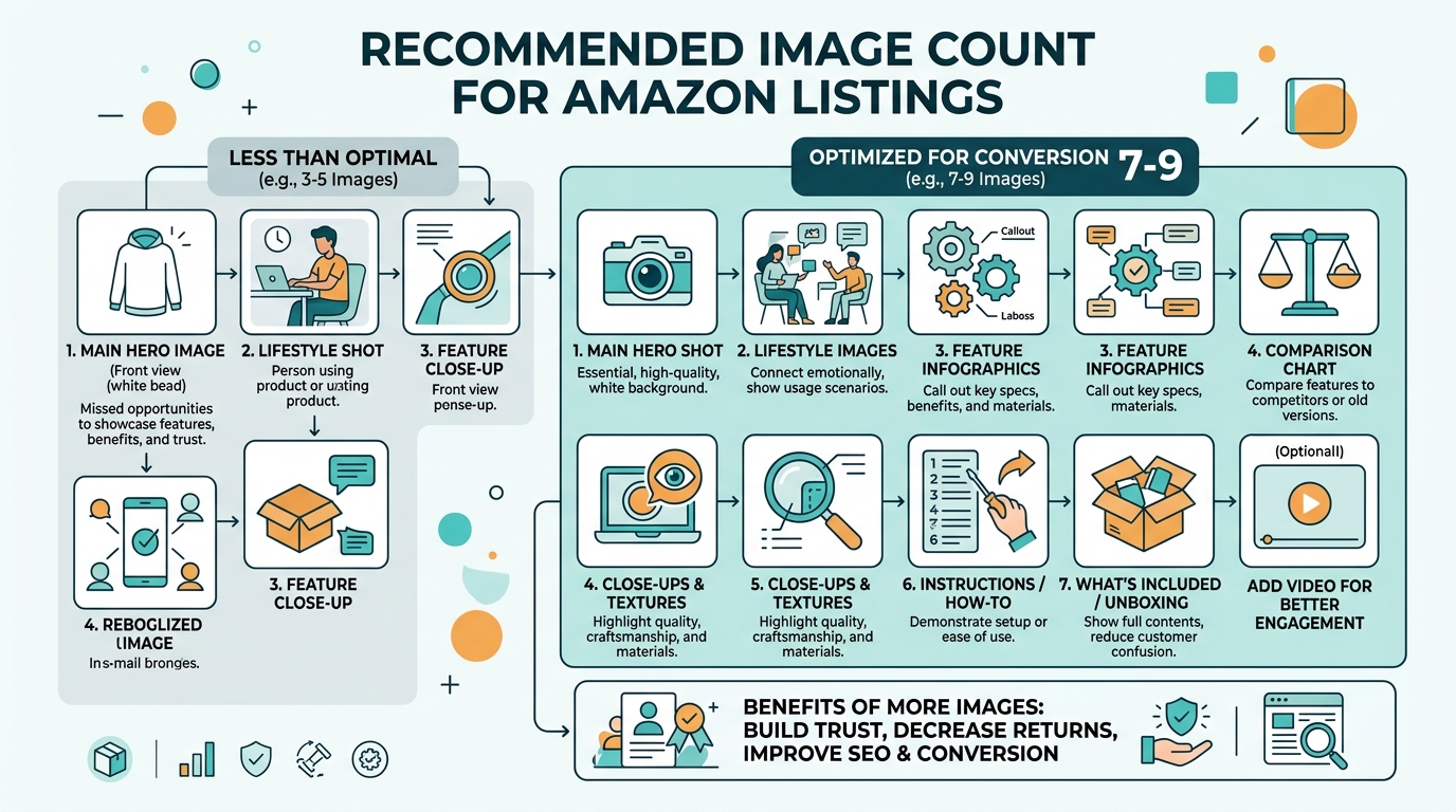
How Many Images For Amazon Listing covers this in more detail.
This isn’t theory. Sellers who audit their images quarterly see average CVR improvements of 23% within 30 days of making changes. That’s because most image problems are fixable once you know what to look for.
The Hidden Cost of Bad Images
Let’s do the math on what poor images actually cost you.
Say you’re driving 1,000 clicks per month at $1.50 CPC. That’s $1,500 in PPC spend. If your CVR is 10% instead of 15% because your images aren’t doing their job, you’re missing 50 conversions per month.
At a $30 average order value, that’s $1,500 in lost revenue monthly. Over a year, bad images cost you $18,000 in sales plus the wasted ad spend on clicks that should have converted.
Now multiply that across multiple ASINs. The numbers get ugly fast.
What Makes This Audit Different
Most image audits are surface-level. Sellers glance at their photos, maybe check if they’re the right size, call it done.
This method digs deeper. You’ll analyze click-through data, conversion paths, and mobile performance. You’ll benchmark against competitors who are stealing your traffic. Most importantly, you’ll prioritize fixes based on ROI impact, not gut feelings.
The process works for any category. I’ve used it for supplements with 47 competitors on page one. Kitchen gadgets with $200 ACoS. Beauty products fighting copycats. The fundamentals don’t change.
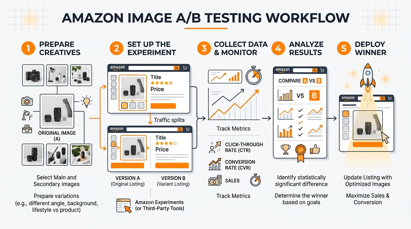
Step 1: Gather Your Performance Baseline
Before you can fix your images, you need to know exactly how they’re performing right now. Most sellers skip this step and audit blind. That’s like trying to lose weight without stepping on a scale.
Start by pulling data from the last 60 days. That’s enough volume to spot patterns without getting skewed by seasonal fluctuations or one-off campaigns.
Essential Metrics to Track
Open your Amazon Brand Analytics and Business Reports. You need five numbers:
- Click-through rate by ASIN: This shows if your main image is doing its job on the SERP
- Conversion rate by traffic source: Organic vs PPC performance tells different stories
- Mobile vs desktop CVR: Mobile images need different optimization
- Session duration: Low numbers suggest images aren’t engaging browsers
- Page views per session: Higher is better, shows images are pulling people deeper
Write these numbers down. They’re your baseline. After you make image changes, these metrics will tell you if you’re moving the needle or just rearranging deck chairs.
Don’t have Brand Analytics access yet? You can still audit using Seller Central data, but the insights won’t be as granular. Focus on overall CVR, ACoS trends, and BSR movement over time.
Competitor Performance Benchmarking
Your numbers mean nothing without context. A 12% CVR might be terrible in supplements but solid in electronics.
Pick your top 5 competitors. The ones ranking positions 1-5 for your main keywords. Use tools like Helium 10 or Jungle Scout to estimate their conversion rates and review velocity.
Here’s the benchmark framework I use:
- Top 20% performer: CVR 2x+ category average, BSR improving monthly
- Average performer: CVR within 10% of category standard
- Bottom 20% performer: CVR below category average, stagnant BSR
If you’re in the bottom 20%, images are likely a major factor. Top performers didn’t get there by accident. Their images are converting browsers into buyers more efficiently than yours.
Mobile Performance Deep Dive
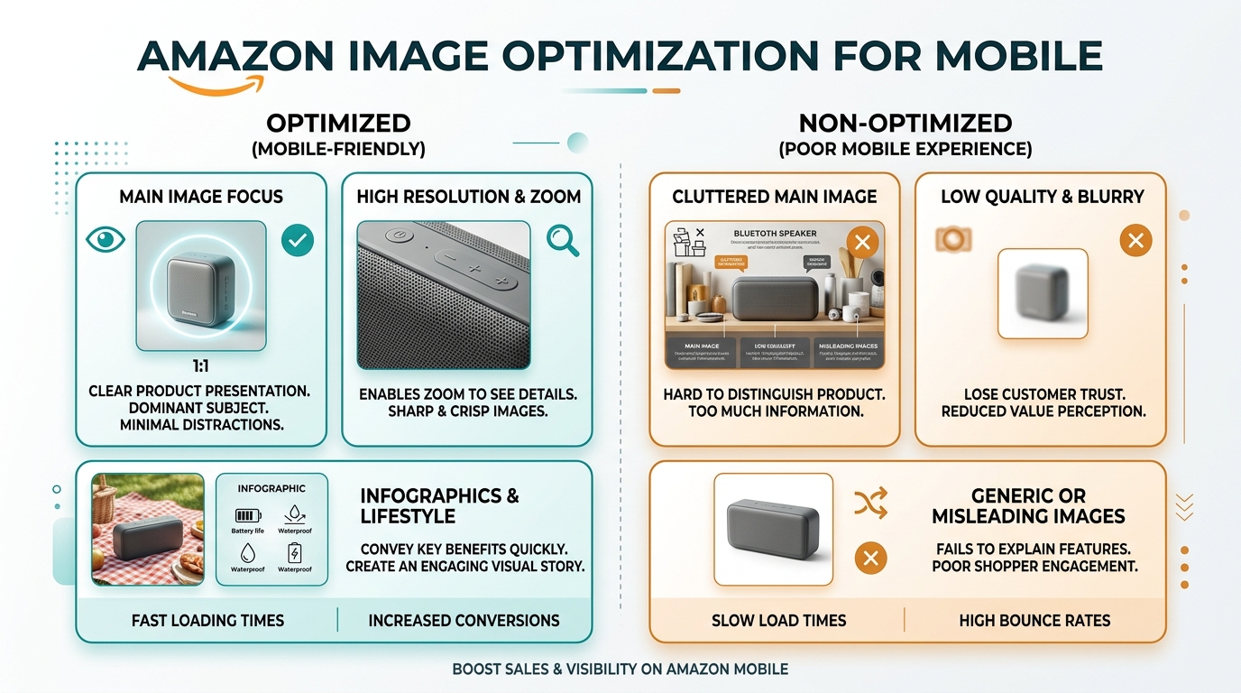
Here’s what most sellers miss: 70% of Amazon traffic is mobile, but desktop gets 90% of image optimization attention.
Your main image might look sharp on a 24-inch monitor but turn into pixelated garbage on a 6-inch phone screen. Text callouts that are readable on desktop become microscopic on mobile.
Log into your Amazon app. Search for your main keyword. Scroll through the results like a real customer. How does your main image perform against competitors at thumbnail size? Can you read key text? Does your product stand out or blend in?
Take screenshots of your listing on mobile. You’ll reference these later when prioritizing fixes.
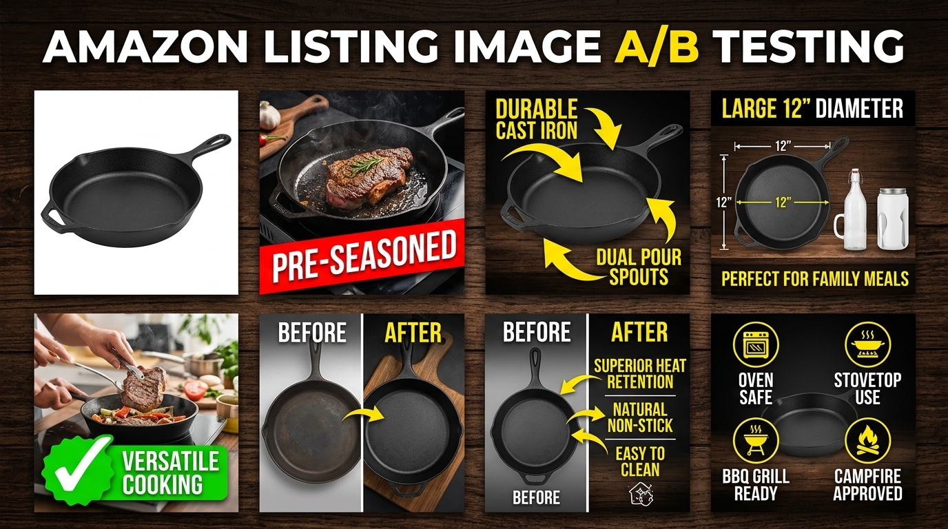
Step 2: Audit Your Main Image Performance
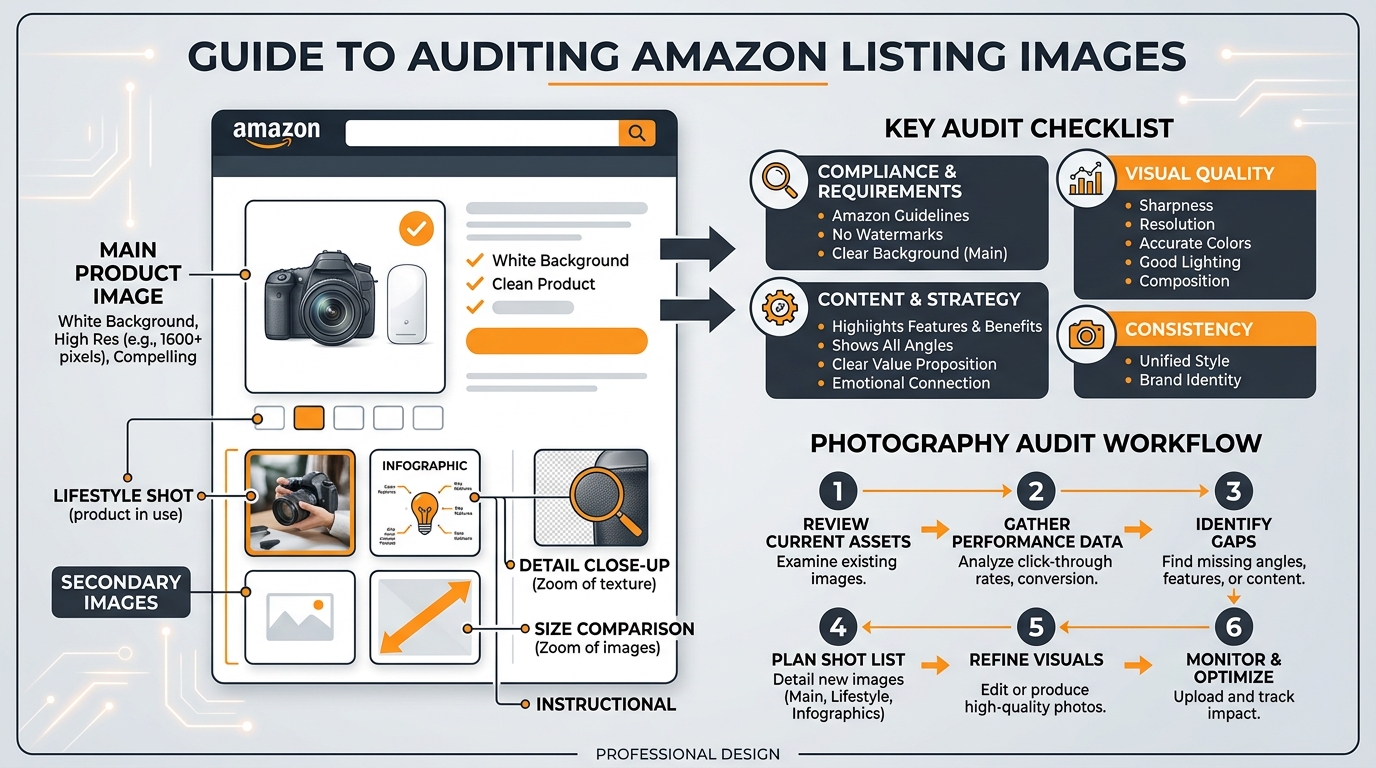
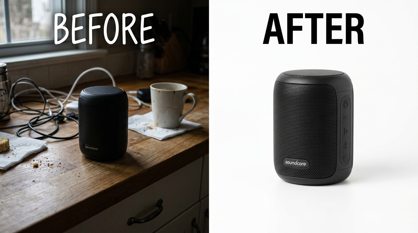
Your main image does one job: get clicks from the search results. Everything else is secondary.
Yet most sellers treat their main image like a portfolio piece instead of a conversion tool. They prioritize aesthetics over CTR performance. They follow generic photography advice instead of Amazon-specific best practices.
The result? Main images that look professional but perform poorly.
The 5-Second SERP Test
Open an incognito browser window. Search for your primary keyword. Look at the first 20 results for exactly 5 seconds, then close your eyes.
Which products do you remember? Which main images stood out? If your product isn’t in that mental list, your main image isn’t working.
This test simulates real customer behavior. Shoppers spend 2-3 seconds scanning search results before their eyes lock onto something interesting. Your main image has that window to make an impression.
Common main image problems this test reveals:
- Contrast issues: Product blends into white background
- Size problems: Product too small in frame, loses impact at thumbnail size
- Angle confusion: Unclear what the product actually is
- Generic positioning: Looks identical to 15 other listings
For Amazon Main Image Best Practices that address these issues, check our detailed guide on main image optimization.
Competitive Main Image Analysis
Line up your main image next to your top 5 competitors. Not on separate screens. Screenshot all six images and put them in a grid.
Look for patterns in the winners:
- Product positioning: Straight-on, angled, or lifestyle context
- Fill percentage: How much of the frame does the product occupy
- Color contrast: How the product pops against the white background
- Props and context: Clean isolated shot vs styled environment
The top-ranking competitors aren’t using random image strategies. They’ve optimized for clicks, either through testing or copying other winners.
If 4 out of 5 top competitors use angled shots and you’re using straight-on, that’s data. If they’re all filling 80% of the frame and you’re at 60%, that’s actionable intelligence.
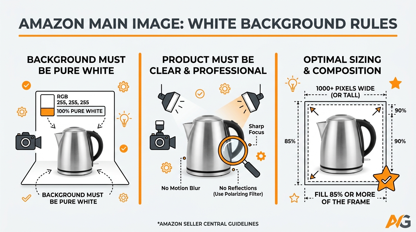
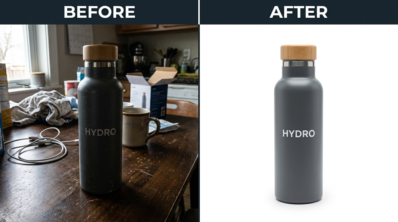
Technical Main Image Requirements Check
Amazon’s image requirements for 2026 are non-negotiable, but sellers still mess up basic specs.
Pull up your current main image and check these technical requirements:
| Requirement | Standard | Why It Matters |
|---|---|---|
| Resolution | 2000×2000 pixels minimum | Enables zoom function, improves mobile clarity |
| File format | JPEG preferred | Faster loading, better compression |
| Background | Pure white (RGB 255,255,255) | Consistent SERP appearance |
| Product fill | 85% of frame minimum | Maximum impact at thumbnail size |
| Text/graphics | None allowed on main image | Compliance requirement |
Missing any of these can trigger listing suppression or hurt SERP performance. It’s basic hygiene, but you’d be surprised how many listings fail these checks.
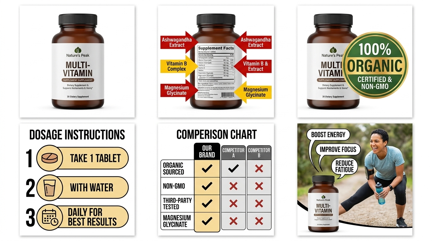
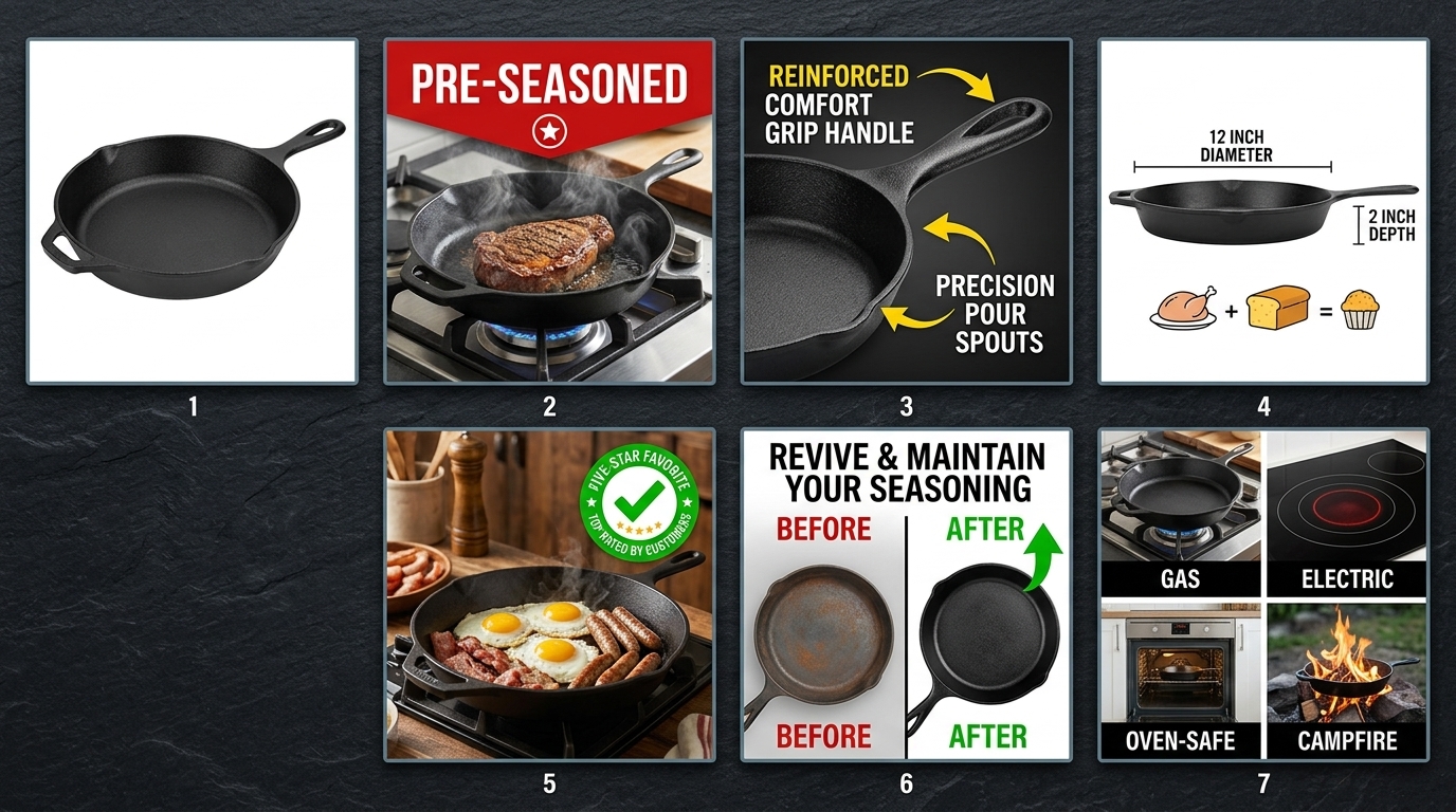
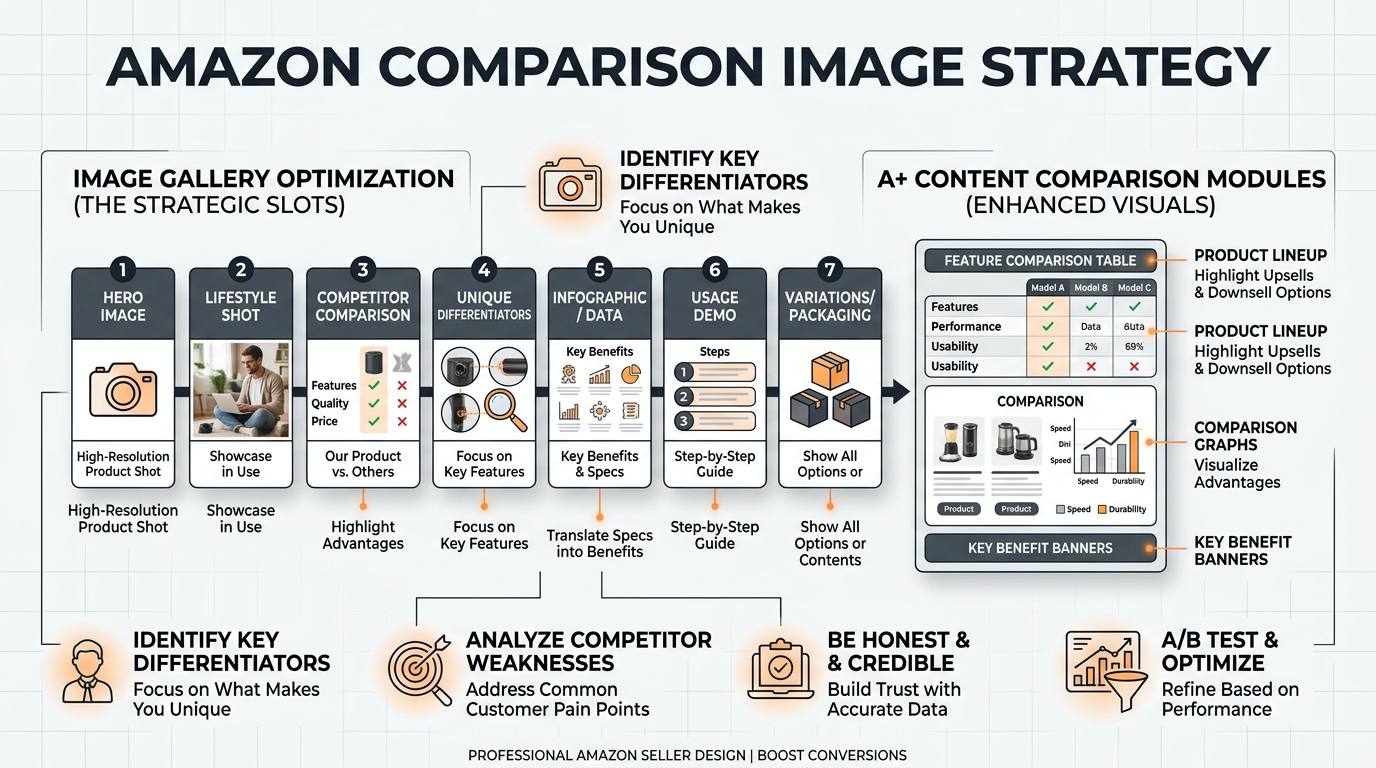
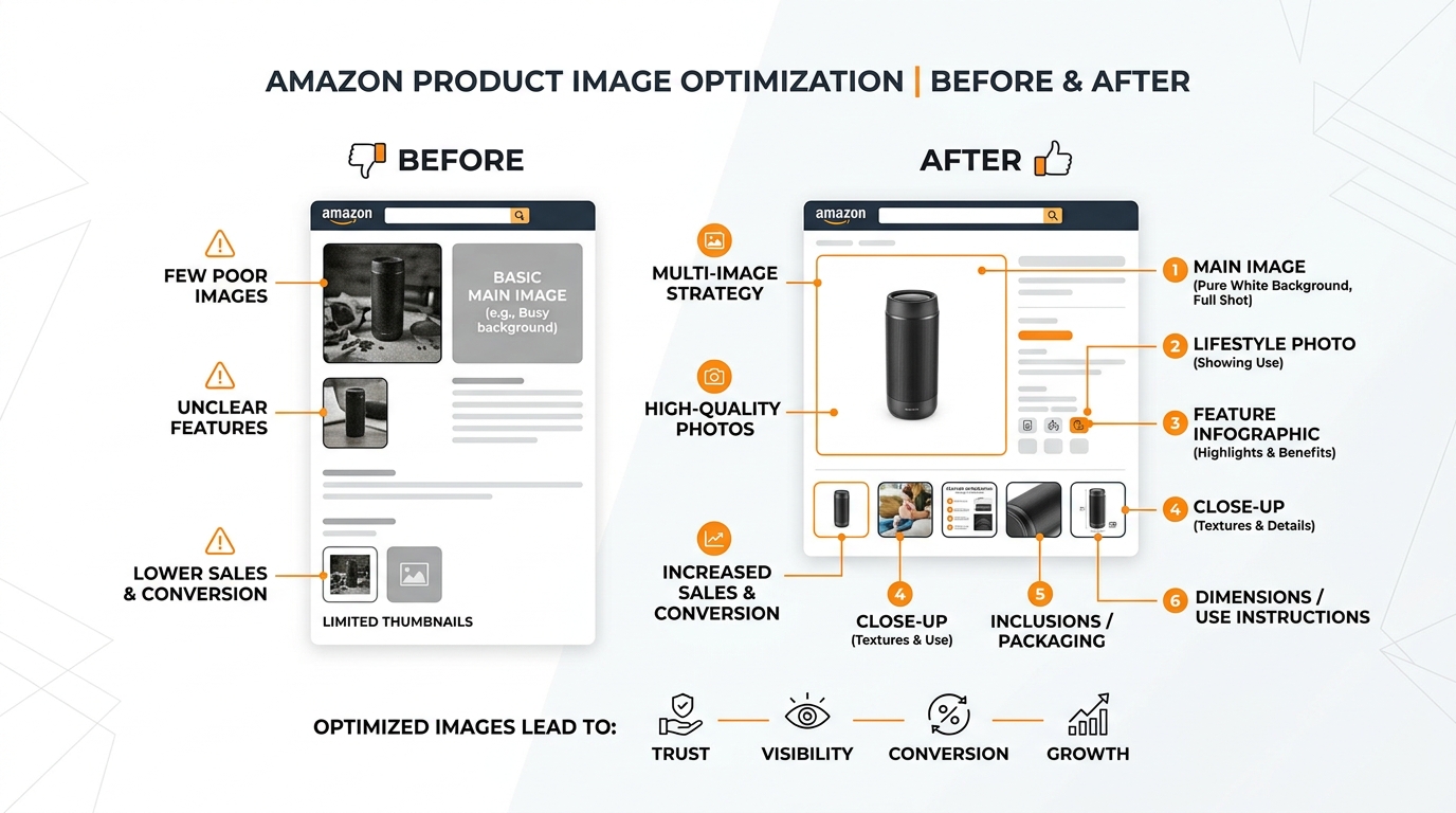
Step 3: Evaluate Secondary Images for Conversion Impact
Your secondary images have one job: convert browsers into buyers after they click through from search results.
Most sellers treat slots 2-7 like a random photo dump. Lifestyle shot here, feature callout there, maybe a size chart if they remember. No strategy. No conversion flow. No wonder their CVR struggles.
Smart sellers architect their secondary images like a sales presentation. Each image serves a specific purpose in moving customers toward the buy button.
The Conversion Flow Audit
Open your listing like a customer seeing it for the first time. Click through images 2-7 in order. Ask yourself:
- Image 2: Does this immediately show the product in use or context?
- Image 3: Are key features/benefits clearly highlighted?
- Image 4: Do I understand size, scale, or what’s included?
- Image 5: Are objections addressed (durability, quality, compatibility)?
- Images 6-7: Is there social proof, comparisons, or additional context?
Each image should answer specific customer questions in logical order. If someone clicks through all seven images and still has major questions about your product, your conversion flow is broken.
I see listings where image 2 is a random lifestyle shot, image 3 jumps to technical specs, and image 4 goes back to another lifestyle angle. That’s not a flow. That’s confusion.
For strategic guidance on how many images to use and what to include in each slot, the optimal approach varies by category and price point.
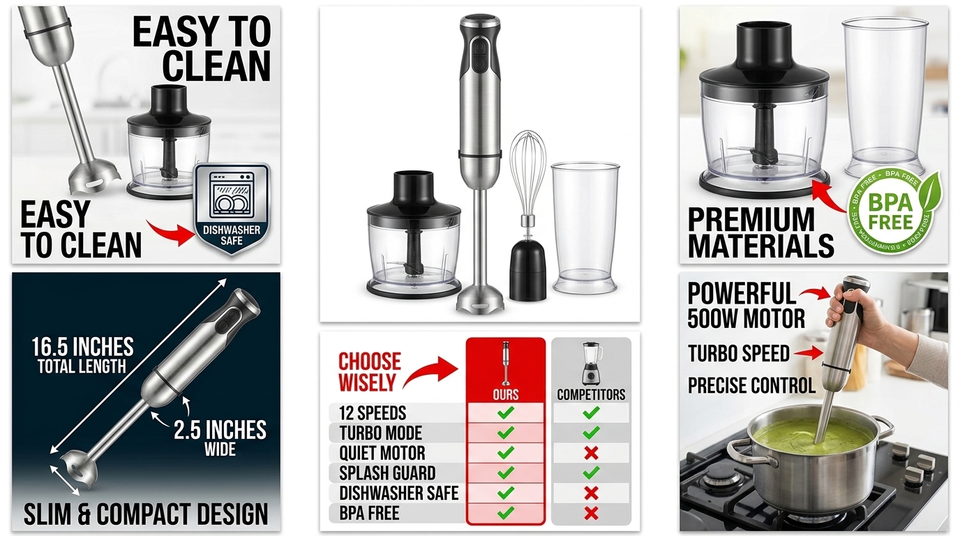
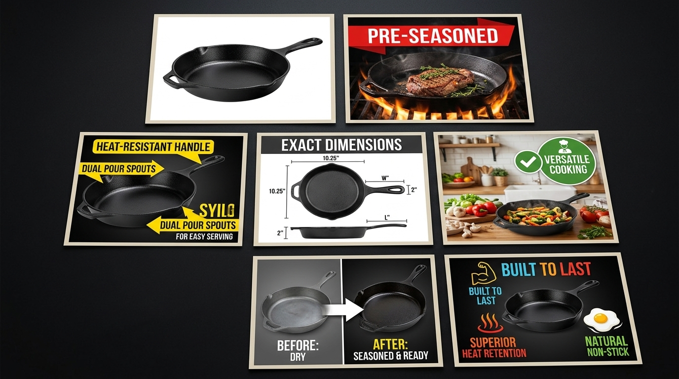
Feature Callout Effectiveness
Feature callouts are conversion gold when done right. Conversion poison when done wrong.
Most sellers highlight features nobody cares about. “BPA-free plastic” on a $200 blender. “Premium materials” without specifics. “Easy to use” with no proof.
Audit your current feature callouts against these criteria:
- Specific benefits over generic features: “Reduces prep time by 60%” vs “Sharp blades”
- Addresses actual pain points: Look at your negative reviews for clues
- Readable at mobile size: Text should be 24pt minimum
- Proper contrast: Dark text on light backgrounds, never reversed
Here’s a quick test: Show your feature callout images to someone unfamiliar with your product. Can they explain the key benefits in their own words? If not, your callouts are too vague or technical.
The best feature callouts I’ve seen focus on 2-3 major benefits max per image. Any more and you dilute the message. Kitchen products should emphasize time-saving or convenience. Supplements should focus on specific health outcomes. Electronics should highlight performance improvements.
Lifestyle and Context Images
Lifestyle images either build desire or waste valuable real estate. There’s no middle ground.
The worst lifestyle shots are generic stock photo setups. Beautiful kitchen, attractive model, zero connection to your actual product benefits. They look professional but tell customers nothing useful.
Strong lifestyle images show your product solving real problems:
- Kitchen gadgets: Actual food prep scenarios, not staged countertops
- Supplements: Active lifestyle contexts that match your target demographic
- Electronics: Real use cases, not glossy product placement
- Beauty products: Before/after results or application demonstrations
Audit your lifestyle images with this question: “Does this image help customers visualize themselves using my product?” If you’re showing a coffee maker in a $50,000 kitchen when your target customer has Ikea countertops, you’re creating disconnect instead of desire.
Step 4: Analyze Mobile Image Performance

Mobile optimization isn’t optional anymore. It’s survival.
70% of Amazon shoppers browse on mobile devices. Yet most listing images are optimized for desktop viewing. The result? Images that look sharp on your laptop but perform poorly where most customers actually see them.
Mobile image optimization goes beyond just making things bigger. It’s about understanding how customers interact with images on small screens and designing for that behavior.
Mobile-Specific Image Problems
Pull up your listing on your phone. Actually scroll through it like you’re shopping. You’ll probably spot these common mobile killers:
Text too small to read: Feature callouts that require zooming to understand. If customers have to pinch and zoom to read your key benefits, most won’t bother.
Complex compositions: Images with multiple elements that become cluttered at phone size. Desktop users can process complex layouts. Mobile users need simple, focused shots.
Poor contrast: Images that lose definition on smaller, often lower-quality mobile screens. What looks crisp on your monitor might look muddy on a customer’s phone.
Swipe fatigue: Too many similar angles or repetitive information. Mobile users swipe fast. Each image needs to deliver unique value immediately.
The Mobile Thumb Test
Here’s how customers actually browse on mobile: they scroll with their thumb, stopping only when something catches their attention.
Open your listing on mobile. Hold your phone normally and scroll through your images using only your thumb. Don’t slow down to study each one. Move at natural browsing speed.
Which images made you pause? Which ones clearly communicated their message in that split-second glance? Those are your mobile winners.
Images that fail the thumb test usually have these problems:
- Key elements positioned in corners (hardest to see on small screens)
- Thin fonts that disappear at mobile resolution
- Busy backgrounds that compete with the product
- Multiple focal points that split attention
Fix these issues and your mobile conversion rate will jump. I’ve seen 15-20% CVR improvements just from making images more thumb-friendly.
Cross-Device Consistency Check
Your images should tell the same story across desktop, mobile, and tablet. But they need to adapt to each format’s strengths.
Open your listing on three different devices if possible. Compare how your images render across screen sizes. Look for:
- Text legibility: Can you read all callouts on the smallest screen?
- Product prominence: Does your product maintain visual impact across formats?
- Navigation flow: Do images make sense in both gallery and carousel views?
Some images work better on certain devices. Dense infographics might be fine on desktop but overwhelming on mobile. Simple lifestyle shots might feel empty on desktop but perfect on phones.
The goal isn’t identical presentation across devices. It’s consistent conversion effectiveness regardless of how customers find you.
Step 5: Competitive Image Analysis
Your competitors are your best source of market intelligence. They’re split-testing images, optimizing for conversions, and revealing what actually works in your category.
The sellers ranking above you aren’t there by accident. Their image strategies are converting browsers into buyers more effectively than yours. Time to figure out why.
Systematic Competitor Image Breakdown
Pick your top 5 direct competitors. Not just anyone in your category, but the listings competing for your exact keywords and customer base.
Create a simple spreadsheet to track what you find:
| Competitor | Main Image Style | Key Differentiators | Mobile Performance | Callout Strategy |
|---|---|---|---|---|
| Competitor A | Angled, 80% frame fill | Size comparison in slot 2 | Clean, readable | 3 benefits max per image |
| Competitor B | Straight-on, props included | Lifestyle focus | Text too small | Feature-heavy |
Look for patterns in the top performers:
- Image sequencing: What story do they tell from image 1 to 7?
- Feature emphasis: Which benefits do they highlight most prominently?
- Visual hierarchy: How do they guide the eye through each image?
- Social proof integration: Do they include reviews, ratings, or testimonials?
Pay special attention to competitors with higher conversion rates. Tools like Jungle Scout can give you estimated CVR data, or you can infer performance from BSR movement and review velocity.
Gap Analysis: What Are You Missing
Now comes the critical part: identifying gaps between your images and successful competitors.
Common gaps I see:
Missing use cases: Competitors show 3-4 ways to use the product, you show one. In kitchen products, this might mean showing the gadget with different food types or prep scenarios.
Weak differentiation: Your images look similar to everyone else’s. No clear reason to choose your product over alternatives.
Poor size context: Competitors include hands, common objects, or measurements for scale. Customers can’t judge your product size.
Limited social proof: Top performers often weave in testimonials, ratings, or user-generated content. Your images are all company-created.
Don’t copy competitors blindly. But if multiple successful listings use similar strategies, that’s market validation. The market is telling you what works.
For deeper insights on competitive positioning, comparison image strategies can help you highlight advantages over specific competitors.
Category-Specific Success Patterns
Different categories reward different image strategies. What works for supplements bombs for electronics. Beauty product tactics don’t translate to kitchen gadgets.
Based on auditing hundreds of listings, here are category-specific patterns:
Supplements: Top performers lead with lifestyle/results imagery, include ingredient callouts, show packaging clearly for trust signals.
Kitchen gadgets: Winners emphasize time-saving benefits, show multiple use cases, include easy cleanup angles.
Electronics: Successful listings focus on performance specs, compatibility info, and durability evidence.
Beauty products: High converters show results/changeations, include ingredient benefits, demonstrate application methods.
Match your audit findings against these category norms. If you’re in supplements but leading with product features instead of lifestyle benefits, that could explain conversion gaps.
Step 6: Create Your Action Plan and Prioritize Fixes
You’ve identified the problems. Now comes the hard part: deciding what to fix first.
Most sellers try to fix everything at once. They reshoot all seven images, update every callout, redesign their entire visual strategy. Three months and $5,000 later, they’ve improved their CVR by 1%.
Smart sellers prioritize fixes based on impact and effort. They tackle high-impact, low-effort changes first, then work toward more complex improvements.
The ROI-Based Prioritization Matrix
Every image problem doesn’t deserve equal attention. A main image that’s killing your CTR should get fixed before a minor lifestyle shot issue.
Rank your identified problems using this framework:
High Impact, Low Effort (Fix First):
- Main image contrast/size issues
- Feature callout text that’s too small to read
- Basic technical requirement failures
- Missing size/scale context
High Impact, High Effort (Plan Carefully):
- Complete image sequence overhaul
- New lifestyle photography
- complete competitor differentiation
- A+ Content integration
Low Impact, Low Effort (Quick Wins):
- Image alt text optimization
- File name improvements
- Minor color/contrast adjustments
- Simple text edits on existing callouts
Low Impact, High Effort (Avoid):
- Purely aesthetic changes
- Complex infographics with marginal benefit
- Following trends that don’t match your category
Focus on the “High Impact, Low Effort” category first. These changes can often improve CTR or CVR within days of implementation.
Timeline and Budget Planning
Set realistic expectations for your image optimization timeline.
Quick fixes (1-2 weeks): Text size increases, contrast adjustments, basic compliance issues. Cost: $0-200 if you can edit images yourself.
Medium changes (3-4 weeks): New feature callouts, additional lifestyle contexts, competitive positioning adjustments. Cost: $200-800 depending on complexity.
Major overhauls (6-8 weeks): Complete image strategy redesign, new photography, complete competitive differentiation. Cost: $800-2500+ for professional execution.
Don’t try to do everything simultaneously. Changes take time to impact your BSR and conversion metrics. Make one round of improvements, measure results for 30 days, then tackle the next priority tier.
Success Metrics and Testing Framework
How will you know if your changes worked?
Establish clear before-and-after metrics:
- CTR improvement: Track click-through rate changes for your main keywords
- CVR change: Monitor conversion rate shifts over 30-day periods
- ACoS trends: Better images should reduce advertising costs per conversion
- Session metrics: Time on page and images viewed per session
- BSR movement: Overall ranking improvements over 60-90 days
Don’t expect overnight miracles. Image changes typically show measurable impact within 2-3 weeks, but full optimization can take 60-90 days as the A10 algorithm adjusts to your improved metrics.
If possible, test changes on lower-volume ASINs first. This gives you data without risking your bestsellers during the testing phase.
Step 7: Implementation and Ongoing Monitoring
Making the changes is just the beginning. Smart sellers monitor performance continuously and adjust based on real data, not assumptions.
Amazon’s algorithm rewards listings that maintain strong performance over time. Your images need ongoing optimization, not one-and-done fixes.
Change Implementation Best Practices
Upload changes strategically to minimize disruption:
Batch similar changes: Update all feature callout images at once, rather than spreading changes across multiple weeks.
Maintain image URLs when possible: Replacing image files is better than uploading entirely new images, which can temporarily hurt SEO.
Time changes strategically: Avoid major image overhauls during peak sales periods or active PPC campaigns.
Test on mobile immediately: Check how changes render on mobile devices before considering them complete.
Keep your old images backed up. Sometimes new images test poorly and you need to revert quickly. Having the originals ready saves time and stress.
Performance Monitoring Schedule
Set up a monitoring rhythm that catches problems early:
Weekly: Quick CTR and CVR checks for major KPIs. Look for sudden drops that might indicate image display issues.
Monthly: complete performance review including ACoS trends, session metrics, and BSR changes. This is when you’ll see real impact from image changes.
Quarterly: Full competitive analysis update. See if competitors have changed their image strategies and if you need to respond.
Bi-annually: Complete image audit using this same process. Markets evolve. Customer preferences shift. Your images need to keep up.
Track your metrics in a simple spreadsheet or dashboard. The key is consistency, not complexity. You want to spot trends and anomalies quickly.
Continuous Optimization Strategies
Image optimization never really ends. Customer preferences evolve. Competitors improve their strategies. New features and requirements emerge.
Stay ahead by:
Following Amazon updates: Amazon listing image requirements change periodically. Stay current to avoid compliance issues.
Monitoring competitor changes: Set up alerts or manual checks when top competitors update their images. Are they testing new strategies worth adopting?
Testing seasonal variations: Holiday themes, summer outdoor contexts, back-to-school angles. Small seasonal adjustments can boost relevance.
Leveraging A+ Content: Use A+ Content to test image concepts before committing them to your main listing slots.
The most successful sellers treat image optimization as an ongoing competitive advantage, not a one-time project.
Related Articles
- Amazon Main Image Best Practices: The 8-Step Framework That Increases CTR by 34%
Frequently Asked Questions
How often should I audit my Amazon listing images?
Audit your images quarterly for complete reviews, but monitor key metrics monthly. Markets shift, competitors evolve, and customer preferences change. Most successful sellers do quick monthly checks on CTR and CVR, then deep audits every 90 days. If you notice sudden performance drops or new competitors gaining traction, audit immediately regardless of schedule.
What’s the biggest mistake sellers make when auditing their images?
Focusing on aesthetics instead of performance data. Beautiful images don’t always convert better. The biggest mistake is auditing based on personal preferences rather than customer behavior metrics like CTR, CVR, and session duration. Always prioritize what the data tells you over what looks good to your eye.
Should I change all my images at once or test them individually?
Test changes in batches, not all at once. Start with your main image since it has the highest impact on CTR, measure results for 2-3 weeks, then tackle secondary images. Changing everything simultaneously makes it impossible to identify which specific changes drove performance improvements. Exception: if you’re addressing basic compliance issues, fix those immediately regardless of testing schedule.
How do I know if my image changes are actually working?
Track CTR and CVR changes over 30-day periods before and after image updates. Meaningful improvements typically show up within 2-3 weeks, but give changes at least 30 days to impact your metrics fully. Look for 10%+ improvements in key metrics – smaller changes might just be normal fluctuation. Also monitor ACoS trends, since better images should reduce your advertising costs per conversion.
What should I do if my audit reveals my images need a complete overhaul?
Prioritize based on impact, not complexity. Fix high-impact, low-effort issues first like main image contrast or unreadable text callouts. These quick wins often deliver 15-20% conversion improvements while you plan larger changes. For complete overhauls, focus on your highest-volume ASINs first, test changes on smaller products when possible, and budget 6-8 weeks for professional photography and implementation.