Step 1: Gather the Right Equipment for Accurate Color
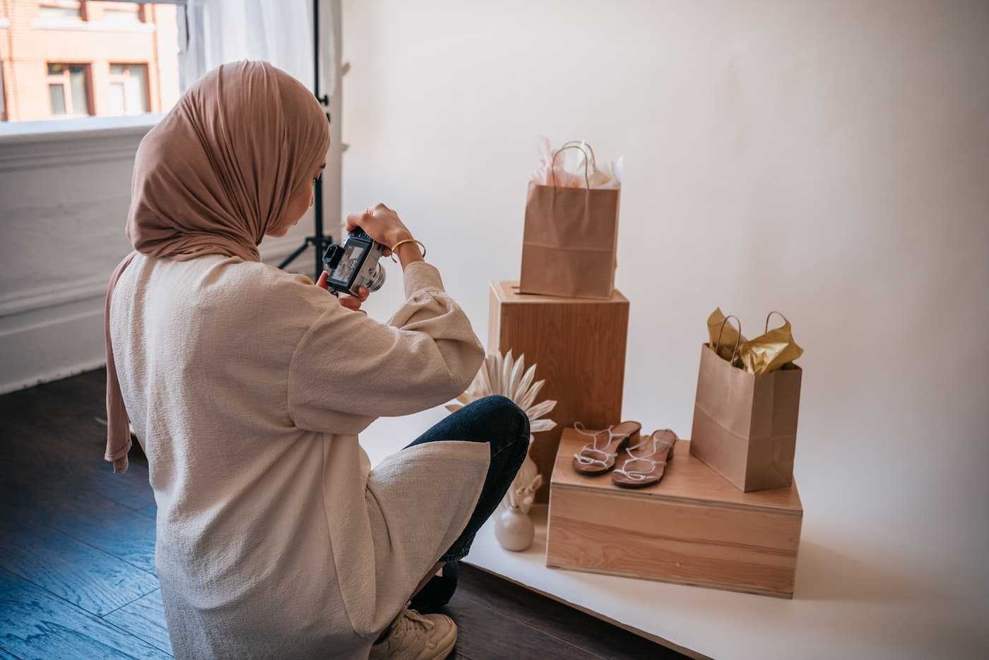
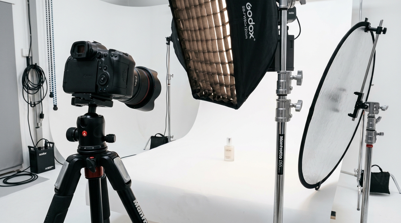
You cannot white balance product photos correctly with a phone propped against a stack of books and Auto White Balance doing the guessing. Auto WB looks at a scene, makes an assumption about what “neutral” should look like, and gets it wrong constantly under mixed studio light. Before a single frame gets shot, three pieces of equipment need to be in place: a gray reference, controlled lighting, and a camera that lets a human override the guesswork.
Last reviewed:
The gray card or color checker you actually need
A basic 18% gray card runs $10-20 and does one job well: it gives your camera and your editing software a true neutral reference point under your actual lighting setup. Step up to an X-Rite ColorChecker Passport ($100-130) and you get 24 color patches instead of one, which lets software correct for color casts across the whole spectrum, not just gray. For a seller running repeat shoots every time a new SKU launches, the ColorChecker pays for itself inside two or three sessions. It replaces “does this look right” with a number.
Lighting that holds a consistent color temperature
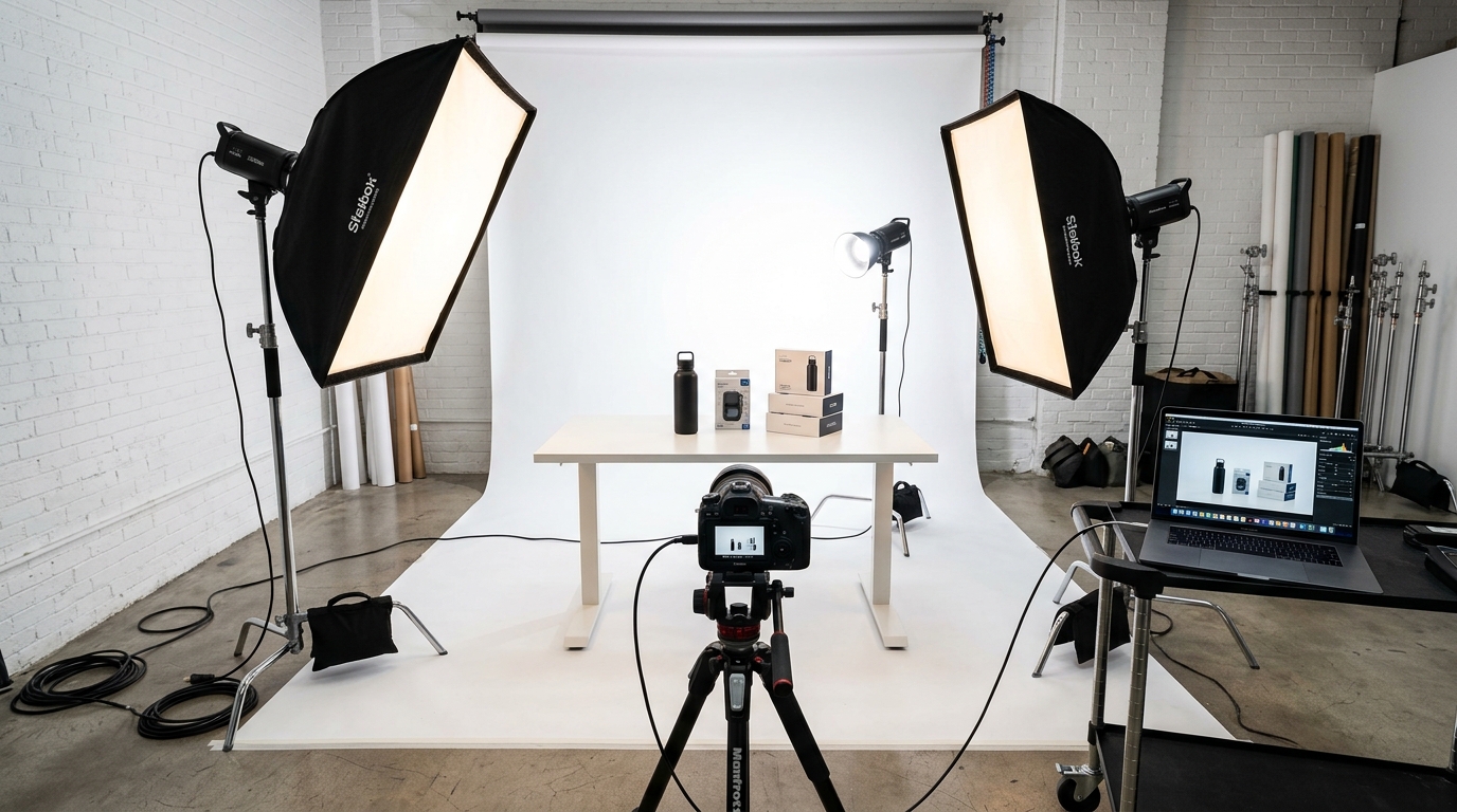
Buy strobes or LED panels rated between 5000K and 6500K, the daylight-balanced range that matches how a Main Image is expected to look: bright, neutral, true to life. Cheap continuous lighting kits drift in color temperature as bulbs heat up, which means your first frame and your fiftieth frame stop matching each other. Spend the extra $150-300 on daylight-balanced strobes with a fixed, published color temperature rating and that drift problem disappears.
Camera settings that support manual white balance
Shoot in Manual exposure mode and RAW file format. Full stop. Turn off Auto White Balance in the camera menu before you touch the shutter. Every DSLR and mirrorless camera above entry level has a Custom White Balance function and a manual Kelvin dial, usually buried two menus deep. Find it now, not mid-shoot when the light is already set and the clock is running.
Watch out: phone cameras and point-and-shoots that lock Auto White Balance with no manual override cannot do this job correctly. If your only camera is a phone, get a different camera before you get a gray card.
Step 2: Standardize Your Lighting Environment First
Most sellers skip this step and pay for it in every photo they shoot afterward. White balance correction only works if the light hitting the product stays the same color from the first frame to the last. Mixed light sources are the single biggest reason a seller can own a $130 color checker and still fail to white balance product photos correctly.
Match your key and fill lights to the same Kelvin rating
If your key light is a 5500K strobe and your fill is a 3200K desk lamp bounced off a card, you have two color temperatures fighting inside one frame. The product shows a warm cast on one side and a neutral or cool cast on the other. Match every light in the setup to the same Kelvin rating before you shoot the reference frame, not after.
Kill every stray light source in the room
Window light shifts color temperature by the hour, from a warm 3000K at sunrise to 6500K-plus under midday overcast. Overhead fluorescent office lighting runs anywhere from 3500K to 5000K depending on the bulb, and it bleeds onto reflective products like supplement bottles, beauty compacts, and stainless steel kitchenware. Shut the blinds, kill the overheads, shoot under your controlled strobes only.
Watch your product’s own color cast
Bright packaging, especially the reds and yellows common in supplement and beauty brands, bounces its own color back onto nearby surfaces and even onto the product itself in reflective areas. White balance settings do not fix this. It is a lighting angle and distance problem, and it is worth knowing the difference before you blame your camera for something your packaging caused.
Watch out: a lightbox with mismatched bulbs is worse than no lightbox at all. It creates a gradient color shift across a single product that no amount of post-processing corrects cleanly.
Step 3: Shoot a Gray Card Reference Frame
Once lighting is locked, shoot a reference frame before the product ever enters the set. This single frame is what every white balance correction downstream depends on, whether you’re setting a custom white balance in-camera or fixing color in post later.
Fill the frame correctly
Hold the gray card or color checker in the product’s future position, under the exact same light the product will sit in. Fill 60-80% of the frame with the card itself, not the surrounding set. A reference shot that includes too much background lets ambient light contaminate the reading.
Lock exposure before you shoot the reference
Set exposure manually (aperture, shutter, ISO) and lock it before the reference frame. A gray card that’s blown out or underexposed gives a bad white balance reading even if the color temperature itself is close. Aim for the card’s histogram to sit mid-range, not clipped on either end.
Reshoot the reference every time light changes
Move a light, swap a modifier, add a reflector, or reposition the camera, and the reference frame is dead. Reshoot it. This feels excessive on a fast-moving shoot with 40 SKUs to knock out, but it’s the difference between a listing that photographs true to color and one that gets a return with “colors don’t match” typed into the review.
Step 4: Set a Custom White Balance In-Camera
With the reference frame captured, tell the camera what neutral actually looks like under this specific light. This is the step most sellers skip entirely, defaulting to Auto White Balance and hoping for the best. Hope is not a color management strategy.
Using your camera’s Custom WB function
Navigate to the Custom or Preset White Balance setting in the camera menu, select the gray card reference frame you just captured, and let the camera calculate the color temperature and tint correction from that frame. Every major camera brand supports this, though the menu path differs. Canon calls it Custom White Balance, Nikon calls it Preset Manual, Sony calls it Custom 1/2/3. Five minutes with the manual solves this permanently.
Dialing in Kelvin manually as a backup method
If the custom WB workflow isn’t available, switch to manual Kelvin input instead. Daylight-balanced strobes in the 5000-6500K range typically need a camera Kelvin setting matched within 100-200K of the bulb’s rating, fine-tuned using the reference frame as a visual check. It’s a rougher method than Custom WB, but it still lands miles ahead of Auto White Balance guessing scene by scene.
| Light Source | Approximate Color Temperature | Typical Color Cast if Uncorrected |
|---|---|---|
| Tungsten / incandescent bulb | 2700K-3200K | Strong orange/yellow cast |
| Household LED (warm white) | 2700K-3000K | Yellow cast |
| Office fluorescent | 3500K-5000K | Green or yellow-green cast |
| Daylight-balanced strobe/LED | 5000K-5600K | Neutral, matches expected Main Image look |
| Overcast daylight | 6500K-7500K | Blue cast |
| Open shade | 7000K-8000K | Strong blue cast |
Step 5: Shoot in RAW, Not JPEG
RAW files store the actual sensor data before the camera applies any color processing. JPEG files bake white balance, contrast, and color decisions into the pixels permanently at the moment of capture. Shoot JPEG and get the white balance wrong, and there is no clean fix waiting for you in post.
Why JPEG bakes in bad color permanently
A JPEG file has already thrown away roughly 90% of the color data your sensor captured, compressed into an 8-bit file optimized for size, not editing latitude. Try to shift white balance more than a small amount on a JPEG and banding, posterization, and visible color shifts show up fast, especially in gradients like the curve of a stainless steel product.
File size and storage tradeoffs, worth it
RAW files run 25-45MB compared to 3-8MB for a JPEG from the same camera. A single shoot covering 40 SKUs at 7 images each generates roughly 280 files, which at RAW size is 7-12GB. Storage costs less than a dollar per shoot on a modern hard drive. Weigh that against the cost of a suppressed listing or a spike in returns from color mismatch, and RAW is not a close call.
Step 6: Correct White Balance in Post-Production

Even a well-executed in-camera custom white balance benefits from a final check in post. This is also where a seller who shot RAW without setting custom WB in-camera fixes everything retroactively, frame by frame or in batch.
Using the eyedropper tool on your gray reference
In Lightroom, Capture One, or Photoshop Camera Raw, select the White Balance eyedropper tool and click directly on the gray card in the reference frame. The software reads that pixel, calculates the shift needed to make it neutral, and applies the correction. This is the single most reliable method to white balance product photos correctly in post, more accurate than eyeballing temperature and tint sliders.
Calibrating your monitor before you trust your eyes
None of this matters if the monitor making the color decisions is itself inaccurate. A hardware calibrator like a Datacolor SpyderX or X-Rite i1Display ($150-200) corrects your monitor’s color output against a known standard. Editing on an uncalibrated monitor means every white balance decision is being made against a reference that’s already lying to you.
Batch syncing white balance across your full shot list
Once the correction is dialed in on the reference frame, sync that setting across every other frame shot under the same light. Lightroom’s Sync Settings and Capture One’s Copy/Apply Adjustments both do this in seconds across a folder of hundreds of images, which is the only realistic way to process a 280-image shoot without losing a full day to manual correction.
Step 7: Verify Color Accuracy Before You Upload
The last step gets skipped constantly, and it’s the one that actually catches mistakes before they cost money. Verify color. Don’t assume it. Get this step right and everything upstream you did to white balance product photos correctly finally pays off in the actual listing.
Side-by-side comparison against the physical product
Put the physical product next to the calibrated monitor, in neutral room lighting, and compare directly. Colors should match within a shade a reasonable customer would never flag. This five-minute check catches mismatches a screen full of thumbnails hides.
Checking consistency across all 7 image slots
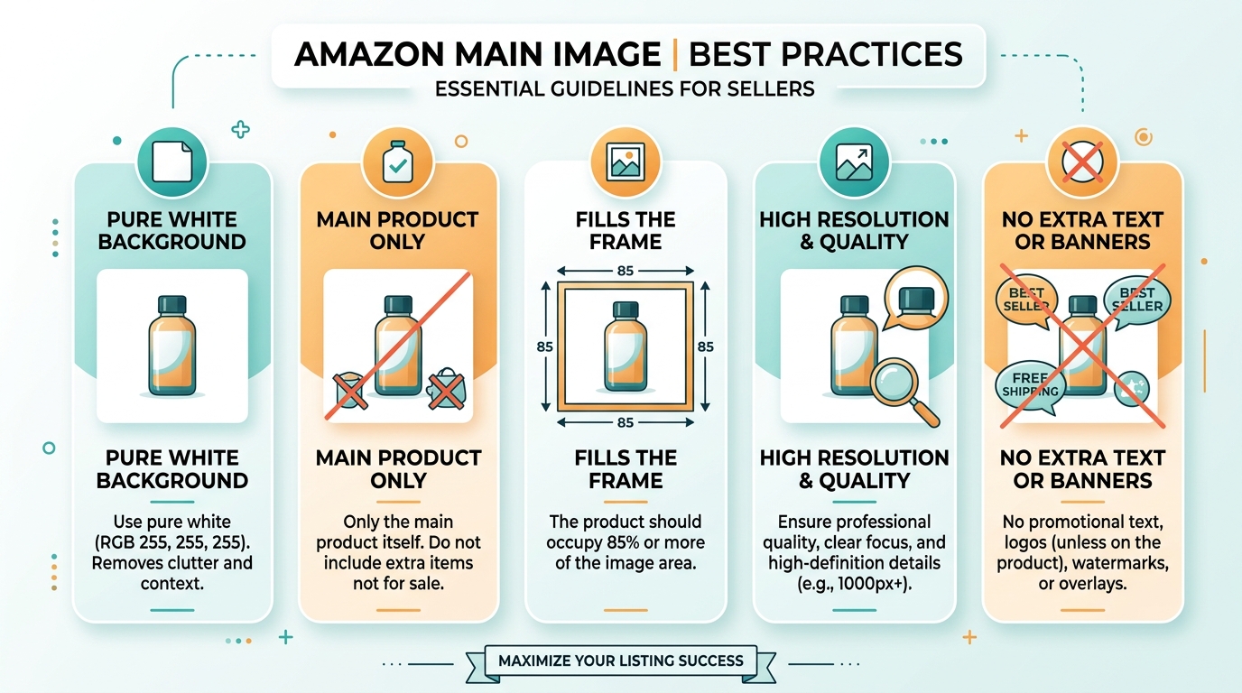
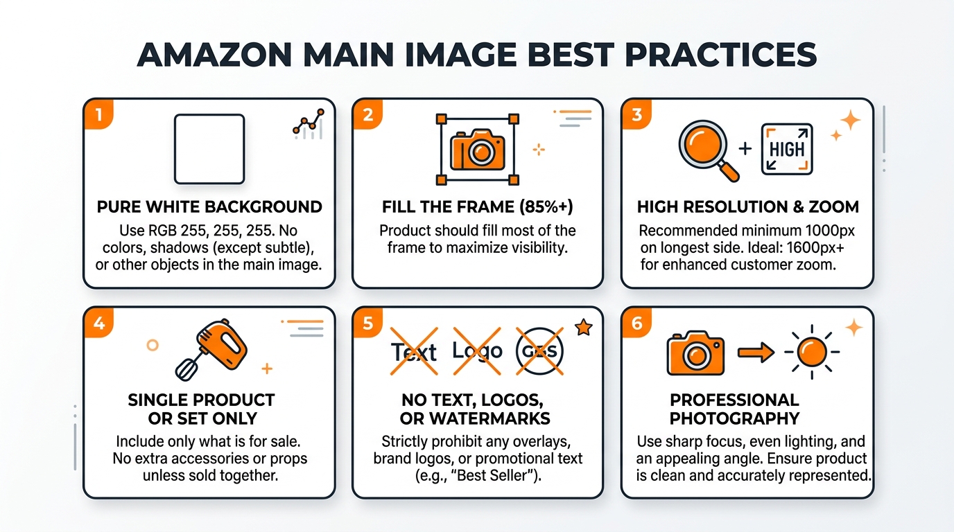
Amazon gives every listing seven image slots, and shoppers scroll through all of them before converting on high-consideration categories like electronics and beauty. If the Main Image reads true white and Image 4 has a warm cast because it was shot on a different day under different light, that inconsistency reads as unprofessional. It erodes trust and drags down CVR even when each image individually looks fine on its own. Amazon’s own product image requirements specify a pure white RGB 255,255,255 background for the Main Image, and a shifted white balance is the fastest way to miss that target without noticing.
When to send it out instead
Build all of this in-house, or hand it to a photography operation that already owns the calibrated gear and runs the workflow daily, like a professional Amazon product photography studio. Either path works. What doesn’t work is skipping the process and hoping Auto White Balance gets lucky across 280 frames.
Common Mistakes to Avoid
- Leaving Auto White Balance on for the entire shoot. It recalculates per frame, which means your 40th product photo can have a different color cast than your first, even under identical light.
- Mixing light sources without matching Kelvin ratings. One 3200K desk lamp in a 5500K strobe setup ruins the whole batch, and it’s the most common cause of split color casts on a single product.
- Shooting JPEG to save memory card space. A $10 SD card upgrade is cheaper than reshooting a listing because the color can’t be corrected after the fact.
- Skipping the reference reshoot after moving a light. Any change to the lighting setup invalidates the last gray card frame, full stop.
- Trusting an uncalibrated monitor to judge color. Shoppers see your listing on their own uncalibrated phone screens, but you still need a neutral starting point to correct from, and an uncalibrated editing monitor doesn’t give you one.
- Uploading without a side-by-side check against the physical product. This is the five-minute step that catches color mismatch before a customer does, in a review.
What’s Next
Now that you know how to white balance product photos correctly, the next weak point to audit is lighting angle and shadow control on your Main Image, since color accuracy and lighting quality solve two different problems that both show up as the same symptom: a listing that underperforms on CTR despite decent PPC placement. Products with inaccurate color also see a measurable bump in returns, and research on ecommerce product presentation from the Baymard Institute has repeatedly flagged “product looked different than pictured” as a top-cited reason shoppers cite for sending items back. Fixing white balance is cheap. Eating a return at $4-8 in reverse logistics fees per unit is not. For more on the fundamentals covered here, browse the rest of the AZ Product Shots blog.
Related Articles
- DIY Amazon Product Photography Setup: A Complete Build Guide Under $500
- Product Photography Lighting for Amazon: The Setup That Actually Converts
- Amazon Product Photography Pricing Breakdown: The Real Math Behind Your Image Investment
Sources & References
Amazon Listing Images That Actually Convert
Stop losing sales to competitors with better images. We research your niche, find the 6 buying objections in your category, and ship 7 strategic listing images that address each one.
Frequently Asked Questions
What’s the best Kelvin setting for Amazon product photography?
Aim for 5000K-5600K on your lights and match your camera’s custom white balance to that same range using a gray card reference. This range reads as neutral daylight, which is the look Amazon’s Main Image guidelines expect and what shoppers are used to seeing on the SERP.
Can I fix white balance in Photoshop if I shot JPEG?
You can nudge it, but not correctly. JPEG discards most of the color data at capture, so any significant white balance shift introduces banding and posterization, especially on gradients and reflective surfaces. Shoot RAW and this stops being a problem entirely.
Do I need a gray card if my studio light never changes?
Yes, because “never changes” is rarely true once you factor in bulb aging, modifier swaps, and stray window light. A gray card reference takes 10 seconds per setup and removes the guesswork, which is cheap insurance against a full reshoot.
How does bad white balance actually affect my return rate?
A product that photographs cooler or warmer than its true color sets a false expectation, and shoppers return items that don’t match what they saw on the listing. Research from the Nielsen Norman Group on ecommerce trust signals consistently shows visual accuracy drives purchase confidence, and confidence gaps show up later as refunds.
Should I ever use Auto White Balance for product shots?
No. Auto White Balance recalculates per frame based on scene content, which means identical lighting can still produce inconsistent color across a shot list. Manual custom white balance with a gray card reference is the only method that holds steady across an entire session.