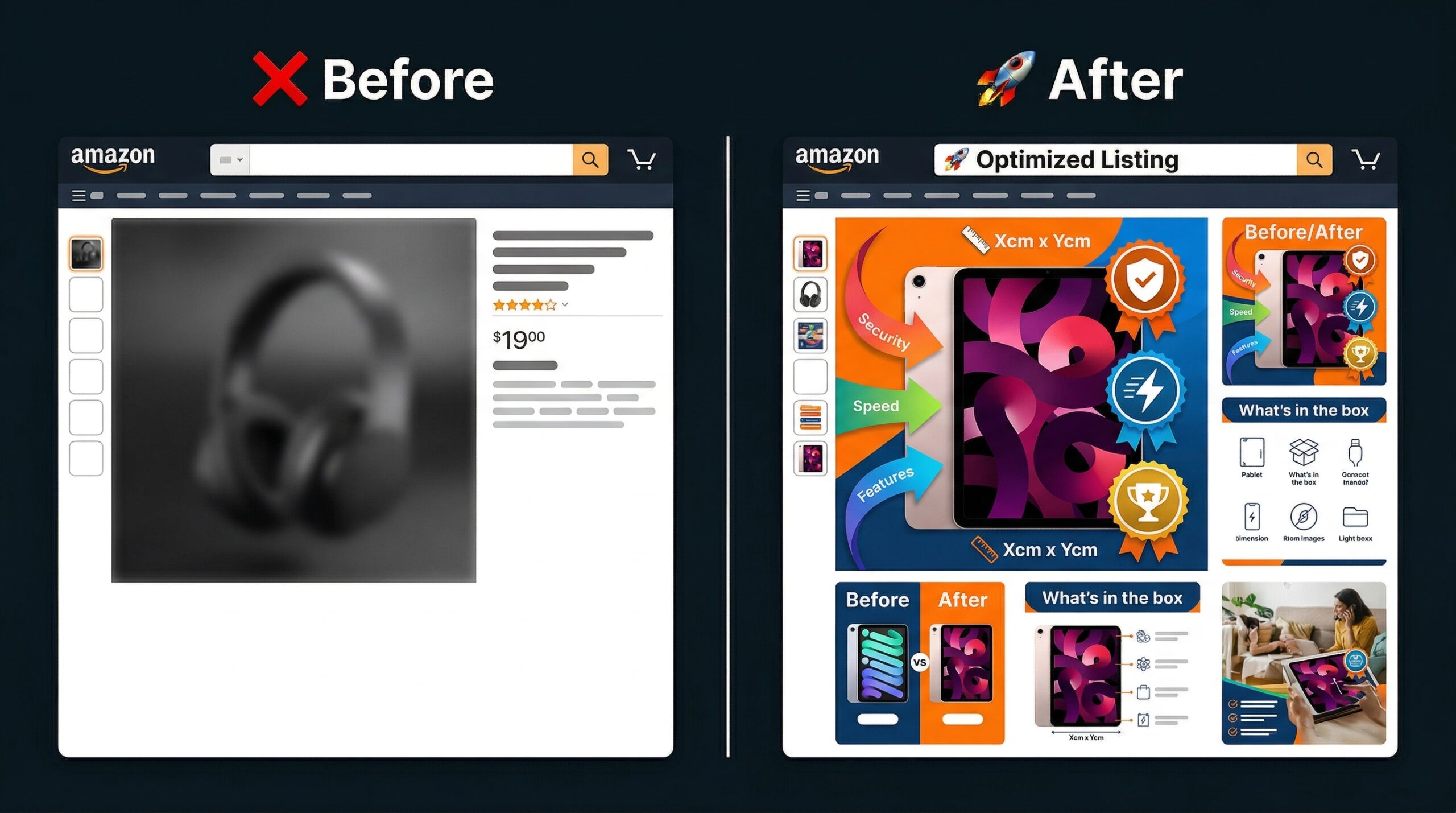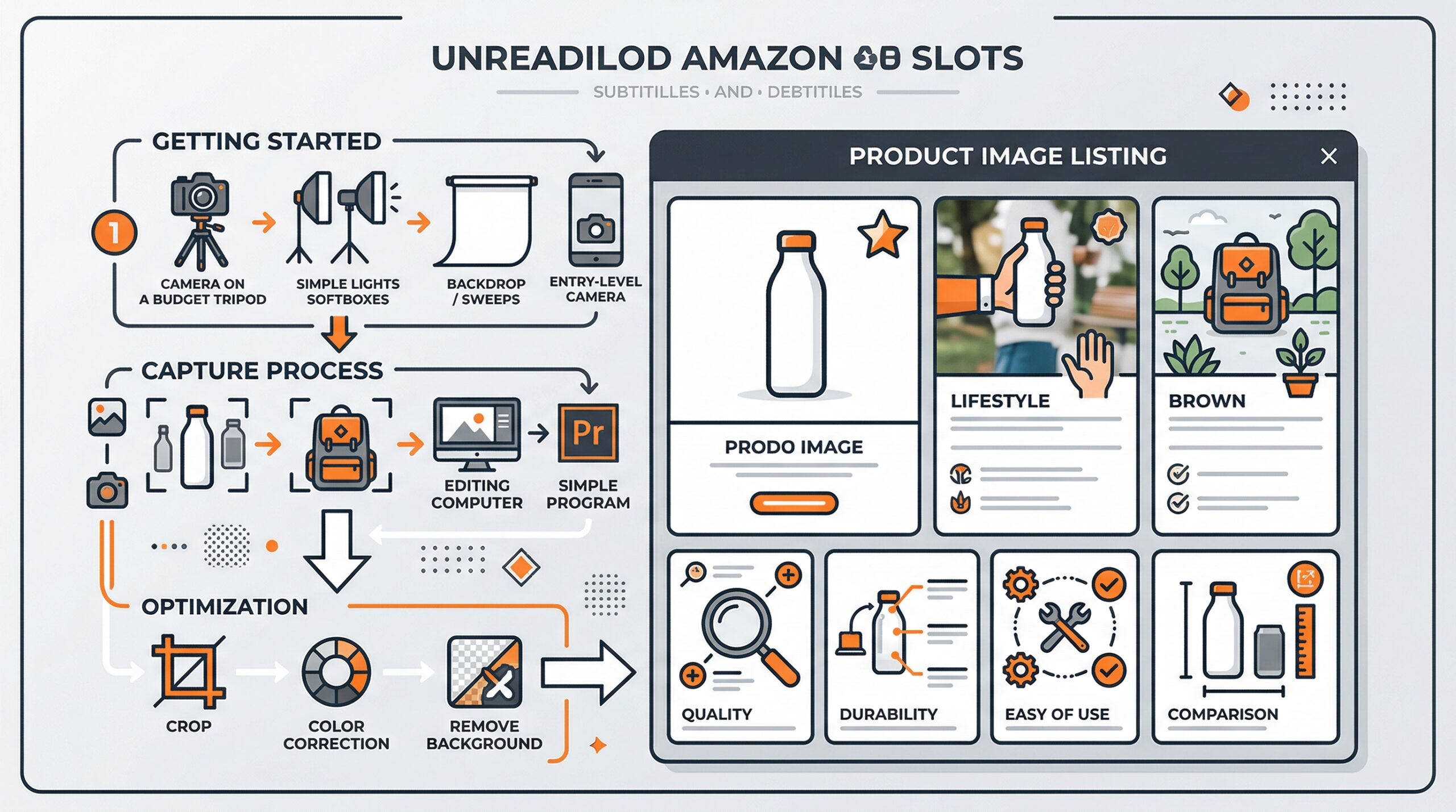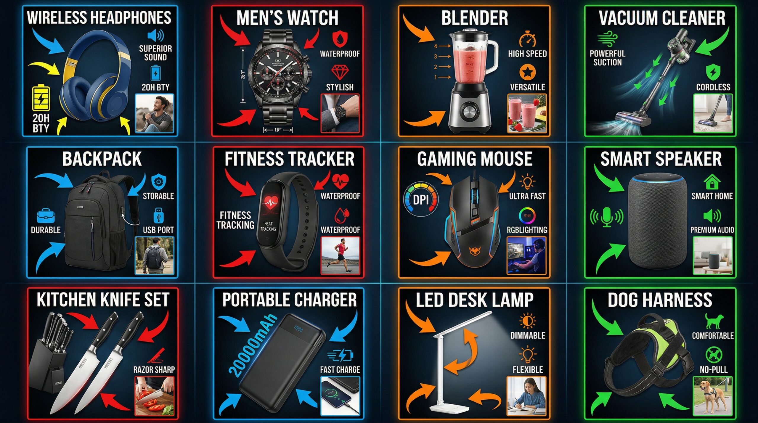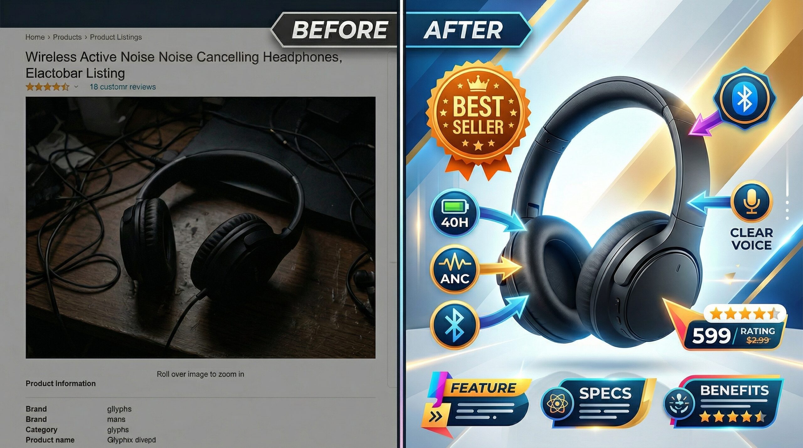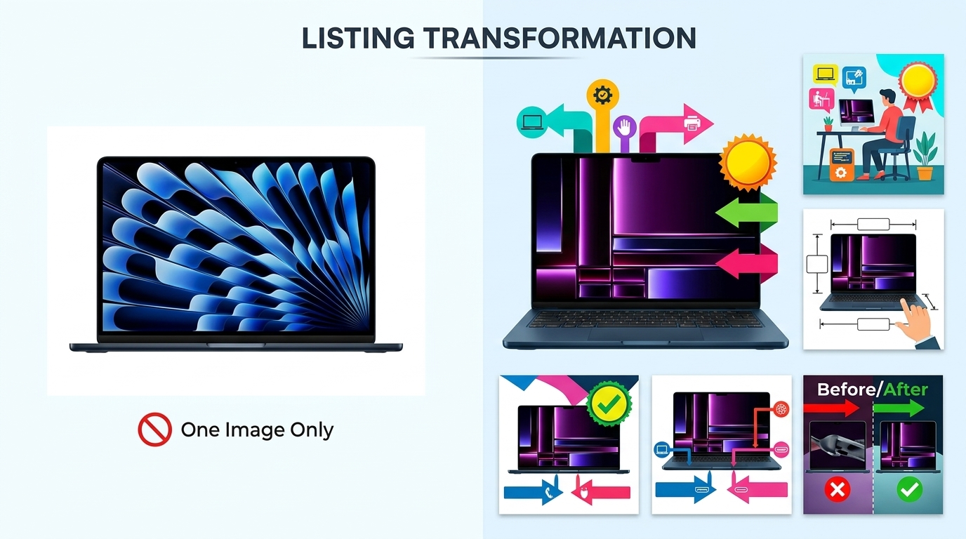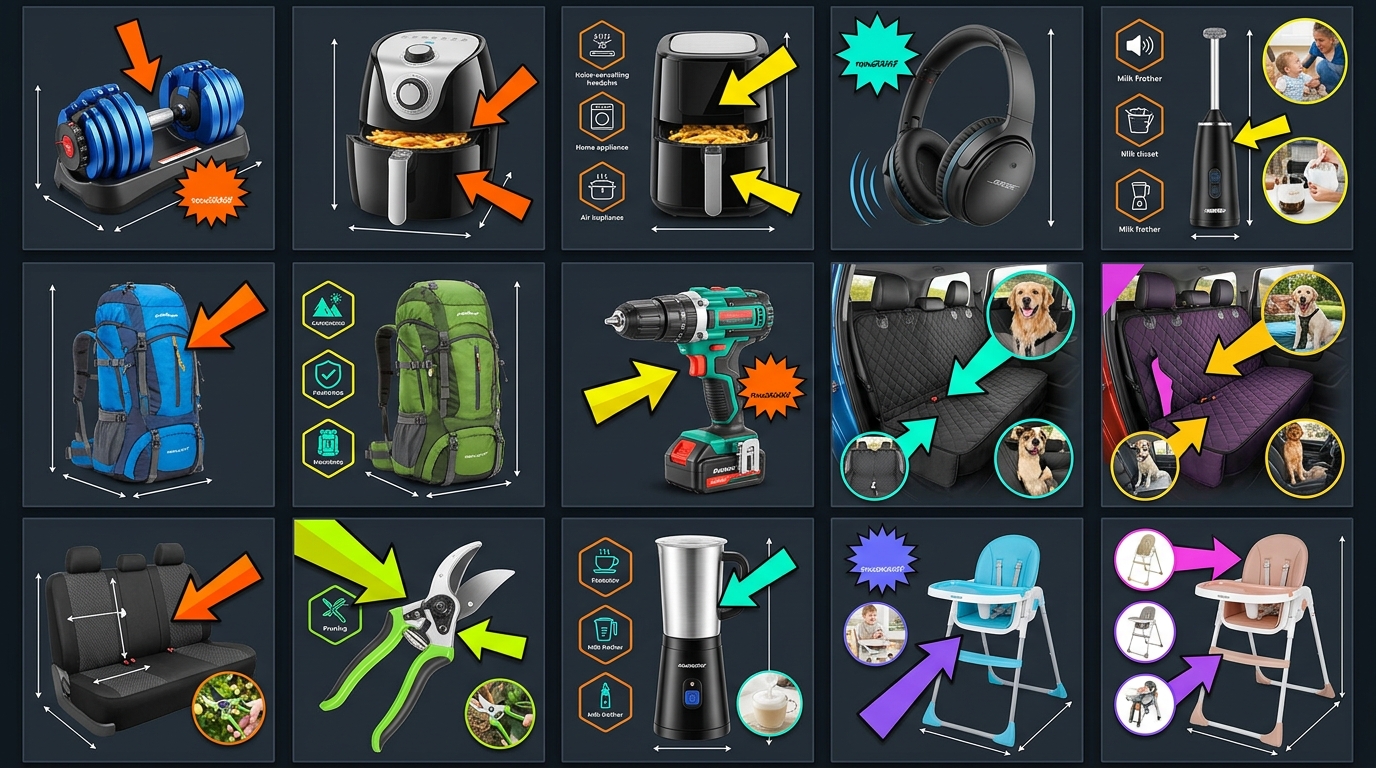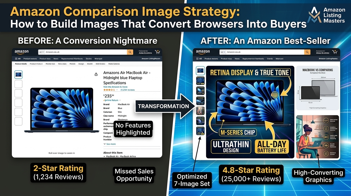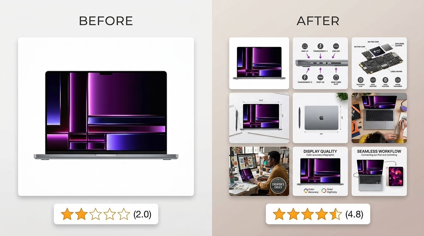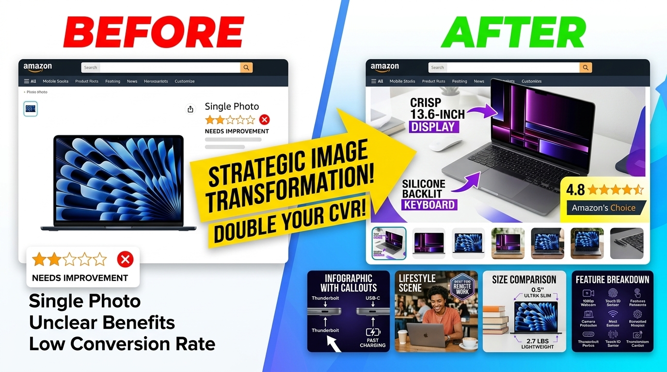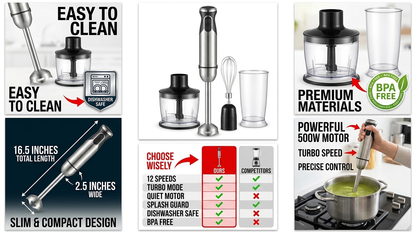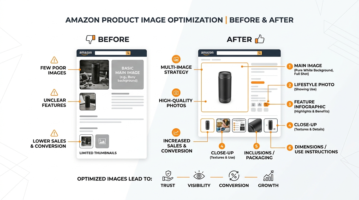
Your A+ Content converts at 3-10% while your competitor’s hits 15-20%. The difference? They understand that A+ Content isn’t a brochure — it’s a systematic conversion machine built on specific image modules, precise dimensions, and tested design principles.
Last reviewed:
Most sellers dump their existing product photos into A+ Content modules and wonder why their conversion rate stays flat. They treat A+ like a photo album instead of what it actually is: five to seven strategic touchpoints that address specific buyer objections in a specific order.
Our content visual marketing guide covers this in detail.
This Amazon A+ content image design guide breaks down each module type, optimal image specifications, and the psychology behind what actually drives conversions. Not theory. Real tactics based on analyzing hundreds of A+ Content layouts across categories from supplements to electronics.
Understanding A+ Content’s Real Impact on Conversion Rates
The Numbers That Actually Matter
Amazon’s own data shows A+ Content increases conversion rates by an average of 5.6%. But dig deeper into category-specific performance and you’ll find massive variance. Supplements with comparison charts see 15-20% lifts. Electronics with technical diagrams hit 10-15%. Meanwhile, basic apparel struggles to break 3%.
Why the gap? Module selection and image strategy.
The Amazon A+ content image design guide principles that separate high-converting layouts from expensive wallpaper:
For more on this, see our amazon storefront design guide.
- Module diversity: Using 5-7 different module types instead of repeating the same format
- Information density: 60-70% visual, 30-40% text optimal ratio per module
- Objection mapping: Each module addresses a specific buyer concern in order of importance
- Mobile-first design: 65% of buyers view A+ on mobile devices under 6 inches
Track these metrics in your A+ Content performance: scroll depth (aim for 70%+), time on page (2+ minutes), and most importantly, conversion rate lift versus your control listing without A+.
How A+ Content Affects Your Organic Ranking
A+ Content doesn’t directly impact A10 algorithm ranking. But it creates a conversion feedback loop that does. Higher conversion rates signal relevance to Amazon’s algorithm, improving your organic position over time.
The math: A 5% conversion rate improvement on 1,000 daily sessions generates 50 additional sales. Those sales velocity signals compound, pushing you up search results where you capture higher-intent traffic. Within 60-90 days, sellers typically see 15-25% organic traffic increases purely from conversion-driven ranking improvements.
But here’s what most sellers miss: A+ Content reduces your PPC costs. Higher conversion rates mean lower ACoS. That extra margin lets you bid more aggressively on competitive keywords, capturing market share from sellers still running 2-3% conversion rates with basic listings.
Mobile vs Desktop Design Considerations
Design for mobile first. Desktop is a bonus. Mobile commerce data from Statista shows 72.9% of e-commerce sales happen on mobile devices, and Amazon skews even higher.
Critical mobile design rules for A+ Content:
- Text size minimum 16px, ideally 18-20px for body text
- High contrast ratios: Black text on white or very light backgrounds only
- Single-column layouts for comparison charts on mobile breakpoints
- Vertical aspect ratios work better than horizontal for lifestyle images
- Icons and badges at 100x100px minimum for mobile visibility
Test your designs on actual devices, not just browser emulators. The way images render on a 5.5″ iPhone SE differs dramatically from a 6.7″ Samsung Galaxy. If your designer only works on a 27″ monitor, your mobile conversion rate will suffer.
Essential A+ Content Modules and Their Specifications

Header Modules That Convert
Your header module gets 100% visibility. Don’t waste it on a pretty lifestyle shot. The four header types that actually drive conversions:
1. Image Header with Text Overlay (970 x 600 px)
- Large hero image with 20% text overlay maximum
- Primary benefit statement in 5-7 words
- Works best for visual products (home goods, fashion, outdoor gear)
2. Logo + Lifestyle Header (600 x 180 px logo, 970 x 300 px image)
- Brand logo left-aligned at exactly 600 x 180 px
- Lifestyle image showing product in use
- Ideal for established brands with recognition
3. Text-Heavy Header (970 x 600 px background)
- Colored or textured background with text overlay
- 3-4 bullet points of core benefits
- Best for technical or feature-heavy products
4. Comparison Header (970 x 600 px)
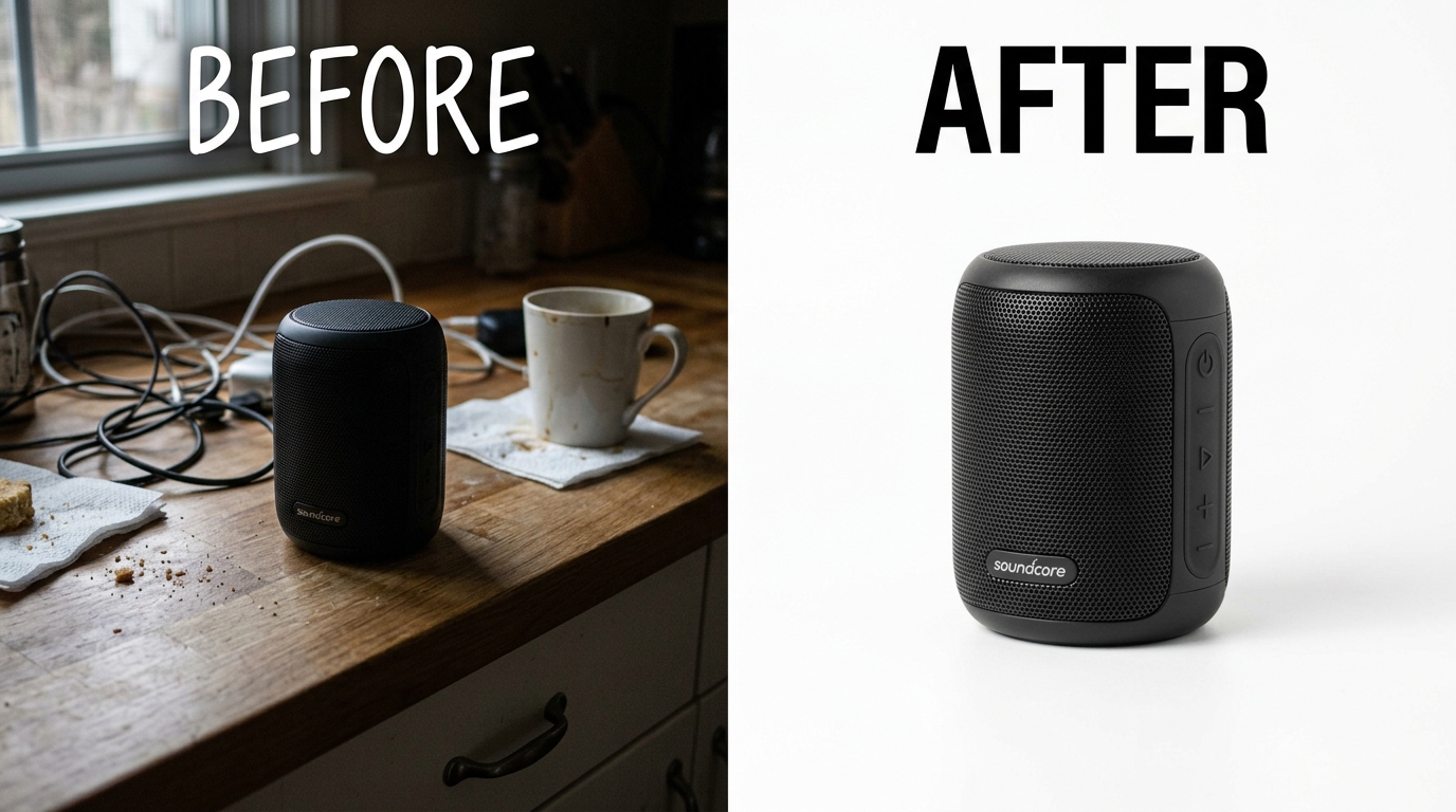
- Side-by-side before/after or with/without product
- Visual demonstration of transformation or benefit
- Highest converting for problem-solving products
Pro tip: Test header modules quarterly. What converts in Q1 might tank in Q4 when buyer intent shifts.
Comparison Chart Modules
Comparison charts drive 25-40% higher conversion rates than any other module type when done correctly. The key? Comparing within your own product line, not against competitors (which violates Amazon’s terms).
Standard Comparison Chart (300 x 300 px per product image)
- 3-6 products maximum for mobile readability
- 5-8 comparison points in rows
- Checkmarks, X’s, or specific values only (no ambiguous symbols)
- Guide buyers to your target SKU with visual hierarchy
Enhanced Comparison Module (970 x 600 px total)
- Larger format allows detailed feature comparisons
- Include pricing tiers if selling multipacks or bundles
- Use colored backgrounds to highlight your recommended option
The psychology: Buyers fear making the wrong choice. Comparison charts reduce decision paralysis by clearly showing which option fits their needs. Always include a “Best For” row that segments use cases.
Image and Text Combination Modules
These workhouse modules carry your feature explanations and benefit statements. The Amazon A+ content image design guide for maximum impact:
Single Left Image (300 x 400 px image, 630 px text width)
- Close-up product detail or feature callout
- 3-4 lines of explanatory text maximum
- Use for highlighting specific features or materials
Four Image Quadrant (220 x 220 px each)
- Grid layout for showing multiple angles or uses
- Each image gets 2-3 words of text overlay
- Mobile stacks to 2×2, maintain readability
Multiple Image Module (300 x 300 px each, up to 7 images)
- Carousel format on mobile, grid on desktop
- Sequential storytelling or process demonstration
- Number each image if showing steps or stages
Text formatting rules that boost readability:
- Sentence case for headlines, not title case
- 14-16 word maximum per paragraph for mobile scanning
- Bold the first 3-5 words of each bullet point
- Active voice only — passive voice kills conversion
Design Principles for High-Converting A+ Content
Color Psychology and Brand Consistency
Your A+ Content color scheme directly impacts buying decisions. Nielsen Norman Group’s research on visual hierarchy shows users make quality judgments in 50 milliseconds based on design alone.
Color strategies that convert:
Trust-building blues (Electronics, Medical, B2B)
- Navy (#003366) to Sky Blue (#87CEEB) spectrum
- White space minimum 40% for clinical feel
- Accent with orange or green for CTAs
Energy-driving reds/oranges (Fitness, Sports, Food)
- Avoid pure red (#FF0000) — too aggressive
- Burnt orange (#CC5500) or crimson (#DC143C) instead
- Balance with 60% neutral backgrounds
Premium blacks/grays (Luxury, Fashion, High-end Electronics)
- True black (#000000) only for text
- Charcoal (#36454F) for backgrounds
- Gold (#FFD700) or silver (#C0C0C0) accents
Maintain exact hex codes across all modules. Color variance between modules screams amateur and kills trust. Your designer should provide a color palette document with specific hex codes, not “use blue for headers.”
Typography Choices That Drive Readability
Bad typography kills conversions faster than any other design element. Your Amazon A+ content image design guide font stack:
Primary Headers: Sans-serif only
- Arial, Helvetica, or Open Sans
- Bold weight (700+) for impact
- 32-48px size range for desktop, 24-32px mobile
Body Text: Maximum readability
- Arial or Verdana only — tested across all devices
- Regular weight (400)
- 16-20px size, 1.5-1.8 line height
- Dark gray (#333333) instead of pure black for reduced eye strain
Accent Text: Strategic emphasis
- Same font family as body, bold weight
- Color contrast minimum 4.5:1 for WCAG compliance
- Use sparingly — 3-5 instances per module maximum
Never use script fonts, decorative fonts, or anything that requires squinting. If your grandma can’t read it on her phone without glasses, redesign it.
Image Composition Techniques
Professional product photography for your main listing images is step one. A+ Content composition is a different game entirely. You’re not just showing the product — you’re demonstrating transformation.
The Rule of Thirds (Modified for A+)
- Place product at intersection points, not dead center
- Leave breathing room — 20% minimum margins
- Eye flow moves left to right, top to bottom in Western markets
Contextual Staging
- Show the product solving the exact problem buyers have
- Include subtle size references (hands, common objects)
- Lifestyle shots need authentic environments, not stock photo kitchens
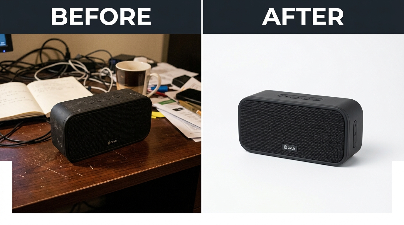
Before/After Demonstrations
- Same angle, same lighting, only variable is your product
- Dramatic but believable transformations
- Time stamps or day counters for credibility
Image composition mistakes that tank conversions:
- Cluttered backgrounds competing for attention
- Multiple focal points confusing the eye
- Inconsistent lighting between modules
- Stock photography that screams “generic”
Technical Requirements and File Optimization
Image File Specifications
Amazon’s A+ Content image requirements are non-negotiable. Miss one specification and your entire submission gets rejected, wasting days of revision cycles.
Absolute requirements for all A+ images:
- File format: JPEG or PNG only (JPEG preferred for photos, PNG for graphics)
- Color mode: RGB only, never CMYK
- DPI: 72 DPI for web optimization
- File size: Under 1MB per image (aim for 100-500KB)
- Minimum dimensions: Module-specific (see breakdown below)
Module-specific dimension requirements:
| Module Type | Image Dimensions (px) | Aspect Ratio | Max File Size |
|---|---|---|---|
| Standard Image Header | 970 x 600 | 16:10 | 500KB |
| Logo | 600 x 180 | 10:3 | 100KB |
| Single Left Image | 300 x 400 | 3:4 | 200KB |
| Four Quadrant (each) | 220 x 220 | 1:1 | 100KB |
| Comparison Chart Product | 300 x 300 | 1:1 | 150KB |
Pro tip: Create templates in Photoshop or Figma with exact dimensions. Eyeballing it leads to rejection.
Compression Without Quality Loss
The 1MB file size limit forces smart compression. Here’s how to maintain quality while hitting size requirements:
JPEG compression settings:
- Quality: 80-85% (never below 75%)
- Progressive encoding enabled
- Remove all metadata/EXIF data
- Optimize for web export specifically
PNG optimization for graphics:
- Use PNG-8 for simple graphics under 256 colors
- PNG-24 only for images requiring transparency
- Run through TinyPNG or similar optimizer
- Remove alpha channel if transparency isn’t used
Batch optimization workflow:
- Export from design software at 100% quality
- Run through ImageOptim or JPEGmini
- Test on actual Amazon upload to verify quality
- Keep master files for future edits
Common compression mistakes: Over-compressing product close-ups where detail matters. Under-compressing backgrounds and lifestyle shots where 70% quality is fine. Match compression to content importance.
File Naming Best Practices
Your file names impact both organization and potential SEO benefit within Amazon’s system. The Amazon A+ content image design guide naming convention that works:
Structure: [Brand]-[ProductASIN]-[ModuleType]-[Position]-[Version]
Examples:
- NutriMax-B08XXX-Header-01-v2.jpg
- TechPro-B09XXX-Comparison-03-v1.jpg
- FitGear-B07XXX-Feature-02-v3.jpg
Why this matters:
- Quick identification during revisions
- Version control prevents uploading old files
- ASIN reference links images to specific products
- Module type helps track performance by section
Avoid spaces, special characters, or dates in file names. Use hyphens or underscores only. Keep under 50 characters total for system compatibility.
Module-by-Module Design Strategy
Building Your Module Sequence
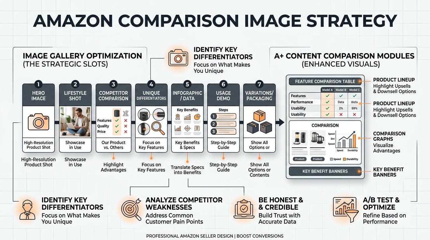
Module order matters more than module quality. Buyers scroll in predictable patterns, and your sequence should match their decision journey. The highest-converting A+ Content follows this psychological flow:
1. Header: The Hook (3 seconds to grab attention)
- Lead with transformation or primary benefit
- Address the #1 buyer objection immediately
- Visual that stops the scroll
2. Credibility Builder (Why should they trust you?)
- Awards, certifications, or manufacturing process
- Founder story or brand heritage (if compelling)
- Social proof numbers if impressive (units sold, years in business)
3. Feature Deep Dive (What makes this special?)
- 3-4 key differentiators with visual explanation
- Technical specifications for researchers
- Material quality or ingredient highlights
4. Use Case Demonstration (How will this fit their life?)
- Multiple scenarios showing versatility
- Before/after states
- Day-in-the-life sequences
5. Comparison Chart (Which option is right?)
- Guide to the profitable SKU
- Clear winner based on their needs
- Upsell to bundles or premium versions
6. Objection Handler (What’s still holding them back?)
- Address size, compatibility, or usage concerns
- Warranty or guarantee visualization
- Easy return process if applicable
7. Final Push (Why buy now?)
- Urgency without fake scarcity
- Value stack visualization
- Lifestyle aspiration shot
This sequence converts because it matches buyer psychology: Attention → Interest → Desire → Action.
Category-Specific Module Templates
Different categories require different approaches. Copy-pasting your supplement A+ Content strategy to electronics will tank your conversion rate. Here’s what actually works:
Supplements/Vitamins A+ Content Structure:
- Header: Benefit-focused (Energy, Weight Loss, Immunity)
- Module 2: Ingredient transparency with dosages
- Module 3: Third-party testing certifications
- Module 4: Comparison chart of different sizes/counts
- Module 5: Usage instructions with timing
- Module 6: Manufacturing facility/quality standards
- Module 7: Subscription savings visualization
Electronics/Tech A+ Content Structure:
- Header: Feature showcase or compatibility highlight
- Module 2: Technical specifications grid
- Module 3: Setup process (3-5 simple steps)
- Module 4: Compatibility chart with devices
- Module 5: Size comparison with common objects
- Module 6: What’s in the box breakdown
- Module 7: Warranty and support information
Home/Kitchen A+ Content Structure:
- Header: Lifestyle transformation shot
- Module 2: Problem/solution demonstration
- Module 3: Material quality and durability
- Module 4: Size guide with kitchen context
- Module 5: Cleaning and maintenance ease
- Module 6: Multi-use scenarios
- Module 7: Brand story or sustainability angle
The pattern: Lead with category-specific buyer priorities. Tech buyers want specs first. Supplement buyers want ingredients. Kitchen buyers want to see it in their space.
A/B Testing Your Modules
Most sellers create A+ Content once and forget it exists. Smart sellers test quarterly and optimize based on data. Your testing framework:
What to test (in priority order):
- Header image and headline (biggest impact)
- Module sequence (rearrange based on scroll data)
- Comparison chart inclusions (products and features)
- Text vs image ratio per module
- Color schemes and button designs
How to structure tests:
- Run for minimum 14 days (full buying cycle)
- 1,000+ sessions per variant for statistical significance
- Test one major element at a time
- Document everything — screenshots, dates, results
Metrics that matter:
- Conversion rate lift (primary)
- Scroll depth percentage
- Time on page increase
- Unit session percentage
- Return rate changes
Pro tip: Test during stable demand periods. Running tests during Prime Day or Q4 gives misleading data from abnormal buyer behavior.
Content Creation Workflow

Planning Your A+ Content Project
A scattered approach to A+ Content creation leads to endless revisions and missed launches. Follow this systematic workflow that gets approval on the first try:
Phase 1: Research and Strategy (Days 1-3)
- Analyze top 10 competitors’ A+ Content
- Document their module types and sequences
- Read your own negative reviews for objection insights
- Map buyer objections to specific modules
- Create module outline with purpose for each section
Phase 2: Content Development (Days 4-7)
- Write all copy first — visuals support text, not vice versa
- Keep a “phrase bank” of tested conversion language
- Maintain consistent voice across all modules
- Get legal/compliance approval on claims
- Create shot list for any new photography needs
Phase 3: Design Execution (Days 8-14)
- Start with wireframes, not finished designs
- Get approval on layout before adding polish
- Design desktop version first, then adapt for mobile
- Export working files at each milestone
- Build template library for future products
Phase 4: Technical Preparation (Days 15-16)
- Optimize all files to exact specifications
- Create backup versions at different compressions
- Prepare submission spreadsheet with module order
- Double-check all text for typos (no editing after submission)
Phase 5: Submission and Launch (Days 17-21)
- Submit during Tuesday-Thursday for faster approval
- Monitor for rejection notices within 24 hours
- Have revision files ready for common rejection reasons
- Plan promotional push once approved
Budget 3 weeks minimum from concept to live A+ Content. Rushing guarantees rejection and rework.
Design Tools and Resources
Professional A+ Content requires professional tools. Your Amazon A+ content image design guide toolkit:
Essential Design Software:
- Adobe Creative Suite ($54.99/month): Photoshop for images, Illustrator for graphics
- Canva Pro ($12.99/month): Template-based design for non-designers
- Figma ($12/month): Collaborative design with developer handoff
- Sketch ($99/year Mac only): UI-focused design tool
Image Optimization Tools:
- JPEGmini Pro ($89): Batch compression without quality loss
- ImageOptim (Free Mac): Simple drag-and-drop optimization
- TinyPNG (Free web): Quick optimization for PNG files
- Photoshop Save for Web: Built-in optimization with preview
Free Resources Worth Using:
- Unsplash/Pexels: High-quality stock photography (modify heavily)
- Google Fonts: Web-safe fonts that render consistently
- Coolors.co: Color palette generator with accessibility checking
- Grammarly: Catch typos before they’re locked in images
Don’t try to design A+ Content in PowerPoint or Word. The image quality and control aren’t there. Invest in proper tools or hire someone who has them.
Working with Designers and Agencies
Most Amazon sellers shouldn’t design their own A+ Content. Your time is better spent on inventory and marketing. But hiring wrong costs more than doing it yourself.
Red flags when vetting designers:
- No Amazon-specific portfolio (Instagram graphics don’t translate)
- Promises about “viral” or “breakthrough” design
- Unfamiliarity with module specifications
- Only shows lifestyle photography, no infographics
- Can’t explain their conversion optimization process
What competent A+ designers deliver:
- Module templates customized to your brand
- 3-5 concepts for A/B testing
- Mobile and desktop versions of each module
- Source files for future modifications
- Submission-ready files with proper naming
Pricing reality check:
- Freelance designer: $1,500-3,500 per ASIN
- Specialized agency: $3,000-7,500 per ASIN
- Full-service agency: $5,000-15,000 including strategy
- Overseas/Fiverr: $100-500 (you get what you pay for)
If you’re selling a $20 product with 15% margins, the math might not work for premium design. But if your LTV exceeds $100 or you’re building a real brand, professional design pays for itself within 60-90 days through conversion lift.
Interview question that separates pros from amateurs: “Walk me through your process for optimizing A+ Content based on performance data.” If they can’t answer with specifics, keep looking.
Measuring and Optimizing Performance
Key Metrics to Track
You can’t optimize what you don’t measure. Most sellers check conversion rate and call it a day. That’s like driving by only watching the speedometer. Track these A+ Content metrics for real optimization insights:
Primary Business Metrics:
- Conversion Rate Lift: Compare 30 days before/after A+ launch
- Average Order Value: A+ should drive upsells to premium SKUs
- Return Rate Change: Good A+ Content reduces returns by setting expectations
- Subscribe & Save Adoption: Track if A+ drives subscription purchases
Engagement Metrics via Brand Analytics:
- Scroll Depth: What percentage view your entire A+ Content?
- Glance Views to A+ Views Ratio: Indicates main image effectiveness
- Time on Page Delta: Increase versus non-A+ listings
- Mobile vs Desktop Performance: Optimize for your traffic source
Competitive Intelligence Metrics:
- Share of Voice: Your A+ impressions versus category
- Conversion Rate Gap: You versus category average
- Content Refresh Frequency: How often competitors update
Create a simple tracking spreadsheet updated weekly. Baymard Institute’s research on ecommerce optimization shows consistent measurement improves results by 20-30% versus sporadic checking.
Common Performance Issues and Solutions
When A+ Content underperforms, it’s usually one of these five issues:
Issue 1: High bounce rate from A+ Content
Solution: Your header module isn’t aligned with search intent. If people search “waterproof phone case” and your header talks about style, they bounce. Match module one to primary keyword intent.
Issue 2: Good traffic but no conversion lift
Solution: You’re not addressing the right objections. Read your 3-star reviews — that’s where real objections live. Build modules that directly answer those concerns with visuals.
Issue 3: Mobile conversion significantly lower
Solution: Text is too small or images too detailed for small screens. Redesign with mobile-first approach: bigger text, simpler graphics, vertical layouts.
Issue 4: A+ Content loads slowly
Solution: File sizes too large. Re-compress all images targeting 150-200KB average. Every second of load time costs 7% in conversions according to Amazon’s own data.
Issue 5: Conversion drops after A+ launch
Solution: Your A+ Content contradicts your bullet points or main images. Ensure consistent messaging across all content. Mixed messages confuse buyers into inaction.
The fix is rarely complete redesign. Usually, it’s one module or message creating friction. Test removing modules one at a time to identify the culprit.
Iterative Improvement Strategies
The best A+ Content evolves based on data, not opinions. Your quarterly optimization cycle:
Quarter 1: Analyze and Plan
- Export all performance data from previous year
- Identify lowest-performing modules via heatmap tools
- Survey recent customers about purchase decision factors
- Plan 2-3 tests for the quarter
Quarter 2: Test Major Changes
- New header concepts based on Q1 data
- Different module sequences for user flow
- Alternative comparison chart structures
- Run each test for 30 days minimum
Quarter 3: Refine Winners
- Take winning concepts from Q2
- Polish design details and copy
- Test premium versus value messaging
- Optimize for peak Q4 season
Quarter 4: Maximize and Document
- Lock in highest-converting version for peak season
- Document what worked for other ASINs
- Build template library from winners
- Plan next year’s testing calendar
This Amazon A+ content image design guide approach compounds improvements. Year one might see 5-10% lift. Year two hits 15-20%. Year three, you’re outconverting competitors by 2-3x because you optimized while they stayed static.
Remember: A+ Content isn’t a set-and-forget asset. It’s a conversion optimization tool that requires active management. Brands that test monthly outperform those that test annually by 40-60%.
Sources & References
Related Reading
- Amazon Infographic Images Guide: How to Create Data-Driven Visuals…
- Amazon Brand Story Visual Strategy: How to Convert Browsers into…
- Amazon A+ Content vs Standard Description: Which Drives More Sales
Related Reading
Frequently Asked Questions
How long does Amazon take to approve A+ Content?
Amazon typically approves A+ Content within 7 business days, but expect 3-14 days depending on submission quality and queue volume. Submit Tuesday through Thursday for fastest approval — Monday and Friday submissions often sit until the following week. Having all images properly formatted and text error-free gets you through in 3-5 days versus 10-14 for submissions with issues.
Can I use lifestyle images from my product photographer in A+ Content?
Yes, but they’ll likely need modification. Standard product photography focuses on the product itself, while A+ Content needs context, comparison, and storytelling. Plan to crop, combine, or overlay text on existing photos. Budget for 5-10 additional shots specifically for A+ Content when booking your Amazon product photography session — it’s more cost-effective than trying to retrofit existing images.
What’s the ideal number of modules for A+ Content?
Five to seven modules optimizes for both conversion and user experience. Fewer than five doesn’t provide enough information to overcome objections. More than seven causes scroll fatigue — only 30% of users reach module eight. Test starting with five modules, then add based on scroll depth data. Premium products can support seven modules; commodity items perform better with five focused modules.
Should I create unique A+ Content for each product variant?
Only create unique A+ Content for variants with significantly different features or target audiences. Color variants of the same product should share A+ Content to reduce management complexity. However, size variants with different use cases (travel versus home size supplements) benefit from customized modules highlighting size-specific benefits and use scenarios.
How do I track ROI from A+ Content investment?
Calculate A+ Content ROI by comparing conversion rates 30 days before and after launch, multiplied by your average daily sessions and profit margin. Example: 1,000 daily sessions × 2% conversion lift × $15 profit margin = $300 daily profit increase. Most sellers see full ROI within 30-60 days. Track monthly to ensure performance maintains — a 5% conversion lift on $50,000 monthly revenue equals $2,500 additional profit monthly.